How to make a meme in Photoshop
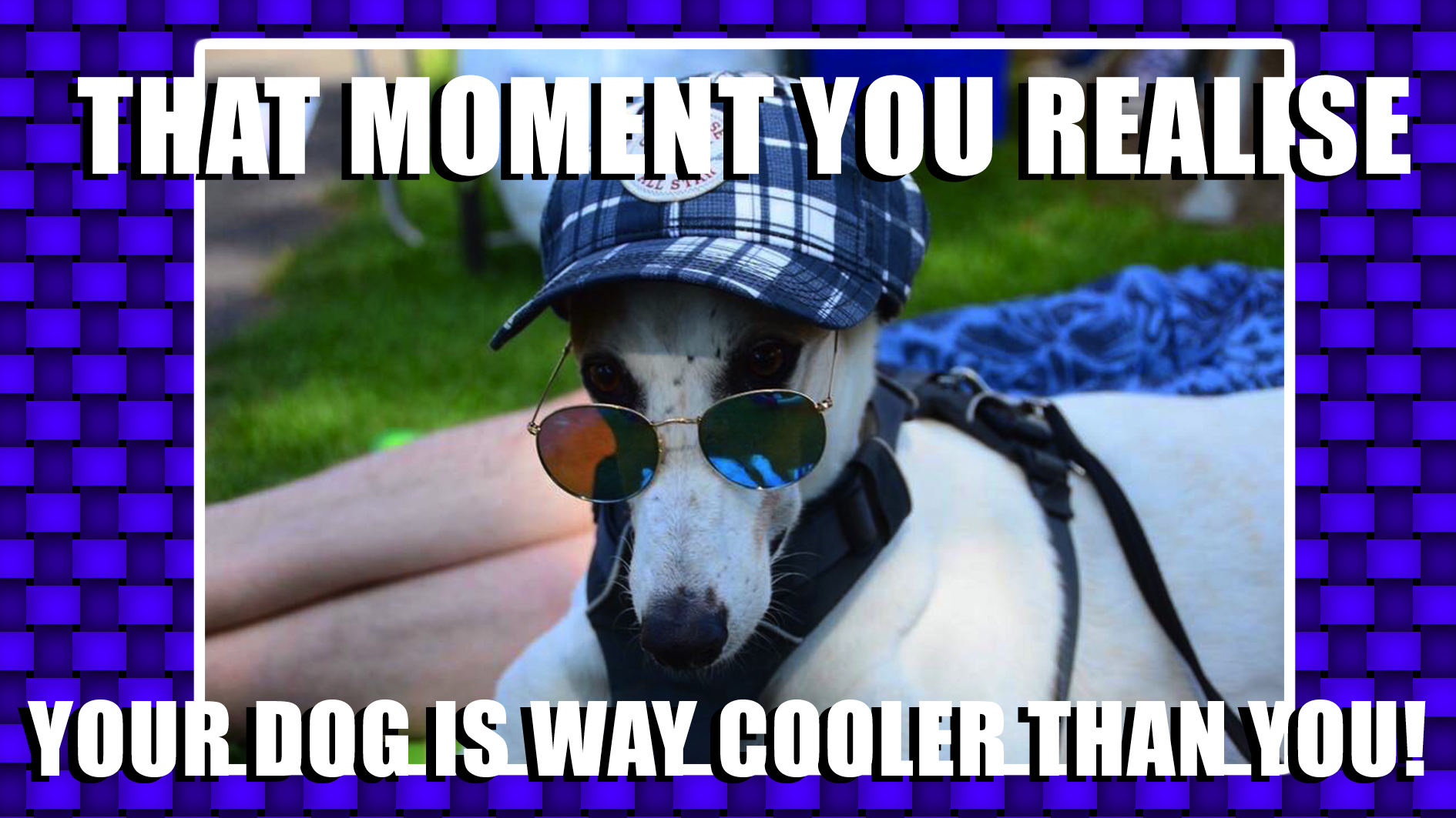
This guide to how to make a meme in Photoshop will help you make multiple memes in moments.

Do you want to know how to make a meme in Photoshop? This guide is here to help. Since the advent of the world wide web, the meme has become ubiquitous with sharing complex information in an easily-consumed nugget. It's a low-investment, high-impact graphic that is quick to churn out, and discarded just as quickly.
You can find a bunch of meme makers out there, including an explicit function in Photoshop Elements, but you can get even more control if you use Photoshop itself. This tutorial will show you how to turn your computer into a meme factory using nothing more than Photoshop CC (and your creative mind, of course).
If you want to up your Photoshop skills across the (art)board, check out our roundup of the best Photoshop tutorials. Elsewhere, see our guide to image file formats to ensure you're creating the right type of file.
Article continues below01. Create document
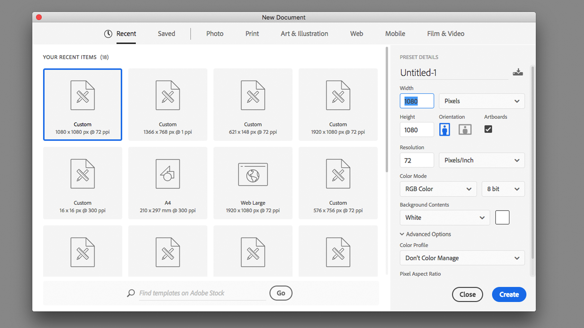
Before opening Photoshop you should check your preferred social platform for the desired format and dimensions. For this tutorial I will start with a canvas size of 1080px x 1080px, which is the standard square image used on Instagram. I will also be using Artboards to create a range of templates, so make sure they are turned on in the New Document window.
02. Select an image
The success of a meme is often based on the strength of the image, usually relying on humour to draw attention. There are plenty of methods for bringing an image into a Photoshop document. One option is to open the image in the app, selecting, copying and pasting it onto the other canvas. Alternatively you can import the image directly into the file or drag and drop in from the Finder.
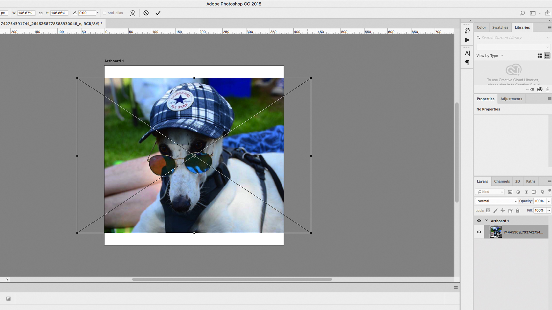
You can resize the image on your canvas using the Transform tool, either under Edit > Transform or using the shortcut Cmd + T, dragging the corner or edges of the frame. Holding the Shift key will retain the proportions and stop your content distorting. You can add a stroke around the edge of the image by using an Outer Glow and setting it to Normal blending, a distance of 15px and a Range of 1%.
If you want to crop part of the image out, use one of the marquee tools to select unwanted areas of the image, then either delete them outright or create a mask and fill the selection with black. If your image is a Smart Object then you can easily move the image around in the frame and switch it out for another image, by double clicking on the layer image.
Sign up to Creative Bloq's daily newsletter, which brings you the latest news and inspiration from the worlds of art, design and technology.
03. Make a background
No meme would be complete without a distinct background to frame the image and make your content pop. Create a new layer with the shortcut Cmd + Shift + N, drag it to the bottom of layers and go to Edit > Fill. You will be presented with a number of options in a drop down menu. Select Pattern and choose a Custom Pattern to use. If this is your first time using patterns, the list on offer may be quite limited, so click on the icon in the top-right corner and add some packages from the list.
If patterns aren’t to your taste, using a flat colour can work just as well. Your design instincts might be screaming at you to pick a colour that complements the image, but memes don’t follow normal rules, and can benefit from garish, clashing colours that might draw the eye and won’t suffer from the same intense scrutiny as other designs. Create a new layer and use the Paint Bucket or Gradient tool to fill it with colour. You can even mix the two ideas by adding a color overlay to a pattern in the Layer Style window.
04. Add text
Ultimately the design of a meme is no more than a vehicle for the content. Alongside the image, the text needs to be unapologetically large and brash, sacrificing style for impact. Use the Type tool to draw a box across your canvas. Keep the text large and minimal, aiming for a hierarchy, with one larger statement and a smaller message below. Pick a thick, blocky typeface that will stand out on top of a busy background, like Impact or Tungsten.
Although it may seem dated, adding a Drop Shadow is a surefire way to make the text stand out. Double-click on the text layer to open the Layer Style window and add a Drop Shadow. I used 100% black and a distance of 8px, creating a hard, angled shadow.
05. Duplicate artboards
The beauty of using Smart Objects is the potential for repopulating with new assets, while Artboards will allow you to quickly duplicate and compare different designs side-by-side. Click on the Artboard layer in the Layers tab, then click on one of the plus signs on the canvas to add a new Artboard (or hold alt and drag the existing Artboard across). You will then be able to experiment with different backgrounds and colours, without ever losing your original design.
Make sure you save your file as a .psd file, meaning you can return and keep editing. Then save as a jpg and upload.
Read more:

Matt has worked for various publishing houses and design agencies, covering studio photography, video production, editorial design, branding, illustration and motion graphics. He currently works for Future PLC with brands such as T3, Woman&Home, Marie Claire, Music Week, TechRadar, Golden Joysticks, Cycling Weekly, Brand Impact Awards, Horse&Hound and Tech&Learning. In the past he has designed titles including Mac|Life, IQ, Bow International, Drummer, iDrum, Acoustic, Clay Shooting, Sea Fishing and GunTradeNews. He has experience across the full Adobe Suite and is currently spending a lot of time creating projects in Blender and After Effects.


