Power up your menus using animation with CSS
Discover how to use animations to make a site more delightful and easy to use.
Sign up to Creative Bloq's daily newsletter, which brings you the latest news and inspiration from the worlds of art, design and technology.
You are now subscribed
Your newsletter sign-up was successful
Want to add more newsletters?
It's through animation that we make sense of the world: doors swing open, cars drive to their destinations, lips curl into smiles. Even the things that feel instantaneous, like lightning striking or dropping a phone on your face while using it in bed, happen over time. It's through that motion that we understand how objects relate and function; if they are light or heavy, rigid or loose, connected or separate, sticky or slippery.
On the web, however, we've got used to things appearing and disappearing in the blink of an eye. We click on a link and everything changes. It's like being led into a room blindfolded, spinning around a few times, and removing the blindfold to take in the surroundings. You don't even know which door you entered through. This is by and large how most sites are built. We can do better.
When learning about the potential of CSS animation, it can be easy to let our imaginations go into hyperdrive and sprinkle animations on just about everything. While animation can be great, we need to be careful and always ask ourselves: Is this animation meaningful? Is it adding any value other than being beautiful? Is it making our product easier to use?
Article continues belowMeaningful animation
In this article we're going work with a common UI design element: a menu toggle. We're going to create the menu (and an icon to go with it) with CSS, and make it come alive with animations. We'll make sure that the animations are meaningful, but also apply web performance best practices to ensure they're as smooth as possible.
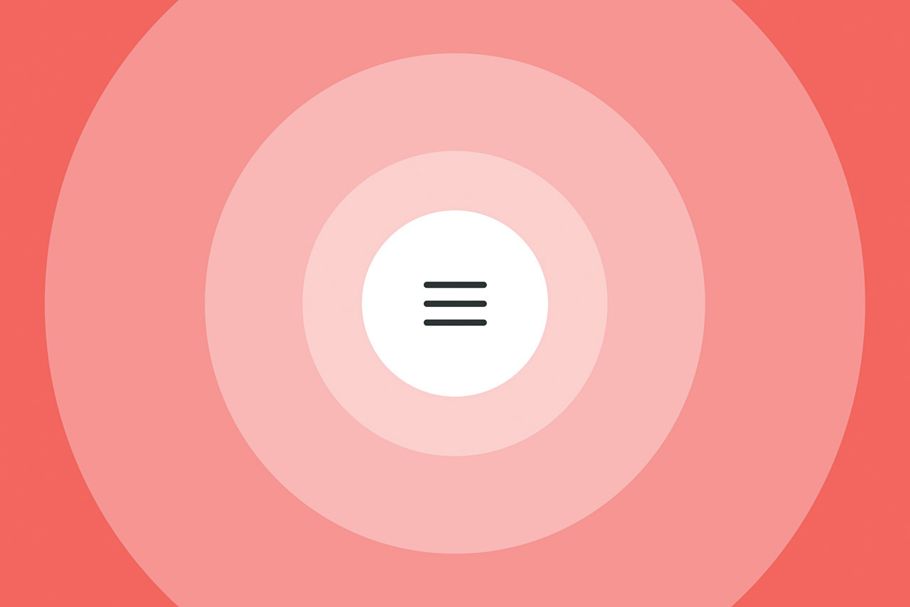
You can preview the end result here. When the user clicks the menu icon we'll expand the icon's background plate (a circle) to cover the screen, and present the menu overlay.
Rather than just flash to a close icon, we're going to animate and morph the three vertical lines (that make up the menu icon) into an 'X', to represent a close icon. In other words, as the menu is revealed the icon morphs into a close button.
Related elements
You might be thinking 'So, is this a meaningful animation?' Well, great question. Short answer: Yes! Longer answer: Animations are great at connecting elements on the screen, and showing how they relate to each other.
Sign up to Creative Bloq's daily newsletter, which brings you the latest news and inspiration from the worlds of art, design and technology.
As we scale up the menu's background plate to become the menu, we show how the two are connected – similar to how an app icon, when pressed on iOS or Android, scales up and takes over the screen, showing that the app was launched from that very icon. Our menu icon doesn't just toggle the menu: it is the menu, only collapsed.
Similarly, just like how an on/off toggle transforms between its on and off state when you press it on iOS, our menu toggle will change between a menu icon and a close icon depending on if our site's menu is visible or hidden. This helps enforce the idea that the two icons function in similar ways: they both control the menu.
So while we're making our site fun to use, we're also making it easier to understand, and improving the user experience ever so slightly.
See how to do this in the video tutorial above and written steps below.
01. Get started

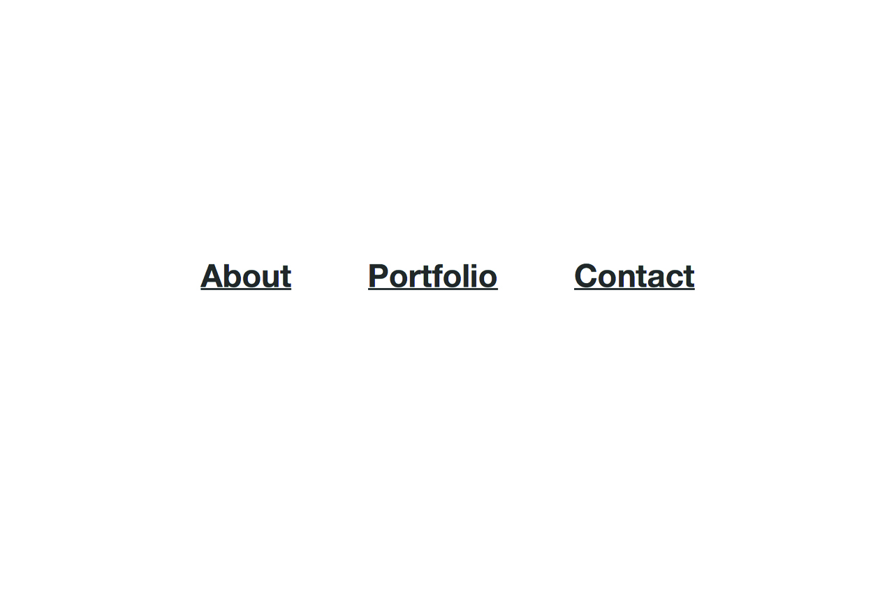
Download the project files. Open up index.html in a browser and you should see three big links against a white background. This is the menu overlay we'll reveal.
First of all we need to hide it. In styles.css, add these styles to .menu-overlay:
opacity: 0;
visibility: hidden;
With the overlay gone, a button should appear in the top-left corner. Let's draw our menu icon here, so there's something to click on to show the overlay. To make it easy to animate, we'll draw it using just HTML and CSS; no bitmaps or vectors. We've already got some HTML in index.html for the menu: a container (.menu), a background (.menu-circle), a link (.menu-link) and the icon (.menu-icon) with one span for each line.
Having a separate div for the background is a somewhat unconventional approach. If we weren't about to add animations to this circle, we wouldn't need a separate div; we could just add a border-radius and background colour to our menu-link.
However, we want to be free to use the transform property on the circle, so we can scale it without affecting the icon itself, so we need to decouple the background from the icon.
Let's start drawing the lines that make up the icon. What do they all have in common? They are equally wide, they have rounded corners, are absolutely positioned, and they have a background colour. Since all the lines share the menu-line class, let's use it to set these shared properties:
.menu-line {
 background-color: #333;
 height: 2px;
 width: 100%;
 border-radius: 2px;
 position: absolute;
 left: 0;
}
Then we can use the lines' unique classes to set the vertical position:
.menu-line-1 { top: 0; }

.menu-line-2 {
 top: 0;
 bottom: 0;
 margin: auto;
}

.menu-line-3 { bottom: 0; }
02. Add a hover effect
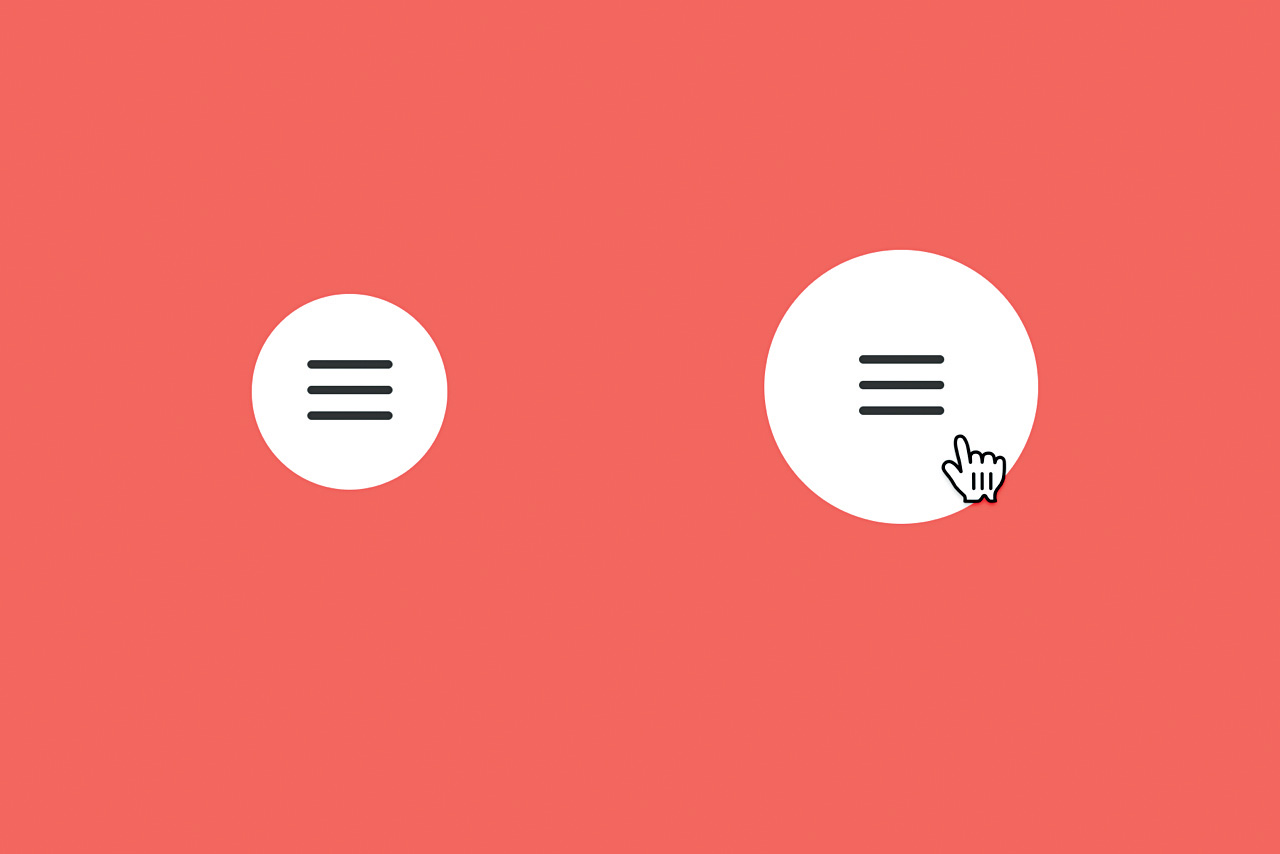
Let's make the icon clearly clickable by adding a hover effect. In styles.css, create a new selector for menu-circle to scale it up when you hover over the menu:
.menu:hover .menu-circle { transform: scale(1.4); }Now we can add our first animation. Add "transition: all 0.2s ease-in-out" to .menu-circle {} (not to the hover state). We're telling the browser to animate all properties that may change for .menu-circle. So when we scale it up on hover, it animates over the course of 0.2 seconds to its new state, with a timing function of ease-in-out.
How do you know which timing function to choose? First of all, avoid using a linear timing function. Few things in the real world move at a perfectly constant speed, so objects animated with a linear timing function tend to look unnatural and stiff (as Einstein would've said, "God doesn't play dice with a linear timing function").
As a rule of thumb, ease-out works great for presenting new objects, and ease-in works great for removing objects. And when in doubt, ease-in-out is a solid timing function to default to: it has a slow beginning and a slow ending, creating a smooth and fluid animation.
03. Show and hide the menu
Let's use jQuery to show and hide our newly created overlay. In script.js, toggle the class of open on .menu-overlay inside the existing click handler:
$(".menu-overlay").toggleClass("open");Then show the overlay when it has a class of open:
.menu-overlay.open {
 opacity: 1;
 visibility: visible;
}
04. Connect the menu icon
The transition we added earlier means we already have a neat fade effect going on when we show and hide the overlay. However, we can make it look like the menu icon background becomes the menu overlay, and better connect the two visually.
Achieving this effect is easier than it seems: all we need to do is to quickly enlarge the menu circle when it's clicked. The overlay will fade in simultaneously, creating the illusion that the menu icon is transforming into the overlay.
We need to be able to style the menu's circle when the menu has been clicked. Open up script.js, and inside our existing click function toggle the class open for our .menu:
$(".menu").toggleClass("open");Now we can target this class with CSS and expand the circle as the menu is opened. At the very bottom of style.css, expand the .menu-circle when .menu also has a class of .open:
.menu.open .menu-circle { transform: scale(60);
}
05. Transform the icon
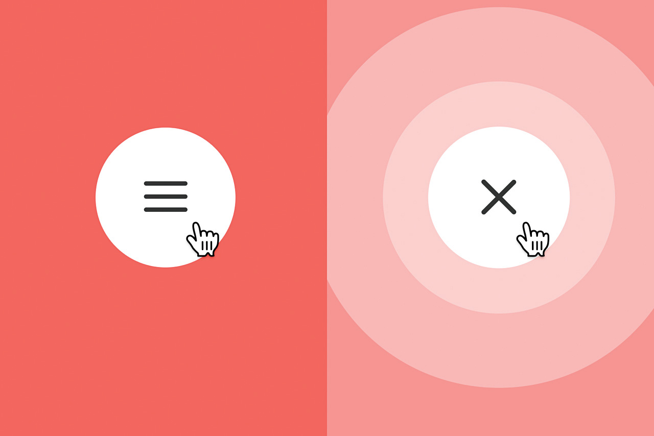
We've got a beautiful reveal effect for our menu, but how do we turn the menu icon into a close icon? It's surprisingly easy once you know how – we'll only need to set three CSS properties. First off, we need to hide the middle line while the menu is being shown:
.menu.open .menu-line-2 { opacity: 0; }Then all we need to do is flip the other two lines 45 degrees in opposite directions (the lines need to point in different directions to form an 'X', so note how one of the lines has a negative rotation of 45 degrees):
.menu.open .menu-line-1 {
 transform: rotate(-45deg);
}

.menu.open .menu-line-3 {
 transform: rotate(45deg);
}
Well, sort of. We also need to centre these two lines vertically. At this point you could be thinking 'Easy! We just need to change the top and bottom position to centre them'. And you'd be right – if we weren't animating this icon.
Since we can only achieve hardware-accelerated animations by limiting ourselves to animating the transform and opacity properties, we'll have to resort to centring the lines through transforms.
.menu.open .menu-line-1 {
 transform: translateY(7px) translateY(-50%) rotate(-45deg);
}

.menu.open .menu-line-3 {
 transform: translateY(-7px) translateY(50%) rotate(45deg);
}
These transforms will move the two lines so they are vertically centred within the icon container, and then rotate them to form the cross.
Let's break it down. We have two translations being used simultaneously: translateY(7px) and translateY(-50%). The first transform, translateY(7px), is used to move the line's top edge to the vertical centre of the canvas. The maths here is simple: 14 is the height of our icon, by dividing it by two we get the middle point: 7.
The second transform, translateY(-50%), is used to move the line so that the line's vertical centre, not its top edge, resides on the vertical centre point of the canvas.
Usually when using the % sign in CSS you refer to the parent of an element (setting width: 100% matches the element's width to that of its parent), but if you use percentages with the transform property you refer to the element itself, not the parent. So for us to find a line's height and move it upwards by half of that, all we need is translateY(-50%).
06. Morph between icons
Instead of just replacing the menu icon with the close icon, let's morph between the two states.
Start by adding a transition to .menu-line in style.css:
transition: all 0.25s ease-in-out;Ta-da! A morphing menu icon. The animation is a bit dull, though. Let's fix that. To make the lines appear more vivid, we can rotate them both an additional 90 degrees. The icon will look the same in the end, but the lines will travel further during the same time period. Change the rotations to rotate(-135deg) and rotate(135deg).
As a rule of thumb, you can always improve an animation by using a custom Bézier curve that's better adapted to your animation. We're currently using ease-in-out – this means that the animation will have a slow start and ending, with a faster pace in the middle.
I think a more spring-like effect is fitting for our icon. Let's make it spin fast, with a small bounce effect as it comes to an end. For .menu-line, replace "ease-in-out" with a custom Bézier curve:
transition: all 0.25s cubic-bezier(0.175, 0.885, 0.32, 1.275);What are all those numbers? Don't worry: Bézier curves are rarely written by hand. You use cubic-bezier() to define the pace of an animation over time, and rather than writing them on your own, I recommend using a reference site. This comes from easings.net. It overshoots at the end of animation, and creates a subtle bounce effect.
While we're at it, go to easings.net and grab the code for easeOutExpo. We'll use this to create a more refined effect for the menu background animation. Update the transition of .menu-circle to use this custom Bézier curve, and make the animation a bit longer (0.5s):
transition: all 0.5s cubic-bezier(0.19, 1, 0.22, 1);Congratulations, you've created a set of animations that are meaningful: they help you understand what's happening on the site while navigating it, creating a sense of spatial awareness. On top of that, the animations run smoothly.
By only animating the transform and opacity properties, we can make sure the browser's hardware acceleration support can kick in, and avoid unnecessary lag. When playing around with animations, make sure you tick these two boxes: make them meaningful, and beautiful.
This article originally appeared in net magazine issue 281. Subscribe to net here.
Related articles:
