An introduction to wayfinding
Discover the art of wayfinding with five best-in-class examples.
Design is all about solving problems. One such problem we all face every day is how to get around without getting lost.
British designers have considerable form in this area. Harry Beck's London Underground tube map is an undisputed design icon, and Margaret Calvert's much-imitated UK road signage is the envy of the world.
For many of us, sat navs have replaced the humble road atlas for navigating over long distances, but when it comes to town centres, museums or famous buildings, hospitals or other potentially confusing places, wayfinding design really comes into its own.
Article continues belowWhat is wayfinding?
In a nutshell, wayfinding design is all about spatial problem solving.
If you're in a particular area of a building or environment, a great piece of wayfinding design will tell you exactly where you are, where you want to go, and how to get there as quickly as possible.
Read on to discover five particularly effective examples of wayfinding design from around the world, and what you can learn from them...
01. Falls Creek ski resort
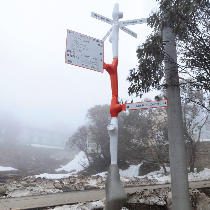
Great wayfinding and signage design can be as much about innovative and creative use of materials as it is about communication design.
Sign up to Creative Bloq's daily newsletter, which brings you the latest news and inspiration from the worlds of art, design and technology.
Winner of a D&AD Wood Pencil in Environmental Graphics in 2011, Büro North's wayfinding work for the Falls Creek ski resort in Australia does exactly that.
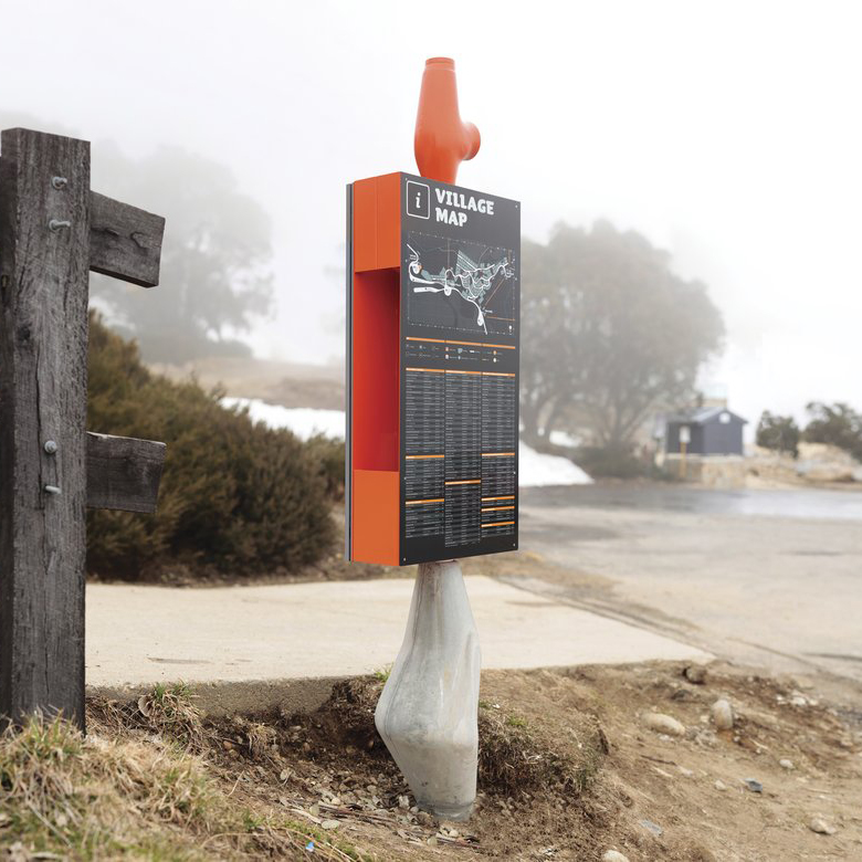
Like most ski resorts, Falls Creek is a complex, rambling place with extensive need for signage. Büro North's modular system enables different signpost units to be slotted together as required.
The design caters to a huge variety of potential directions that a sign might need to point within the ski village, as well as providing the maximum visibility of information within an economical, versatile sign structure.
02. Google Chrome Web Lab
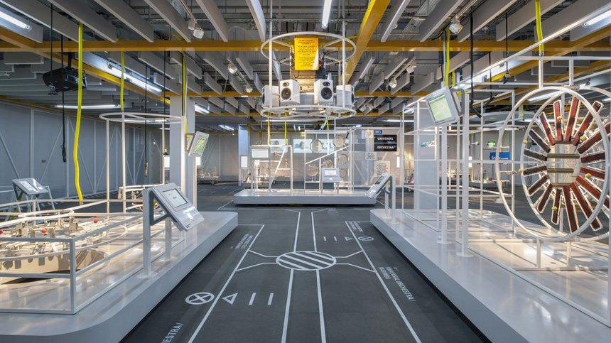
Wayfinding isn't restricted to the physical world, as shown by the innovative design of Google's Chrome Web Lab exhibition at London's Science Museum.
As well as being a physical installation that visitors could explore in person, the exhibition was open to the world via 24-hour web cam feeds.
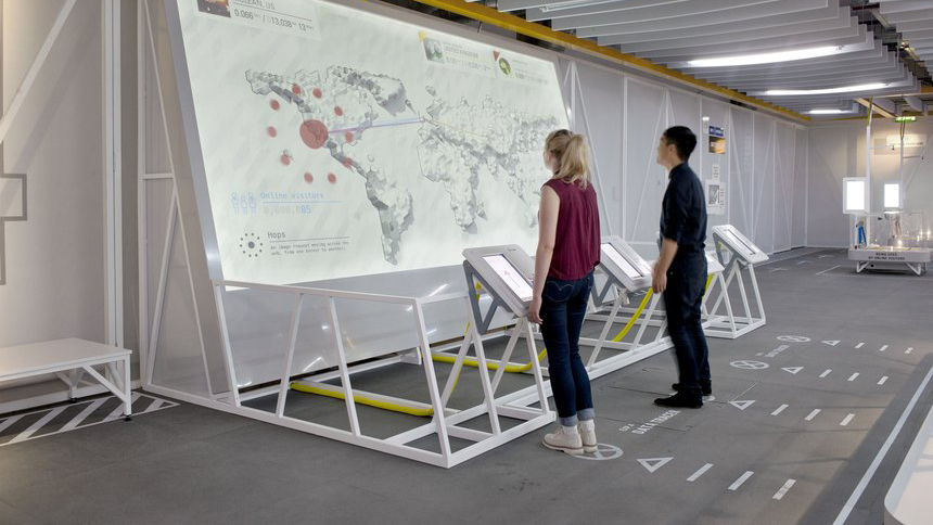
Technological experiments included as the 'Universal Orchestra', which encouraged users to collaborate through physical and virtual instruments, and 'Sketchbot', a camera that converted your portrait into a sand drawing.
To make the exhibition equally navigable for in-person and online visitors, London-based design consultancy Bibliothèque split the exhibition into distinct architectural planes, using a graphic flowchart system on the floor that could also be read from a birds-eye-view perspective.
03. V&A Ceramics Galleries
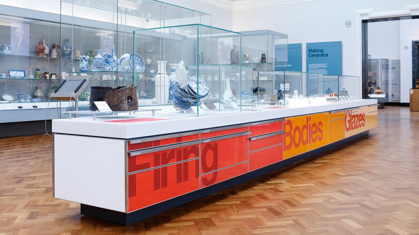
Another D&AD Wood Pencil winner, Cartlidge Levene's exhibition graphics for the V&A Ceramics Galleries demonstrate how wayfinding can also help you navigate through complex layers of information in a small space.
Briefed to integrate the graphics seamlessly with the architectural design of the space, Cartlidge Levene made use of the walls, ceilings and display units.
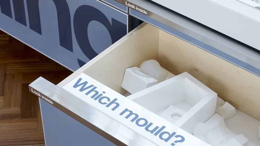
This included large-scale type in the ceiling cornicing, and dates painted directly onto wall surfaces to provide narrative and act as navigational aids.
An easily updated label system integrates with the display cases, while bold enamel graphics interact with the furniture to explain the ceramic-making process.
04. University of Applied Sciences Osnabrück
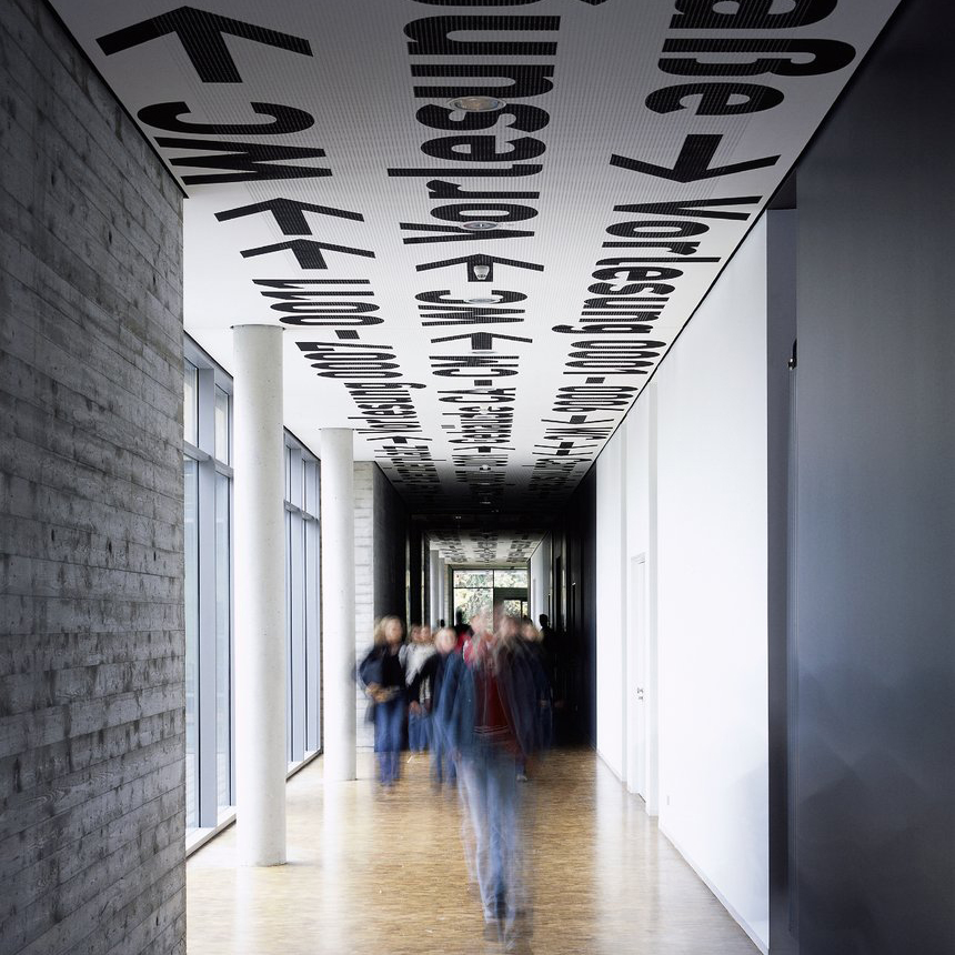
This striking wayfinding for the University of Applied Sciences Osnabrück raises the stakes on the awards front: it won Büro Uebele a D&AD Yellow Pencil.
The agency's description is poetic: "A sky of black letters and numbers, interspersed with red clouds. Words like stars show the way, guiding the traveler. The ceiling is the firmament, scattered with words, the concrete walls are bare."
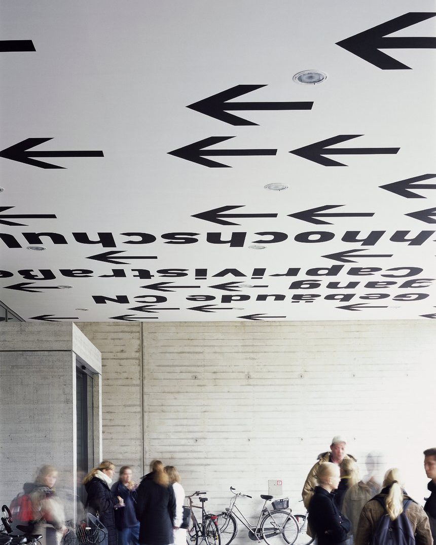
Making use of the ceiling instead of the walls, the system guides people through the corridors, repeating key information about destinations in huge, unmissable type with clear arrows pointing the way.
While the floor and walls are brutally simple and bare, the ceiling – or "starry sky", as the agency puts it – does all the work.
05. Here East campus

Occupying a 1.2 million square-foot area on the site of the former London 2012 Olympics, Here East is a vast campus for tech entrepreneurs.
Working alongside Poke London and Hawkins\Brown, dn&co created bold, flexible and expressive branding for Here East, based around a disrupted 'H'.
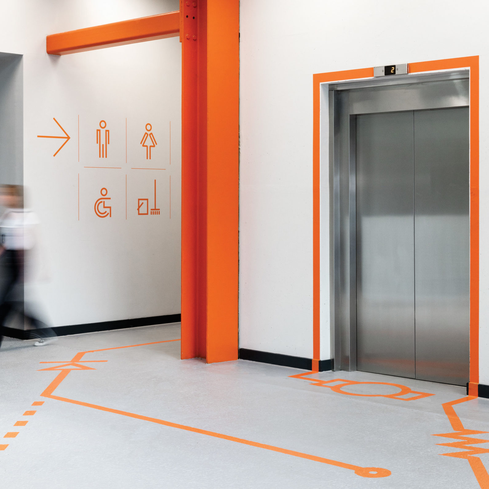
As part of the brand development, dn&co also took responsibility for the wayfinding and signage to help people navigate the enormous campus.
Catering to the audience's specialist reference points, the wayfinding system and accompanying iconography is inspired by electrical diagrams.
It literally leads people through the space to their destination, using bright orange lines and bold symbols on the floor and walls.
Related articles:

Nick has worked with world-class agencies including Wolff Olins, Taxi Studio and Vault49 on brand storytelling, tone of voice and verbal strategy for global brands such as Virgin, TikTok, and Bite Back 2030. Nick launched the Brand Impact Awards in 2013 while editor of Computer Arts, and remains chair of judges. He's written for Creative Bloq on design and branding matters since the site's launch.
