Expert guide to making your JavaScript responsive
Jonathan Fielding shows that handling JavaScript across responsive states doesn't need to be a minefield.
Sign up to Creative Bloq's daily newsletter, which brings you the latest news and inspiration from the worlds of art, design and technology.
You are now subscribed
Your newsletter sign-up was successful
Want to add more newsletters?
When we think of responsive web design development, the first thing that comes to mind is how we can use media queries to change the look and feel of our site depending on rules defined by the query. Media queries are conditional, with CSS being applied if the browser is meeting the condition. A visual change to a site may also require a change to how the site functions. This is where we start using JavaScript.
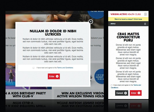
There are many examples of where we may want to change functionality; for example, where on desktop we want to show content in a modal window. This provides a good, usable experience on desktop. However, on mobile devices modal windows often look cramped and provide a poor user experience. The best option is to disable the modal functionality on mobile. It's here that CSS can fall short, and where JavaScript can be used to pick up the work.
Watch this video to accompany the tutorial...
Unfortunately, adding JavaScript that manages the change of functionality based on the responsive state of your site can be trickier than simply using a media query. This is because we need to gracefully handle the transition between states. With CSS media queries, the styles are just turned on or off, or overridden when we're in different states, but, with JavaScript, we must handle both the conditional logic and the turning on or off of functionality ourselves.
Article continues belowThe browsers don't leave us completely unaided as newer browsers feature the matchMedia API. The matchMedia API can watch to see if a condition is met. If it is, it will fire a method. Conditions are in the form of the same media queries that we are already familiar with from CSS. To see how we can use the matchMedia API, we can take a look at the following example that logs to the browser console when we enter and leave the mobile state:
var mql = window.matchMedia("screen and (maxwidth: 768px)");
mql.addListener(function(e){
  if(e.matches){
    console.log('enter mobile');
  }
  else{
    console.log('leave mobile');
  }
});
We set up a query list using window.matchMedia and set up query notifications by calling the addListener() method passing our callback. When the media query is matched or unmatched, our listener method is called and we can handle the change of state.
Browser support for the matchMedia API is good with the exception of Internet Explorer, as the earliest version to support it is Internet Explorer 10. If you want to use the matchMedia API, you have the option to include a polyfill for the matchMedia API, which enables support for the matchMedia API in older versions of Internet Explorer.

The main limitation of this API is that it handles the switching between states. However, it doesn't handle having a resize event for each state, which may be required for some functionality. Typically, this has led to me ignoring the matchMedia API and, instead, rolling my own solution based on using the browser resize event. This typically would look something like this:
Sign up to Creative Bloq's daily newsletter, which brings you the latest news and inspiration from the worlds of art, design and technology.
var stateManager = (function () {
  var state = null;
  var resizePage = function () {
    if ($('body').width() < 768) {
      if (state !== "mobile") { displayMobile(); }
resizeMobile();
    }
    else {
      if (state !== "desktop") { displayDesktop(); }
resizeDesktop();
    }
};
  var displayMobile = function () {
state = "mobile";
console.log("enter mobile");
  };
  var displayDesktop = function () {
state = "desktop";
console.log("enter desktop");
  };
  var resizeMobile = function () {
    console.log("resizing mobile");
  };
  var resizeDesktop = function () {
    console.log("resizing desktop");
  };
  return {
    init: function () {
      resizePage();
      $(window).on('resize', resizePage);
    }
  };
} ());
stateManager.init();
Here we added a resize event to the window that checks the current state of the browser. As the browser is resized, we check the width of the page and determine whether we're in the mobile or desktop state. Once this has been determined we check whether we're already in the state. If we are, we simply fire a state resize method. Otherwise, we fire an enter state method. Simple. However, if you have more than a couple of states, this method has the potential to become very unwieldy.
This is when I usually start looking at JavaScript libraries to see if there's something that makes things simpler.
Looking at libraries
So far, we've looked at how we can simply write our own JavaScript to handle responsive states. However, there are JavaScript libraries that will make our job easier. Not only does using a library make writing responsive JavaScript simpler, libraries often handle cross browser differences, so you don't have to.

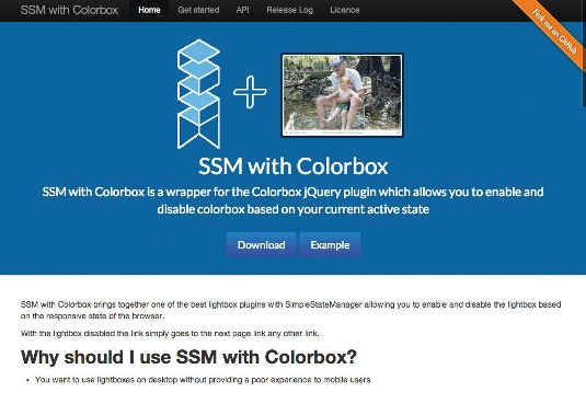
A popular library for handling responsive JavaScript is SimpleStateManager. SimpleStateManager is built around the concept of states, a state being the condition of the browser at a specific width. A good example of states you may already be using is where a responsive site may have a small state for mobile devices, medium state for tablets and a large state for desktop. In this example you could use SimpleStateManager to add JavaScript specific to each of your states.
SimpleStateManager allows you to add JavaScript methods for entering, leaving and resizing responsive states based on the width of the browser. The core methodology for using SimpleStateManager is to prepare a state on the onEnter event, clean up the state on the onLeave event and use the onResize event for handling the resize of the state.
There are two ways in which you can get started with SimpleStateManager, the first of which is to use Bower. Alternatively you can download the library's JS file from SimpleStateManager and include it in your project. You can then start adding states:
(function(window){
  ssm.addStates([{
    id: 'mobile', maxWidth: 767, onEnter: function(){
      console.log('enter mobile');
    }
  },
  {
    id: 'desktop', minWidth: 768, onEnter: function(){
      console.log('enter desktop');
    }
  }]);
  ssm.ready();
}(window));
In this example, we add two states: mobile and desktop each with an enter event that logs out to the console which state we have entered. We then fire a .ready() method to tell SSM that we have added our states and we are ready to run any onEnter methods required for the current state.
SimpleStateManager allows you to add infinite states, which can overlap one another, meaning you do not need to duplicate code between states. While it's possible to add infinite states, please bear in mind the performance implications of adding too many states.
The key advantages of using SimpleStateManager is that it makes it really simple to add states to your browser in a way that offers great performance. SimpleStateManager also provides you with the APIs to write your own plug-ins to extend the built in functionality. This means you can extend it to support feature detection like geolocation and touch. Unlike libraries that use the matchMedia API, it doesn't require a polyfill to work in older browsers such as Internet Explorer 7, 8 and 9.

The disadvantage of SimpleStateManager is that it's limited to only responding to changes in the width of the website. This means that it works great for the majority of responsive websites. Should your website need to carry out more complex queries you have the option to either write a plug-in to extend SimpleStateManager. Alternatively, you can use a library that utilises the matchMedia API.
To summarise: the key benefit of using a library like SimpleStateManager over rolling your own solution (either with the matchMedia API or the browser resize event) is that it makes writing responsive JavaScript much simpler. This means that we can concentrate on optimising our sites to work responsively rather than spending our time having to manage the process of switching between our responsive states ourselves.
Words: Jonathan Fielding
This article originally appeared in net magazine issue 250.

The Creative Bloq team is made up of a group of art and design enthusiasts, and has changed and evolved since Creative Bloq began back in 2012. The current website team consists of eight full-time members of staff: Editor Georgia Coggan, Deputy Editor Rosie Hilder, Ecommerce Editor Beren Neale, Senior News Editor Daniel Piper, Editor, Digital Art and 3D Ian Dean, Tech Reviews Editor Erlingur Einarsson, Ecommerce Writer Beth Nicholls and Staff Writer Natalie Fear, as well as a roster of freelancers from around the world. The ImagineFX magazine team also pitch in, ensuring that content from leading digital art publication ImagineFX is represented on Creative Bloq.
