American Airlines has released a dramatic new logo design, shown here:

Created by Futurebrand, the new logo keeps the main elements of the classic logo (below), designed by Vignelli Associates - the red, white and blue colouring, the eagle and the company name - but dramatically reinvents them. The colours are brighter and more modern, and there's a pared down approach and horizontal flow to the design that seems appropriate for an airline, although the wings remind us more of those on a hang-glider than either an eagle or a passenger jet.

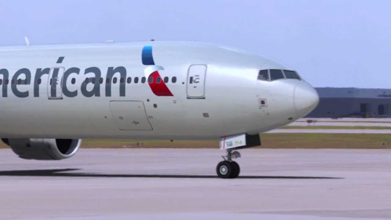
American Airlines has also given its planes a brand new look, as shown below. The first planes to sport the new livery are to begin flying in February

The company states on its website that "Our logo and the refreshed look and feel of our planes is light, vibrant and modern, reflecting the travel experience we aim to bring you."
American Airlines has released this video to explain the thinking behind its new branding:
Learn more about logos:
- Brand a logo: 15 design trends for 2012
- The ultimate guide to logo design - 25 expert tips
- 2012's biggest logo redesigns
What do you think of the new logo and branding? Let us know in the comments below!

