New York Times magazine unveils new logo and typefaces
Sign up to Creative Bloq's daily newsletter, which brings you the latest news and inspiration from the worlds of art, design and technology.
You are now subscribed
Your newsletter sign-up was successful
Want to add more newsletters?

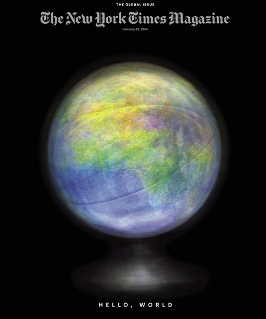
You don't stay in print for 119 years without doing a few things right. And in the case of the New York Times magazine, founded in 1897, one of those things has been to regularly refresh its design.
It's now revealed its latest look, one which may not be revolutionary, but it is at least claimed to be significant.
In an editorial announcing the changes, it promises: "new concepts for columns, new writers, new ideas about how to compose headlines, new typefaces, new page designs in print and online, new ideas about the relationship between print and digital."
Team effort
The redesign was led by the title's design director, Gail Bichler and art director, Matt Willey, working closely with the designer Anton Ioukhnovets.
Most notably, it includes a new logo, shown below. The previous logo (top) has been redrawn by the typographer Matthew Carter, with the new design (bottom) described by the title as being "more modern, more graciously spaced".

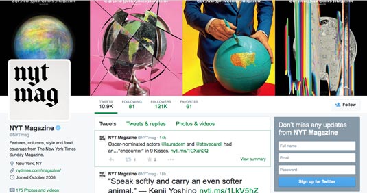
More strikingly, there's also a new short-form logo for the magazine, for use in smaller and more casual settings like its Twitter page.


Bichler and Willey have also also overseen the creation of an entire suite of typefaces for the publication, shown below.
Sign up to Creative Bloq's daily newsletter, which brings you the latest news and inspiration from the worlds of art, design and technology.

The magazine also promises they'll continue to experiment with new and innovative ways of presenting stories online, after pioneering the Snowfall approach to multimedia publication.
What do you think of the new design? Let us know in the comments!
Like this? Read these!
- The ultimate guide to logo design
- Our favourite web fonts – and they don't cost a penny
- Hands-on review: Adobe Photoshop CC

Tom May is an award-winning journalist specialising in art, design, photography and technology. His latest book, The 50 Greatest Designers (Arcturus Publishing), was published this June. He's also author of Great TED Talks: Creativity (Pavilion Books). Tom was previously editor of Professional Photography magazine, associate editor at Creative Bloq, and deputy editor at net magazine.
