Make the most of your graphic assets
Anthony Neil Dart demonstrates a practical way to utilise your graphic asset library
- Software Illustrator and Photoshop CS3 or later
- Time needed 4-5 hours
- Skills
-Create abstract vector blends
-Apply grids to your work
-Utilise Smart Objects and Layer Styles
We all know deadlines are challenging: not only do you have monetary issues to deal with, but also your precious time. That’s why establishing a practical, efficient workflow is essential in preventing your workload becoming unmanageable.
Like many creatives, I tend to use my downtime for experimentation and learning new skills. During this process I like to create my own library of graphic assets to accommodate my stock images, or indeed any other pieces of design shrapnel I have lying around that I can potentially repurpose in my work. Whether it’s vector experimentation in Illustrator, manipulation in Photoshop or tinkering around with a 3D application, if I make something interesting then I’ll categorise it and keep it in a folder for later repurposing. This technique can save a huge amount of time for those jobs when you might not have the luxury of creating everything from scratch.
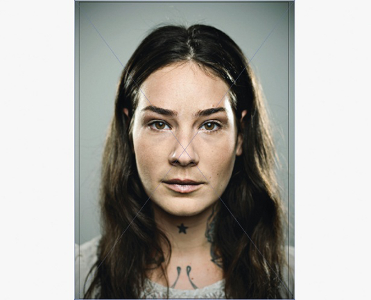
01 Select a portrait image, ensure the dimensions work in an A4 document in Illustrator and save the file. This image will update itself later on, after you’ve made the relevant adjustments in Photoshop. You can use the Clipping Mask function to test that the composition works and lock off your layout. It’s a good idea to make use of the layers in Photoshop – one for your placeholder image, one for your grid and another for your typography or any other graphic images you might want to use.

02 Open your placeholder image in Photoshop, make a new document and select International Paper in the preset drop-down menu. Choose A4 for the paper size and select Transparent Background and 300dpi resolution. Next, drag your placeholder image into your new document, and position and scale to match your Illustrator file. Once this is done make a new adjustment layer, select Hue and Saturation and drop your Saturation slider all the way down, draining all the colour.

03 Next we’re going to draw a shape around the facial area with the Pen tool. Adjust the Bézier handles until you have a rounded, organic shape, then double-click on the path and give it a name. Ctrl/Cmd+Alt/Opt+click on the path to make your selection, then hit Backspace or Delete to punch out your selection shape.
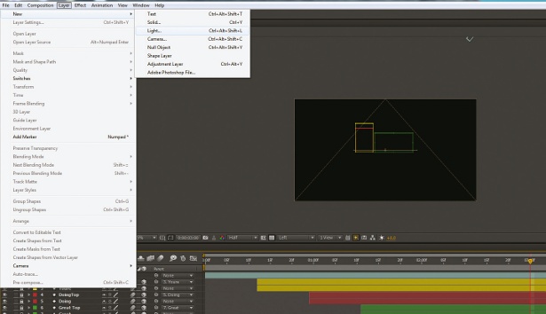
04 Double-click the layer to bring up your Layer Style menu, and select Bevel And Emboss. Choose Inner Bevel from the Style drop-down, set Technique to Smooth and Direction to Up. Under the Shading Options, drag around in the Global Light option, and with Preview selected you should be able to quickly match the lighting of your photo. Your image has an embossed frame as a result of the Layer style, so use the Transform tool to scale up your image very slightly to hide the embossed edge, and save your .psd.
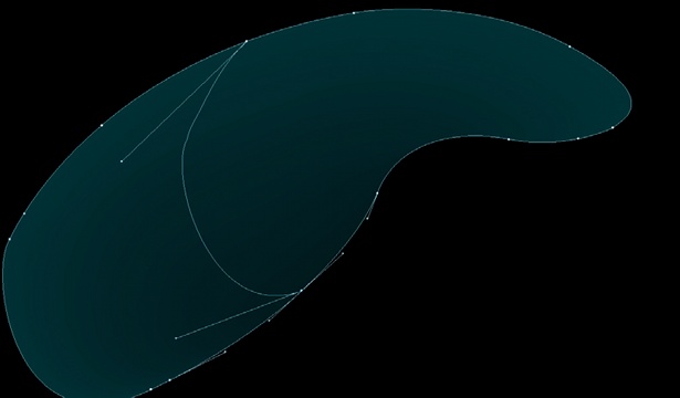
05 In Illustrator, draw two curves to blend between. Remember to go to the Object drop-down and select Blend Options and Specified Steps. Push this up as high as you want – or as your computer can handle: at least 200 steps should yield the desired result. The key to getting an interesting look is to have a white and black keyline fill on your curves so that when you make the blend you get a gradient result.
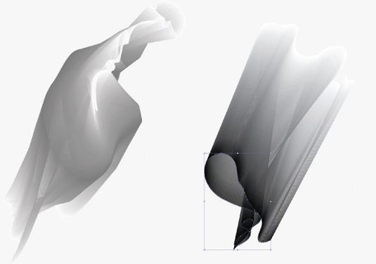
06 Once you’ve made the blend you can double-click the first or second curve between which the blend is taking place. You should now see a grey dialog box indicating that you’re in a layered state. Select your Warp tool (you can hold Alt/Opt and drag to give a bigger brush size) and drag over the curve to sculpt interesting results that will almost give the look of a 3D surface.
Daily design news, reviews, how-tos and more, as picked by the editors.
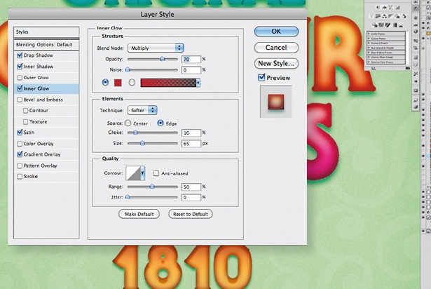
07 Proceed with warping and deforming the curve on both blend curves until you finish with a result you’re happy with. Double-click the curve once more, or click the back arrow in the top left dialog to return to the object’s altered blend result.
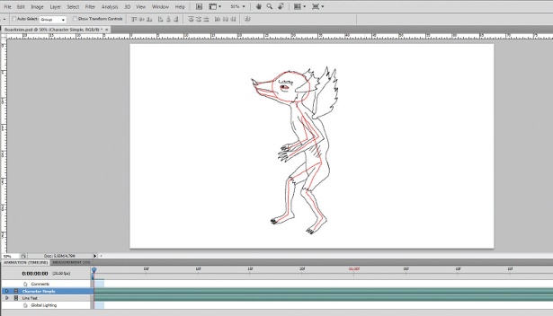
08 Copy and paste this shape into your Photoshop document. Then select Pixels from the dialog box for a destructive result that rasterises the object to the size of your Photoshop document, or alternatively choose Smart Objects for a non-destructive placement. This means that if you double-click the smart object and make adjustments in Illustrator, once you return to Photoshop the result will automatically refresh in the same positioning. Transform and position the blend object under your face layer until you’re pleased with the composition.
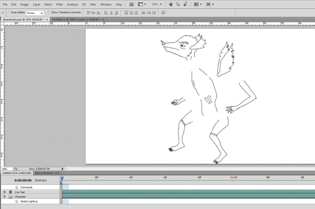
09 Use the Type tool to create your numeral, letter or special character layer behind the face layer, then proceed to scale it up with the Transform tool (Ctrl/Cmd+T) and position according to your composition. Next, double-click the type layer to access the gradient layer style, use the linear gradient and drop the opacity to around 20 or 30 per cent. This breaks the flat colour of the white surface to fake a more 3D appearance. This is where you can start to utilise images from your own library to make it more individualistic – I’ve also positioned some mountains toward the top.

10 Next select your Brush tool and increase the size – I used 800 pixels. Make a new layer and name it ‘Inside head shade’, then paint the drop shadow until you’re pleased with the results. You can always come back to control the opacity or blending mode, but I’ve kept mine standard.
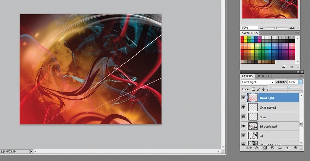
11 I added the doves above the numeral layer by making a duplicate and selecting Preserve Transparency on the layer, then filling it black to look like a silhouette. I dropped the opacity to 10 per cent and added a Gaussian Blur to soften the edges. Use the Transform tool to scale the drop shadow down and position it favourably to match the lighting of your shot. I usually hold Ctrl/Cmd during the transform to manipulate the handles just slightly, adding perspective. The white flowing lines were drawn in Illustrator with the Pencil tool, and I selected a dashed line under the Stroke Option box.
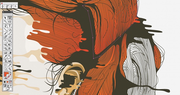
12 I then dropped in some stock images of liquid, which I strung together to form this composite – it’s actually white milk so I selected Levels (Ctrl/Cmd+L) and used the middle handle to grade the white to black. I then used the Smudge tool to fake the depth of field (out of focus) and to give it a sense of motion. Again, get creative with whatever you have lying around in your archive – experiment with what you have. I repeated the previous step when creating the drop shadow for the liquid.
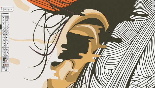
13 Next I utilised some cloud images that I shot on my Canon 550D. I used the Clone tool to build up the hard edges with varying transparency settings so that I would have a believable soft edge in my composite. There’s plenty of room for experimentation here, so don’t be afraid to keep adding layers. Once you’re happy with your image, save the layered .psd file and proceed to flatten your composite to save out a still image. If, like me, you kept your image monochromatic then save out your final placeholder image as Grayscale, as opposed to RGB or CMYK, because this will save you significant image size. Remember to keep your placeholder image and Illustrator file in the same folder, because of the way Illustrator references files.
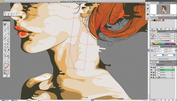
14 Return to your Illustrator document. You will notice Illustrator prompts you to update the image because you have made changes to the original proxy image saved in step one. With your adjusted image in position, draw a box the same size as your A4 image with the Rectangle tool, then go to Object menu>Path>Split Into Grid. In the dialog box select Preview so you can see row and column adjustments update as you input them. There’s room for experimentation here too – I find the 4x8 grid very flexible for large or small amounts of type. Lock image and grid layers and move over to your type layer.
15 With your type layer selected, click on the Type tool and enter your headline and body copy. As you can see, I use the grid to dictate my type formatting. You’ll also notice that I’ve used white and red lines as spacers, using the same grid – this adds more of a dynamic look to your composition as well as adding to the overall cohesion of the typography. It gives structure and almost solidifies the negative space, holding the type together.

Anthony Neil Dart
A self-taught designer working in motion design and direction, Dart takes a multidisciplinary approach to his work. His clients include Ericsson, Audi, Ford, Nokia, Toyota, MTV and Peugeot.
www.anthonyneildart.tv

Thank you for reading 5 articles this month* Join now for unlimited access
Enjoy your first month for just £1 / $1 / €1
*Read 5 free articles per month without a subscription

Join now for unlimited access
Try first month for just £1 / $1 / €1

The Creative Bloq team is made up of a group of art and design enthusiasts, and has changed and evolved since Creative Bloq began back in 2012. The current website team consists of eight full-time members of staff: Editor Georgia Coggan, Deputy Editor Rosie Hilder, Ecommerce Editor Beren Neale, Senior News Editor Daniel Piper, Editor, Digital Art and 3D Ian Dean, Tech Reviews Editor Erlingur Einarsson, Ecommerce Writer Beth Nicholls and Staff Writer Natalie Fear, as well as a roster of freelancers from around the world. The ImagineFX magazine team also pitch in, ensuring that content from leading digital art publication ImagineFX is represented on Creative Bloq.
