Five killer ways to use maps
Location-based apps, contact pages and even portfolios can be enhanced by the intelligent use of maps, says Matthew Smith
Sign up to Creative Bloq's daily newsletter, which brings you the latest news and inspiration from the worlds of art, design and technology.
You are now subscribed
Your newsletter sign-up was successful
Want to add more newsletters?
Cartography has a long history, and some of the most beautiful maps in the world are ancient ones. Have we lost the beauty of great maps and relegated them to pure utility with Yahoo or Google Maps? Not at all. An open API, new map tools and good design sensibility can help us to have the best of both worlds. Beautiful cartography is back on the map – so to speak.
Design your own maps
Using Google’s Map API or tools such as MapBox, we can create dynamic colour systems and content-focused maps that get the data you don’t need out of the way, so that the stuff you do need can rise to the surface. For instance, if you’re designing a map to look like post-World War III America, you could remove all traces of roads and buildings, and replace all map icons with zombies. C’mon, you know you want to.
Don’t lose your head
As with any good design, it’s important that you don’t lose the usefulness of the map as you redesign the style. Make sure you’re maintaining clear distinctions for roads, boundaries, labels and other elements when necessary. The user should be able to achieve the actions you’ve set before them – whether the map is decorative, for exploration, or an integral tool to an app. No one said that useful roads must be yellow, but keep in mind that your audience may be confused by a map style that breaks the common colour patterns that have been established over the past decade. Do your homework and choose your styling carefully.
Article continues belowFive examples to check out
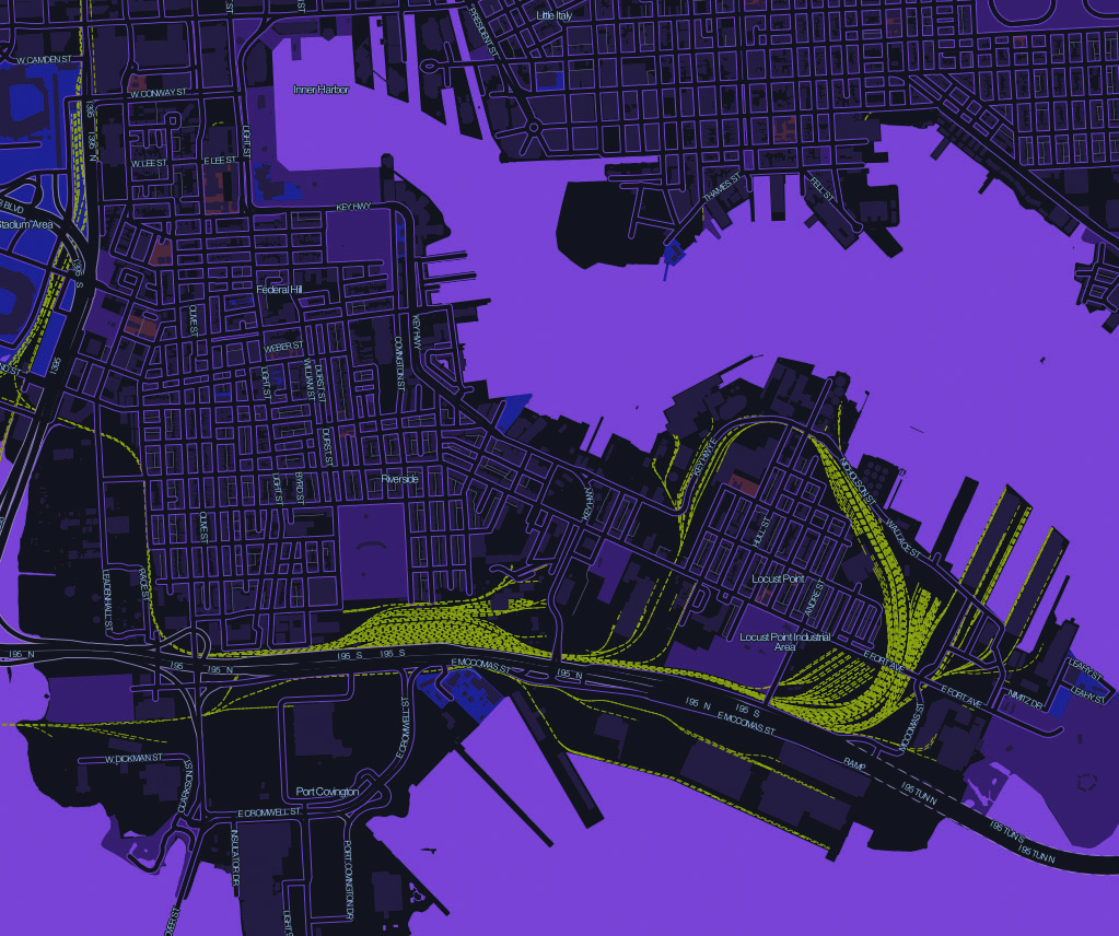
1. Baltimore Dark This example of a night style map of Baltimore, Maryland, is an amazing showcase of what’s possible with the MapBox tool and a great colour scheme.
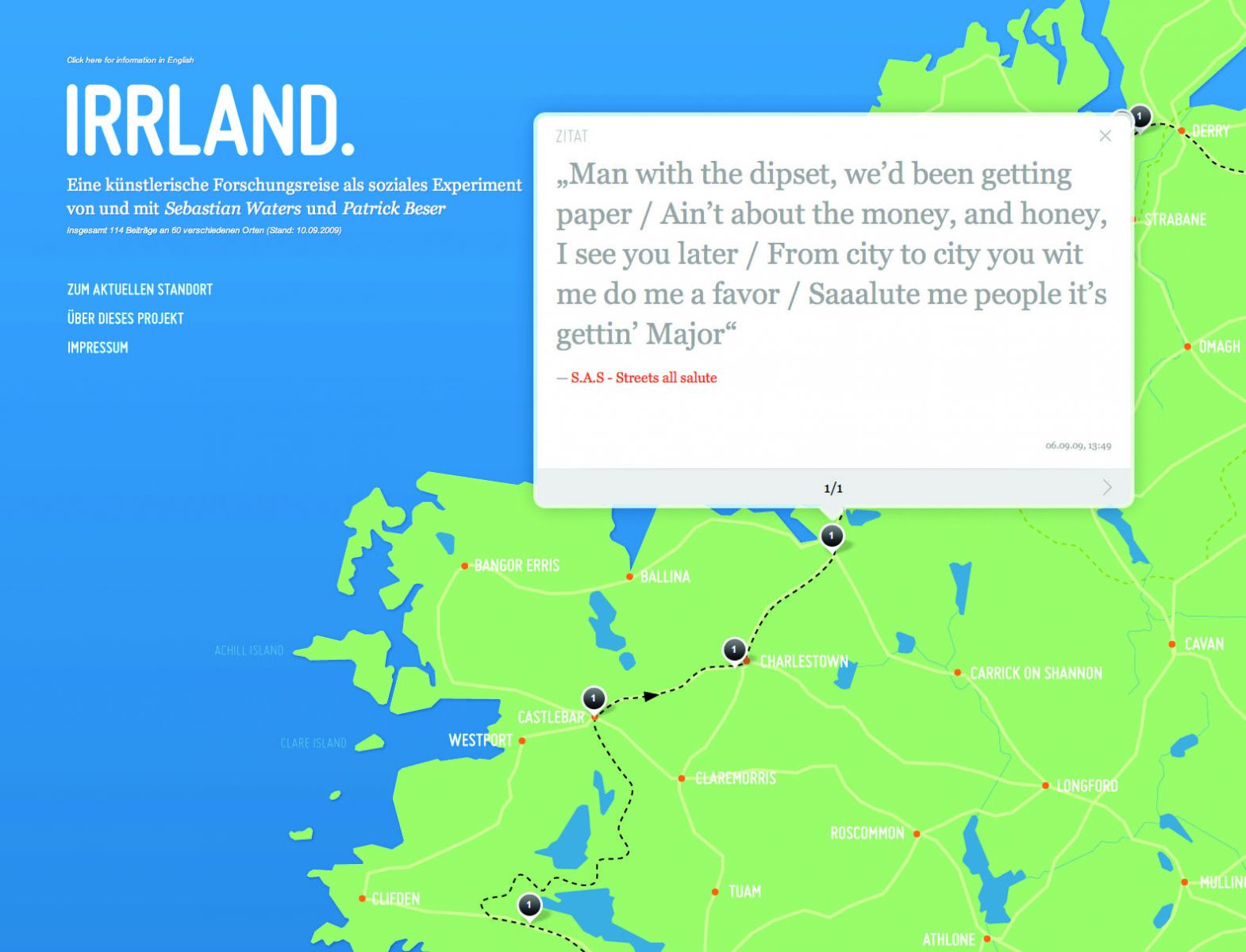
2. Irrland You may not need a world map. If this is indeed the case, take some inspiration from the guys at the Irrland Tumblelog, who are mapping a social experiment using Tumblr, with this map as a posting platform.
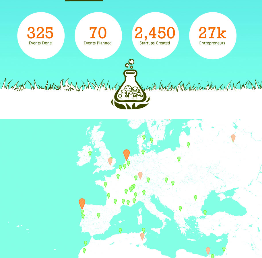
3. Startup Weekend If all you want to show on your map is a set of data points and event happenings, then check out Startup Weekend, who have made a super-sexy blue and white map with indicators of the most popular Startup Weekend events going on across the world.
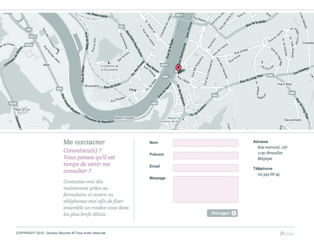
4. Docteur Bourdon The folks at Docteur Bourdon stayed in the spirit of Google Maps, but desaturated the colours to go for a subtle, in-brand effect on their contact footer.
Sign up to Creative Bloq's daily newsletter, which brings you the latest news and inspiration from the worlds of art, design and technology.
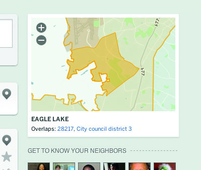
5. EveryBlock Meanwhile, EveryBlock really customises the look and feel of its maps, turning them into simple outlines of districts and neighbourhoods that are easily recognisable. Getting the details out of the way makes for an elegant and easily readable map.
If you've seen any examples of sites using maps to great effect, why not mention them in the comments?

The Creative Bloq team is made up of a group of art and design enthusiasts, and has changed and evolved since Creative Bloq began back in 2012. The current website team consists of eight full-time members of staff: Editor Georgia Coggan, Deputy Editor Rosie Hilder, Ecommerce Editor Beren Neale, Senior News Editor Daniel Piper, Editor, Digital Art and 3D Ian Dean, Tech Reviews Editor Erlingur Einarsson, Ecommerce Writer Beth Nicholls and Staff Writer Natalie Fear, as well as a roster of freelancers from around the world. The ImagineFX magazine team also pitch in, ensuring that content from leading digital art publication ImagineFX is represented on Creative Bloq.
