Five killer ways to use minimalism
Most designers love simplicity. But as Gene Crawford explains, minimalist design isn’t simply a matter of taking things away
Minimalism is a design concept that many of us admire. We strive for it in our work and enjoy looking at work that is minimalist in nature. But what actually makes something minimal?
Although I sometimes use the terms ‘minimal’ and ‘simple’ as if they were interchangeable, by definition, minimalism actually refers to the paring down of elements to get to the essence of a thing. This doesn’t mean you practise minimalist design simply by removing ornamentation; it means you ensure that every part of the design works together to the point where nothing else can be added or removed to improve it. It’s not easy to do well.
As it relates to architecture or design, minimalism encompasses light, form, detail of material, space, place and the human condition. It is necessary to consider simultaneously both the factors that determine how we see something and how we use it.
There is a traditional Japanese aesthetic called wabi-sabi, which is the appreciation for things that are imperfect or in a natural state. It stresses asymmetry, roughness or irregularity: the things we often enjoy about the natural environment.
Together, these qualities define what is essential about a an object, or a design. The tricky thing about minimalism is that it’s subjective: what is simple to me may not be to you. When we consider what comprises the ingredients essential to communicate an idea, you may look on something I consider unnecessary as a deal-breaker.
But working in a minimalist fashion can be very rewarding when you get it right. For me, minimalism is as much about the journey towards creating a piece of work as the finished work itself.
Five examples to check out

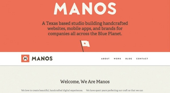
1. Manos Web design firm Manos employs minimalism well for its own site. Everything feels well placed to convey the personality of the agency and what it does. I can’t imagine adding or removing anything from the page to make the design better.

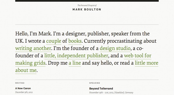
2. Mark Boulton The blog for designer and writer Mark Boulton is a great example of removing the unnecessary to enable users to get to the content of the posts.

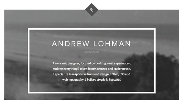
3. Andrew Lohman Designer Andrew Lohman’s portfolio is a great example of how you view the details of a page while you’re using it.

4. New Hope Academy The website for the private school New Hope Academy considers form very heavily. Pay close attention to how your eye travels around the page as you view the site for the first time.

5. The American Association of Homecare Minimalism isn’t just for portfolios. The American Association of Homecare website is a great example of bringing minimalist qualities to a larger, more content-dense project.
Sign up to Creative Bloq's daily newsletter, which brings you the latest news and inspiration from the worlds of art, design and technology.

The Creative Bloq team is made up of a group of art and design enthusiasts, and has changed and evolved since Creative Bloq began back in 2012. The current website team consists of eight full-time members of staff: Editor Georgia Coggan, Deputy Editor Rosie Hilder, Ecommerce Editor Beren Neale, Senior News Editor Daniel Piper, Editor, Digital Art and 3D Ian Dean, Tech Reviews Editor Erlingur Einarsson, Ecommerce Writer Beth Nicholls and Staff Writer Natalie Fear, as well as a roster of freelancers from around the world. The ImagineFX magazine team also pitch in, ensuring that content from leading digital art publication ImagineFX is represented on Creative Bloq.
