How to create great-looking responsive HTML emails
Eric Morris demonstrates how to make your HTML emails look great on any device or client, from the newest iPhone to Microsoft Outlook.
As social media platforms and communication channels continue to roll out, you may start to wonder if HTML email still has a place in this world. But, marketing data firm Custoria reports that, while customer acquisition rates via Facebook have remained relatively stable, acquisition rates via email have quadrupled over the past four years. The trick to successful email, it seems, is to make newsletters look good.
Watch the accompanying video for this tutorial:
With research showing that 47 per cent of emails are opened on mobile devices, there's a lot riding on your email to make a good impression on mobile. However, with existing solutions, we found ourselves straining to modify purpose-built templates, or reinventing responsive techniques specifically for this medium. On top of of that, any solution we developed had to support Microsoft Outlook, a client infamous for seemingly disregarding them at will.
Article continues belowWe realised that templates weren't the answer, so we decided to build Ink, a responsive email framework. Similar to Foundation, our responsive web framework, Ink gives us a solid, tested base upon which we can build responsive email, in addition to providing built-in UI elements for rapid prototyping.
We start with a visual design whenever we develop a new Ink-based email. Often this is just a simple Sharpie or whiteboard sketch, but it's important to have an idea of what you're building before you start.
For this tutorial, we're going to create a marketing email for a fictitious ecommerce startup, Bootsies & Hat (B&H). The marketing email should have: the brand's colours and logo, a few social media links for good measure and physical address and 'unsubscribe' link to comply with the CAN-SPAM act.
- See a demo of this tutorial here.
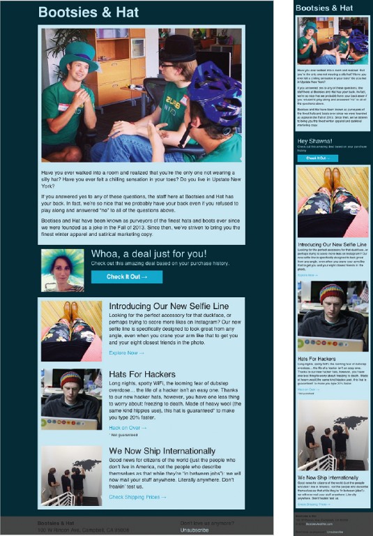
We want to organise the marketing blast into three content sections. The email will start with an announcement and a juicy hero image to draw the reader in. The second section will contain a personalised deal. The third section will feature the pictures and descriptions of our newest products.
Sign up to Creative Bloq's daily newsletter, which brings you the latest news and inspiration from the worlds of art, design and technology.

Divide and conquer
Next, we break up the design into individual code components. Ink has three main structures for that:
- Container: holds the email in a 580px-wide content area and centres it in the body.
- Row: divides the content vertically and into content sections.
- Column: divides up rows horizontally. On the desktop, each row is divided into 12 columns, with a section spanning n columns. On mobile devices, column sections each become their own row and expand to 100% width.
We often print the visual design and draw grid sections with Sharpies. An annotated structure map to follow as we code is surprisingly useful.
Setting up Ink
Now that we've got an idea of what we're going to code, it's time to break out Ink. Ink has pretty frequent releases, so we advise you to grab the most recent version whenever you start a new project. After downloading Ink, pop open the ZIP file and copy the contents of boilerplate.html into your text editor.
The boilerplate file already links to the Ink CSS. It also provides a basic foundation for your message, such as meta tags and some wrapper tables to help make your email responsive.
First we set the background colour for the email. Since some mail clients strip away the body tag, you should set this on the .body <table> as well as on the actual body:
body, table.body {
  background: #002b36;
}
We start the structure with a <table> container with a class of container to hold the header. For an example:
<table class="container newsletter">
  <tr>
    <td>
Inside this container we make a <table> with a class of row and a <td> with both wrapper and last classes. There's typically a <td> for every column section in the row, with the last class applied to the last <td> in the row. Since there is only one column section (12 columns wide), there's only one wrapper, which must receive the last class:
<table class="row">
  <tr>
    <td class="wrapper last">
Inside the wrapper <td>, we create a column with a new <table>, this time with the classes twelve and columns. However, in addition to the one content <td>, we need a second, empty <td> with a class of expander. The expander <td> forces the column section to become full-width on small screens:
<table class="twelve columns">
  <tr>
    <td>
      <h1>Bootsies & Hat</h1>
    </td><td class="expander"></td>
To fill in the content in the newsletter section, put an <img> tag inside the regular <td> of the column section in the first row and some text separated by <br> or <p> tags in the second. With the <img>, be sure to specify an exact height and width using HTML attributes. Also provide a valid alt attribute:
<img src="images/hero.jpg" width="560" height="373" alt="Amazing deals on bootsies and hats for the whole family!">All the height, width and alt attributes are necessary because some clients block images by default or else refuse to resize them based on CSS. Setting containers apart with background-color is simple: add one class and a single background-color CSS rule. Appropriate padding is trickier, however. Ink has a built-in helper class, text-pad, that can be applied to the content <td>s of the columns to take care of this.
New Products section
Like the newsletter section, we create a container <table> and three row <table>s for the 'new products' section. The table's rows each have two wrapper <td>s. Only the second has a class of last:
<table class="container products">
  <tr>
    <td>
      <table class="row">
        <tr>
          <td class="wrapper">
            <!-- Picture column goes here -->
          </td><td class="wrapper last">
<!-- Text column goes here -->
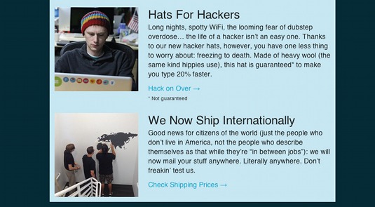
Insert a new columns table with the class four into the first wrapper. Then place the product image inside the content <td>. Inside the second wrapper, insert a columns table of class eight and fill the content <td> with description text, and perhaps a link through to the site. Instead of using the text-pad class this time, we'll use left-text-pad on the image <td>s and right-text-pad on the text <td>s. The directional text-padding classes pad only the outside edge on large screens, but pad both sides when the columns become full-width on mobile devices. The breakout section between 'newsletter' and 'new product' sections starts with the same container > row > wrapper > columns structure. This section, however, will look like an individual row in the product section, except with three and nine column split.

Ink's visibility classes allow you to selectively show or hide elements on different platforms. In this case, we only want to show the image (our imaginary customer's profile picture) on desktop, and we want to swap in a headline with the customer's name on mobile devices. To hide the image:
<div class="hide-for-small">
  <img src="images/you.jpg" width="120" height="120" alt="Our loyal customer.">
</div>
To swap out the headers, put two <h4> tags in the content <td>, one with the hide-for-small class and one with the show-for-small class:
<h4 class="hide-for-small">Whoa, it's a deal just for you!</h4>
<h4 class="show-for-small"">Hey Eric!</h4>
The footer row's markup requires a few modifications to fill the full browser width. First, set up the section like normal, with the container outside of the row. Next switch the row and container classes, leaving the wrapper <td> on the inner table. Next, on the <td> for the outer table, add a class of center and an align center attribute. Finally, add a center tag between the two tables.
For example:
<table class="row">
  <tr>
    <td class="center">
      <center>
        <table class="container">
          <tr>
<td class="wrapper">
Now the row extends across the entire width of the body, which means that you can style it by adding a background colour. The content is still restricted to the 580px container. After you've inlined your code, it's important to test it thoroughly.
You now have the tools to create responsive emails that'll look great almost anywhere.
Words: Eric Morris
This article originally appeared in net magazine issue 252.

The Creative Bloq team is made up of a group of art and design enthusiasts, and has changed and evolved since Creative Bloq began back in 2012. The current website team consists of eight full-time members of staff: Editor Georgia Coggan, Deputy Editor Rosie Hilder, Ecommerce Editor Beren Neale, Senior News Editor Daniel Piper, Editor, Digital Art and 3D Ian Dean, Tech Reviews Editor Erlingur Einarsson, Ecommerce Writer Beth Nicholls and Staff Writer Natalie Fear, as well as a roster of freelancers from around the world. The ImagineFX magazine team also pitch in, ensuring that content from leading digital art publication ImagineFX is represented on Creative Bloq.
