Report: Ampersand 2011
Typography geeks wowed by Ampersand conference
Sign up to Creative Bloq's daily newsletter, which brings you the latest news and inspiration from the worlds of art, design and technology.
You are now subscribed
Your newsletter sign-up was successful
Want to add more newsletters?

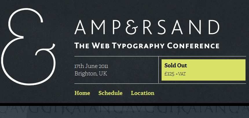
Ampersand, a conference in Brighton devoted entirely to web typography, took place on Friday and was enthusiastically received by lovers of type.
Paul Lloyd of Clearleft told us: "We created Ampersand, the UK's first web typography conference, as we felt the time was right to bring together experts and practitioners from these two increasingly overlapping disciplines.
"Many of the talks covered similar themes, but each brought a differing perspective, which I think proved invaluable for the audience. Web designers were given an insight into the immense effort required to design and prepare a font for on-screen use, whilst typographers learnt how to embrace the perceived constraints found on the web.
"At a time when web design is finally maturing and becoming a profession in its own right, it's heartening to know that typography will be an important part of our practice."
The big announcement of the day was that Hoefler & Frere-Jones typefaces will soon be available as web fonts. Jonathan Hoefler spoke about the challenges of adapting typefaces for screen use in his talk "Putting the 'Fonts' into Webfonts".
Comic Sans creator Vincent Connare talked us through its design and explained why he created it, and went on to speak about creating fonts for small devices. His slides are available at www.connare.com/darkside.pdf.
John Daggett spoke about the future of CSS typography, covering some of the new properties in the CSS Fonts Module. Slides here http://t.co/U5VBXyv.
There were also talks from Fontdeck co-founder Jon Tan and designer Jason Santa Maria.
Designer Anthony Stonehouse provides an interesting account of his favourite bits of Ampersand at http://www.thewanderlust.net/blog/2011/06/18/ampersand-conference-2011/ and Eye Magazine has a report at http://blog.eyemagazine.com/?p=5803. There's also a good blog post from designer David Bushell at http://dbushell.com/2011/06/18/ampersand-conference-ampconf/.
Sign up to Creative Bloq's daily newsletter, which brings you the latest news and inspiration from the worlds of art, design and technology.

The Creative Bloq team is made up of a group of art and design enthusiasts, and has changed and evolved since Creative Bloq began back in 2012. The current website team consists of eight full-time members of staff: Editor Georgia Coggan, Deputy Editor Rosie Hilder, Ecommerce Editor Beren Neale, Senior News Editor Daniel Piper, Editor, Digital Art and 3D Ian Dean, Tech Reviews Editor Erlingur Einarsson, Ecommerce Writer Beth Nicholls and Staff Writer Natalie Fear, as well as a roster of freelancers from around the world. The ImagineFX magazine team also pitch in, ensuring that content from leading digital art publication ImagineFX is represented on Creative Bloq.
