7 web design mistakes every beginner makes
It's easy to tumble into pitfalls when you're starting out in web design. Learn what they are and how to avoid them.
Experimenting and making mistakes is an important part of learning. Each year in my work as a university lecturer, I see new students making the same sorts of mistakes in their web design work. Hopefully by identifying those issues here, we can better learn to avoid them.
01. Lack of overall vision
Every web page exists for a reason, whether it is to convey information, provide entertainment, sell a product or service or allow the user to perform a task. Every element on the page needs to work in service of this purpose.
Look over your design: the function of each element should be clear, and anything that doesn't support this purpose should be removed. Things that are clickable need to look like they are clickable – whether that's through underlining, styling as buttons or another visual system, the key is to be consistent.
You should aim to create a clear visual hierarchy, so the user can easily scan the page and pick out key information or functions. The tone and styling of your page should reflect the purpose of the site, but the content itself is the most important part of the design. If your site is there to promote your skills as a web designer, perhaps we don't need to hear about your passion for stamp-collecting? Think about why the user has come to the site, and what you want them to do when they get there. Carefully consider how you organise the information and functionality – for example, don't unnecessarily break a site into multiple pages if it would work better as a single page that scrolls.
02. Falling for fads and trends
It's fun to keep up with fashion, but it's more important to stick with core design principles. For example, classic Olympic Games posters from the mid-20th century still look fantastic today, while many of the skeuomorphic 'Web 2.0' websites of the early 2000s, with their bevels and glass effects, already look dated. The stereotypical 'hipster' look of silhouetted anchors and moustaches is already heading the same way.
The key is to stick to the principles of typography, image and layout, rather than mindlessly applying meaningless iconography or tricksy CSS and Photoshop effects. Sometimes less is more, and just because you can make a jQuery image carousel or parallax scroll effect, it doesn't mean you should.
Nobody is born with good taste (I certainly wouldn't claim to have it!) and taste is, of course, subjective. But by exposing ourselves to well-designed things, we can definitely gain an appreciation for good design over bad, and hopefully see the mistakes in our own work more easily.
Daily design news, reviews, how-tos and more, as picked by the editors.
03. Not aligning to a grid
Although the grid-lines are invisible, most professional designers align their work to a strict grid, often made up of eight, 12 or 16 thin vertical columns. These columns should be evenly sized and spaced, with clear margins and gutters separating them. Visual elements can span one or more columns, so in practice the 12 thin 'columns' might be divided into three actual text columns, and at other times an image might span all 12. Varying how these columns are broken-up can help to stop the design looking too much like a rigid table.
Grid systems originated in print design, but have come to the web via frameworks such as 960 Grid System and more recently responsive systems such as Skeleton, which are able to dynamically alter the size and number of columns based on screen resolution. Remember, visual elements should either clearly line up, or clearly look like they are not meant to. Where things almost line-up, but don't quite, is where they start to look weird. Also look out for 'orphaned' words or elements that wrap into unexpected places. It's normally better to 'design in the browser' than in Photoshop, as you'll get a more realistic idea of how the site looks.
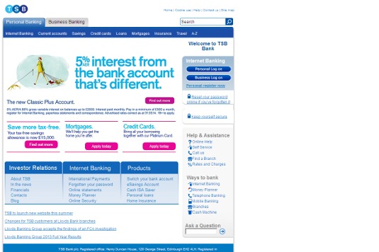
At the very least, a webpage should normally centre within the browser width, rather than leaving the page content anchored to the left with an empty void to the right (I'm looking at you, TSB).

04. Poor text treatment
Students often make text too small. The default HTML font size comes from a time when websites had to account for desktop users with 800x600 resolution monitors, but in the era of mobile devices and high definition monitors, we can think bigger. Designers such as Jeffrey Zeldman have shown that large font sizes can work well for paragraph text.
Don't forget to check how your website looks at a range of resolutions and use CSS media queries to adapt if necessary. Headings should be significantly bigger that paragraph text. Also ensure you give enough vertical space between lines of text. In typography, this distance is called the 'leading', and in CSS is controlled by the 'line-height'. The default value puts lines quite close together, which can mean the reader loses track of where they are, as their eye moves down the page. Try using a value that is 50% larger than your font-size, for example 36px for 24px text.
Ensure that you leave enough 'white space' around text – this just means empty space on the page which serves to help separate elements and lead the eye around the page. Ensure that you limit the width of text columns so that you don't have too many words to a line – this also helps to make sure the reader doesn't lose their place as their eye moves from the end of a line to the beginning of the next line. Generally an average of somewhere around 10 words to a line works best. For the same reasons, avoid text-align:center or text-align:right for paragraph text.
Limit yourself to two or three fonts, and avoid using images as text – services such as Google Fonts and Typekit give access to a wide range of web fonts. Ensure that there's sufficient contrast between the text colour and background colour – generally dark text on a light background is best. Light text on a dark background can work too, but can be viewed as more masculine, cold or uninviting. Online tools like Adobe Kuler can help you choose a tasteful colour scheme. Avoid high contrast background patterns that can confuse the shape of letters.
05. Poor treatment of photography
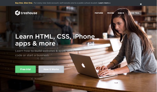
The most common mistake here seems to be students sizing photos too small on the page, meaning they lose their impact. Full browser-width images (as seen on Treehouse, for example) give a more impactful, 'glossier' feeling that's more like a printed magazine. Also ensure that the photography you choose communicates the message your website is trying to convey, and that you have the legal right to use it. Stock photography websites offer an amazing selection of images, but be sure to steer clear of the many 'cheesy' shots you'll find there. If you're using your own photography, make sure you adjust the colour and contrast levels to ensure it looks punchy and not washed out, but still looks natural.

06. Poor treatment of icons and logos
A common problem is bad cutting-out of artwork, with visible jagged edges ('jaggies'), or furry feathered edges. Master the pen tool in Photoshop, or use the polygonal lasso and zoom-in extremely close. Another frequent issue is jpeg compression artefacts, so use SVG or a high-resolution PNG for icons and logos. Ensure that you don't display artwork above its native resolution, as it will appear blurry. You might get away with this for a photograph, but never for an icon graphic.
07. Leaving things unfinished or broken
A professional designer will never knowingly leave something unfinished or broken on a public site. Bigger design agencies might have a dedicated QA (Quality Assurance) team to spot mistakes, but as a beginner it's up to you. Rope a friend in to help proof-read and check over your designs. It's amazing what a second pair of eyes can spot!
Look out for links to non-existent pages, 'broken images', layout glitches, styles not appearing and spelling mistakes. Attention to detail is key. If you tried to implement something, but you couldn't quite make it work, take it out! If you have obvious mistakes on your page, people will only see the mistakes and miss your message.
And of course, don't make no-brainer errors like leaving the page title as 'Untitled Document' or leaving place-holder text on the page! But none of us would do that, would we?! Lorem ipsum dolor...
Words: Iain Lobb Illustration: Elly Walton

The Creative Bloq team is made up of a group of art and design enthusiasts, and has changed and evolved since Creative Bloq began back in 2012. The current website team consists of eight full-time members of staff: Editor Georgia Coggan, Deputy Editor Rosie Hilder, Ecommerce Editor Beren Neale, Senior News Editor Daniel Piper, Editor, Digital Art and 3D Ian Dean, Tech Reviews Editor Erlingur Einarsson, Ecommerce Writer Beth Nicholls and Staff Writer Natalie Fear, as well as a roster of freelancers from around the world. The ImagineFX magazine team also pitch in, ensuring that content from leading digital art publication ImagineFX is represented on Creative Bloq.
