Why your websites need context
Gene Crawford considers how context is key to a site's usability, thinking through purpose and user interaction.
There are so many different types of devices, screen widths and resolutions to worry about when we're designing and building websites now, making it impossible to keep up with everything. Targeting screen widths, keeping things fluid between sizes and tackling images and media are typically the primary focus when you're building out a project. There is one thing that I'd like to ensure that we all remember: context.
You can call this a 'content first' or a 'mobile first' approach. Call it whatever you need to. But at the core of something we design and build is the context for which that thing is intended. Thinking through a website's purpose and how people will interact with it is paramount to making something highly usable. If this sounds like common sense to you, well, it is. It's also one of the most difficult things to do.
It's a small detail but a manifestation of this overall concept can be found in the use of the 'hamburger' navigation icon. Research the origin of this icon on your own. You'll likely find it's been appropriated from a different context of use altogether.
Article continues belowWhen used all alone, it's difficult to know exactly what it does. When it's used to denote 'hidden' navigation on one device, it sometimes fails to translate as the same thing on another device. The point is, you need to keep the context of what you're trying to achieve, in whatever you're designing, top of mind, whether it's a small detail like a navigation icon, or the entire website itself.
Check out these examples:
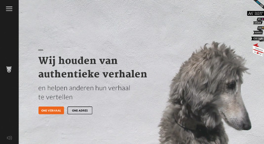
01. Dr. Woe's

The 'fly out' navigation on the marketing firm Dr. Woe's website is a good example of appropriating a nice app design trend into a website. However, the navigation design's interaction and use of the 'hamburger' icon may not translate as well to the desktop as it does to a mobile device.
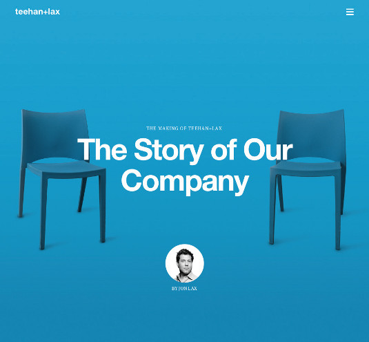
02. Teehan+Lax

The website for the design firm Teehan+Lax utilises the 'hamburger' icon significantly to contain 80 per cent of the website's sub page links. This is more a style choice than a functional one. One could argue that on a desktop this navigation icon is not obvious to its purpose.
Sign up to Creative Bloq's daily newsletter, which brings you the latest news and inspiration from the worlds of art, design and technology.
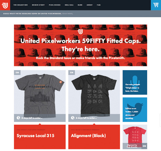
03. Pixelworkers

The main navigation on T-shirt printing company website, United Pixelworkers, changes drastically across all the different targeted screen widths. This design manages to maintain a clean look of the navigation approximate to different device usage.
Words: Gene Crawford
Gene's mission is to work tirelessly at providing inspiration and insight for developers. This article originally appeared in net magazine issue 250.

The Creative Bloq team is made up of a group of art and design enthusiasts, and has changed and evolved since Creative Bloq began back in 2012. The current website team consists of eight full-time members of staff: Editor Georgia Coggan, Deputy Editor Rosie Hilder, Ecommerce Editor Beren Neale, Senior News Editor Daniel Piper, Editor, Digital Art and 3D Ian Dean, Tech Reviews Editor Erlingur Einarsson, Ecommerce Writer Beth Nicholls and Staff Writer Natalie Fear, as well as a roster of freelancers from around the world. The ImagineFX magazine team also pitch in, ensuring that content from leading digital art publication ImagineFX is represented on Creative Bloq.
