Vauxhall's new logo has something missing
Flat design loses some essential details.

Sign up to Creative Bloq's daily newsletter, which brings you the latest news and inspiration from the worlds of art, design and technology.
You are now subscribed
Your newsletter sign-up was successful
Want to add more newsletters?
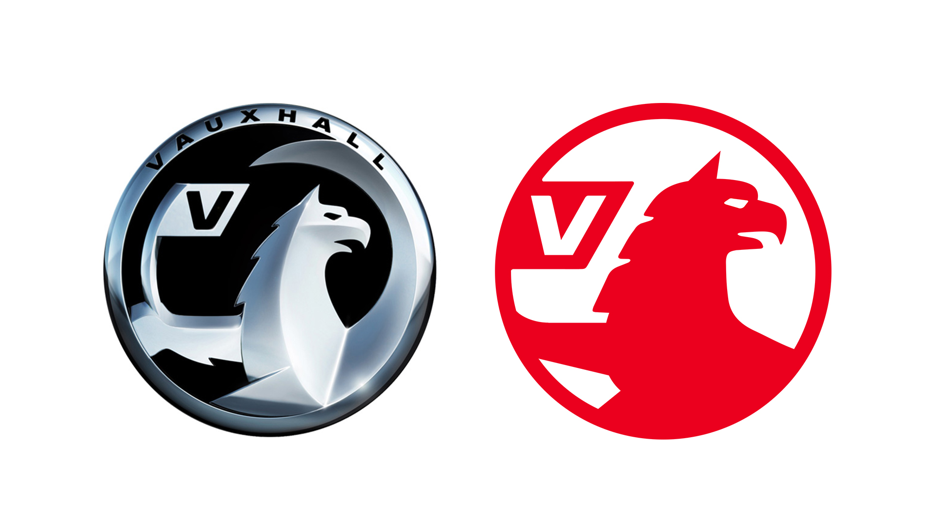
British car manufacturer Vauxhall has quietly unveiled a new logo, in the first update to its brand identity since 2008. The new logo, which now appears on Vauxhall's website and social media pages, is yet another example of a car company eschewing 3D in favour of flat design.
In terms of shape, Vauxhall hasn't looked much further than its 2008 symbol for logo design inspiration. But the shiny metallic texture is now gone, as is the word Vauxhall at the top of the outer ring. The company's mythical griffin creature has also lost its wing (and doesn't look too happy about it). This new logo was first spotted on Twitter (below), with Vauxhall itself yet to officially announce the update.
Trying to dig for more information, but it looks like Vauxhall have a new logo @vauxhall @ucllc #logodesign pic.twitter.com/eDx9JPAAt4June 28, 2020
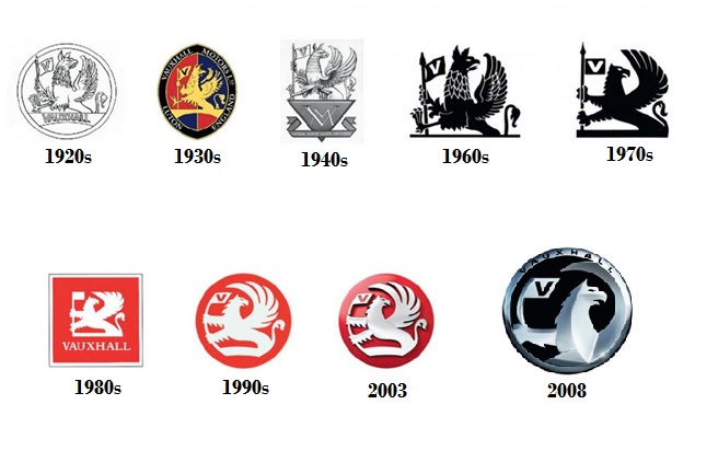
According to The NewsWheel, Vauxhall's logo has featured a griffin holding a 'V' flag since the company was first registered (in London's Vauxhall district, of course) in 1857. The creature (with the body of a lion and head of an eagle) comes from the coat of arms of Sir Falkes de Breauté, whose mansion, Falkes' Hall, eventually became known as Vauxhall. The logo has undergone many changes, with 2008 seeing most of the griffin's body being cropped out.
Article continues below 
While the new design is a clean, minimal take on 2008's logo, we can't help but think that the missing wing has taken a certain flourish with it. The griffin's elegant shape added a touch of character and splendour that's now sadly absent. Still, with car companies left, right and centre opting for flat design (BMW recently revealed the biggest change to its logo in 100 years), Vauxhall's design decision is unsurprising. And while somewhat unexciting, it's certainly consistent with other brands refreshing their logos with digital in mind.
Perhaps this simpler logo will prove easier for customers to recall, though. As a recent study revealed with hilarious results, many struggle to draw various car logos from memory, with only 14 per cent getting Vauxhall's griffin vaguely right. At least there's now one less wing to remember.
Read more:
- Google Photos’ new logo falls flat
- Designers are fuming about Adobe's new Creative Cloud icons
- Is Comic Sans really as bad as people think?
Sign up to Creative Bloq's daily newsletter, which brings you the latest news and inspiration from the worlds of art, design and technology.

Daniel John is Design Editor at Creative Bloq. He reports on the worlds of design, branding and lifestyle tech, and has covered several industry events including Milan Design Week, OFFF Barcelona and Adobe Max in Los Angeles. He has interviewed leaders and designers at brands including Apple, Microsoft and Adobe. Daniel's debut book of short stories and poems was published in 2018, and his comedy newsletter is a Substack Bestseller.
