It's not a huge exaggeration to say that it would be hard to imagine life without the humble Command key on Macs. The Apple equivalent of 'Control' is used as a modifier key in some of the most frequent key combinations that save us time in everything from basic word processing to Photoshop shortcuts and more.
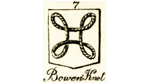
It's present on the best keyboards for Mac and the Magic Keyboard for iPad. But there's a question many never think to ask: why is Apple Command key marked with a heraldic knot?

In the early 1980s, the Command button was called the 'Apple key' or 'Open Apple key', a little like keyboards for Windows have a Windows key today. Apple IIe and IIc had both an 'Open Apple' and 'Closed Apple' key, one with an outlined Apple logo and one with a solid logo.
Article continues belowThis was until former Apple boss Steve Jobs put his foot down. Jobs knew the importance of branding, and he understood the value of the Apple logo. He felt that the logo was being overused: and its presence on modifier keys was a big culprit since it meant menu screens listing commands were full of Apple icons. The company was “taking the Apple logo in vain,” he said.
Apple bitmap artist Susan Kare was given a matter of days to come up with a replacement for the 1984 Macintosh. In a dictionary of symbols, she came across the a symbol that comprises one continuous loop with four smaller loops at each corner.

In Nordic countries, the symbol is used on road signs. No, not to indicate a shortcut, but to flag tourist attractions and places of cultural interest, apparently because it resembles the shape of a castle with corner towers seen from above. As a result, the Command key sometimes called 'fornminne' (ancient monument) by Swedish Mac users and 'seværdighedstegn' (landmark) by Danish users.

In Unicode and HTML, the symbol is encoded as U+2318 ⌘: place of interest sign. But its history actually goes back even further. As a heraldic symbol, it's known as the Bowen knot or the St John's Arms, and variations appears in several coats of arms.
Sign up to Creative Bloq's daily newsletter, which brings you the latest news and inspiration from the worlds of art, design and technology.
Want to learn about the surprising history behind more symbols? See our piece on the unknown stories behind everyday icons.

Joe is a regular freelance journalist and editor at Creative Bloq. He writes news, features and buying guides and keeps track of the best equipment and software for creatives, from video editing programs to monitors and accessories. A veteran news writer and photographer, he now works as a project manager at the London and Buenos Aires-based design, production and branding agency Hermana Creatives. There he manages a team of designers, photographers and video editors who specialise in producing visual content and design assets for the hospitality sector. He also dances Argentine tango.
