Apple has given its online store a complete redesign, and it's already causing a ton of debate. The store was down for an hour on Tuesday before it came back with a brand new look, also reintroducing a dedicated store tab on the main website.
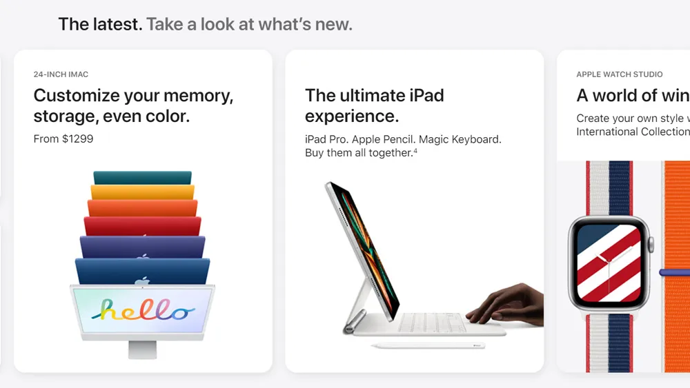
The new design is chock-full of horizontally scrolling card carousels and a LOT of content. Below a link to chat with a specialist, there are images and links to major product lines (Mac, iPhone, AirPods, etc.), some of which lead to new dedicated Store pages showing the models available. Scroll down and there are sections on everything from what’s new to highlights, accessories, support pages, trade-in and more. The site currently highlights the Apple back-to-school deal offering free AirPods for students.

The redesigned store is very much in keeping with the iOS Store app, which was redesigned in May. New items are shown as cards like they are in the Store app, which makes the new online Store feel decidedly mobile-first, the scrolling cards working better on a phone than on desktop.
The move has users divided. Many have welcomed the return of a dedicated store tab – something that Apple removed back in 2015. That does seem to make it easier to discover products if you don't already know what you want to buy. There's also been a lot of praise for the clean layout and simple, intuitive copy. UX designer Hawke Bassignani said on Twitter: "It looks nice! And it’s another example that modern Apple is doing things more like a regular consumer ecommerce company." "It's genuinely beautiful," another user tweeted.

But some people think there's way too much going on and fear the look spreading to the whole website. Others take issue with the left-side padding, which creates a lopsided look on desktop.
"This new site is an abomination. Everything is a carousel," one person commented on the MacRumors forum, while another wrote: "Too difficult to shop. SO much information and too many clicks to get to the products." Another complained: "Why is everything so gigantic on the page? It makes me feel like I need to zoom out. I don’t need 50pt text and giant photographs of everything."
Whatever you think of the new store, there's no denying that Apple has some stunning products for creatives, and indeed for anyone else. If you're looking to buy, make sure you check our guide to the best Apple deals available now from different retailers.
Read more:

