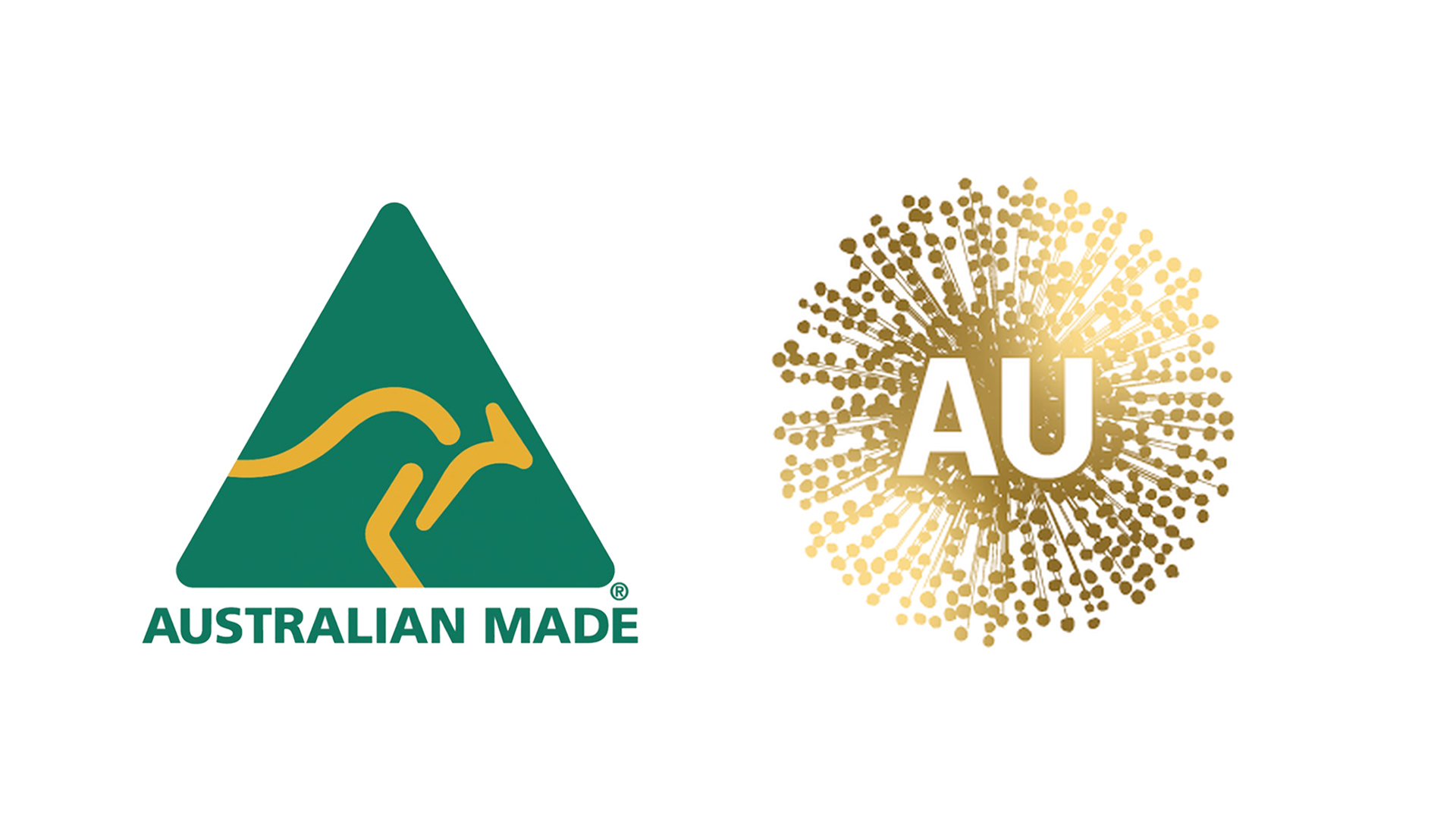
Australian logo ditched after going viral for all the wrong reasons
It looked a little like something else.

Sign up to Creative Bloq's daily newsletter, which brings you the latest news and inspiration from the worlds of art, design and technology.
You are now subscribed
Your newsletter sign-up was successful
Want to add more newsletters?
Some rebrands are successful, some less successful, and some are just plain baffling. Australian Made's new logo certainly fell into the latter category last month, replacing its beloved kangaroo with something that looked a lot more sinister. Thankfully, the viral redesign has now officially been canned.
The Australian Made mark is designed to signify products that are, you guessed it, Australian made. According to its website, the logo is "the mark of Aussie authenticity". But as many pointed out online, the new version looked remarkably like a virus. Not quite where we'd look for logo design inspiration – especially in 2020.
I can’t believe they have changed the Australian made logo to look like this, it looks like a virus. I will be writing to the Australia’s Nation Brand Advisory Council & Trade Minister @Birmo to reinstate the Kangaroo! pic.twitter.com/KzfMebQ9wRJune 30, 2020
Believe it or not, the new design wasn't actually supposed to look like a virus. According to ABC, it was meant to represent the golden wattle, Australia's native flower that appears on the Commonwealth Coat of Arms. That makes more sense – although with the sheer amount of virus imagery doing the rounds this year, we can't believe Australian Made didn't make the connection.
Article continues belowAccording to The Australian, the updated logo, designed by marketing agency BBDO Sydney, will now be replaced with a different take on the wattle. Trade Minister Simon Birmingham says the design was completed last year, long before the 'c' word became quite so ubiquitous. “Obviously COVID means there’s a need to have a look at that piece of work – particularly the logo element – given some of the associations people were drawing,” he said.
MEDIA RELEASE: The Australian Made kangaroo is here to stay. The famous Australian Made logo is not being replaced. It will remain as Australia’s global product symbol, following reports of a new Nation Brand for Australia. Read more: https://t.co/Gpu0TWehuM pic.twitter.com/5inen21IX3July 1, 2020
Fortunately, the abandoned logo didn't actually represent a blanket rebrand for Australian Made. The company took to Twitter (above) to announce that the kangaroo wasn't disappearing – the new logo was only planned be adopted by businesses and government agencies.
Now that the viral wattle has officially been ditched, exactly what logo said business and agencies will eventually end up with remains to be seen. But if said experts are looking for inspiration that's slightly less, er, biological, they could do well to check out our best logos of all time.
Read more:
Sign up to Creative Bloq's daily newsletter, which brings you the latest news and inspiration from the worlds of art, design and technology.

Daniel John is Design Editor at Creative Bloq. He reports on the worlds of design, branding and lifestyle tech, and has covered several industry events including Milan Design Week, OFFF Barcelona and Adobe Max in Los Angeles. He has interviewed leaders and designers at brands including Apple, Microsoft and Adobe. Daniel's debut book of short stories and poems was published in 2018, and his comedy newsletter is a Substack Bestseller.
