Beijing 2022 Olympic logos are a calligraphic delight
The Olympic and Paralympic Winter Games emblems are packed with subtle symbols.

While most of us are winding down for the year and looking forward to what 2018 has in store, the Beijing 2022 Winter Olympics organising committee is planning even further ahead with the launch of the official logo designs for the games.
As the name suggests, Beijing 2022 is due to take place in five year's time. The official emblems for the Winter Olympic Games and Winter Paralympic Games were announced on Friday in a special ceremony at the Chinese capital's National Aquatics Centre.
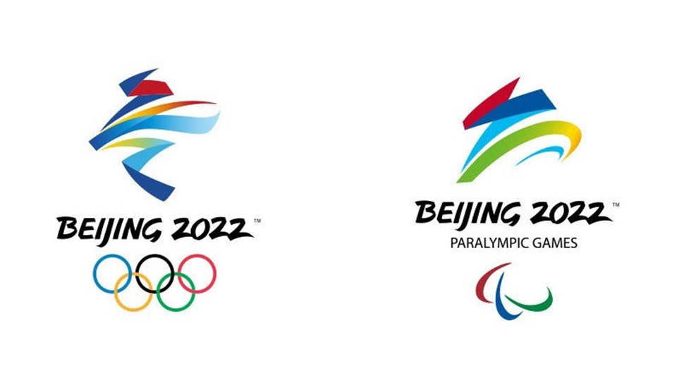
The pair of logos were designed by artist Lin Cunzhen, and blend together aesthetic elements from both traditional and contemporary Chinese culture. Each emblem aims to embody the "passion and vitality of winter sports" according to the official Olympics site.
Article continues below 
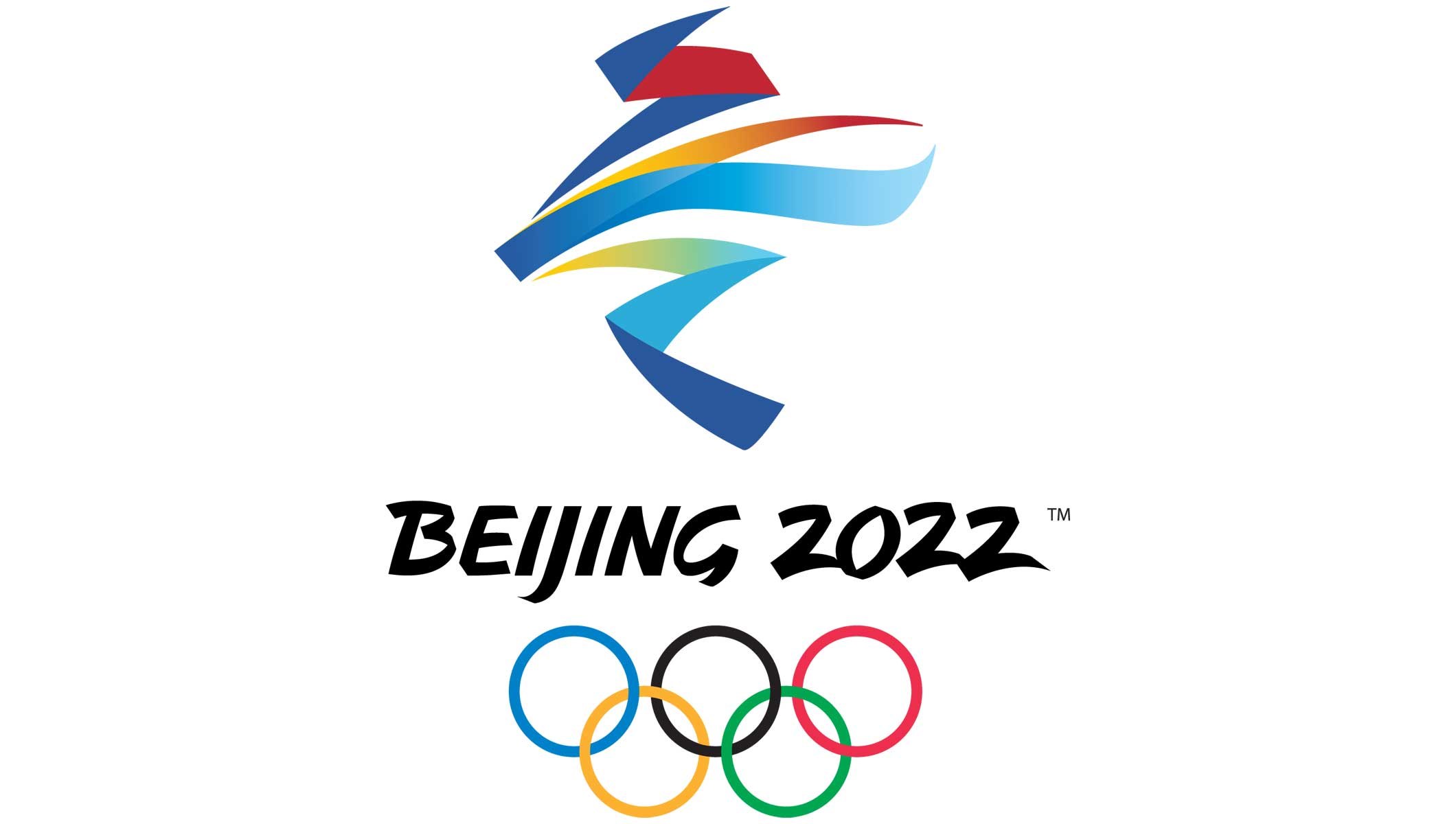
Western readers might not be able to immediately understand all the elements of the Beijing 2022 Winter Olympic Games emblem (above) seeing as it's based on the Chinese character for winter: 冬. But once you know the shape of the character, it's clear to see the stylistic similarities.
On top of this, the Winter Olympics emblem is designed to resemble a skater at the top and a skier at the bottom, with the host country's mountains running between them.
Colour in branding is of course a powerful tool, and here colour also plays an important part in the logo, with blue representing dreams and the wintery weather, while red and yellow mirrors the colours of China's national flag as well as standing for youth, passion and vitality.

Meanwhile, the Winter Paralympics logo, named Flying High, takes its inspiration from the Chinese 'fly' character, which looks like this: 飞. The design is said to conjure up "the image of a wheelchair athlete surging towards the finish line and victory."
Sign up to Creative Bloq's daily newsletter, which brings you the latest news and inspiration from the worlds of art, design and technology.
Cunzhen, whose Beijing 2022 logo designs were chosen from a batch of 4,506 submissions from around the world, previously co-designed the emblem for the Summer Youth Olympic Games in Nanjing in 2014.
"The two Beijing 2022 emblems vividly illustrate the vitality and passion of winter sports, the resilience of the participating athletes and the spirit and beauty of contemporary China," says the president of the Beijing 2022 organising committee, Cai Qi. "They also express the wishes and hopes of 1.3 billion Chinese people that Beijing 2022 is a success."
Related articles:

Dom Carter is a freelance writer who specialises in art and design. Formerly a staff writer for Creative Bloq, his work has also appeared on Creative Boom and in the pages of ImagineFX, Computer Arts, 3D World, and .net. He has been a D&AD New Blood judge, and has a particular interest in picture books.
