Is this the most ingenious book cover design ever?
It's a typographical treat.

Sign up to Creative Bloq's daily newsletter, which brings you the latest news and inspiration from the worlds of art, design and technology.
You are now subscribed
Your newsletter sign-up was successful
Want to add more newsletters?
They say you shouldn't judge a book by its cover, but with book stores often goldmines of brilliant graphic design, it can be hard not to be swayed by a beautiful cover. One particularly inventive design is currently doing the rounds online – and it might be one of the best we've seen.
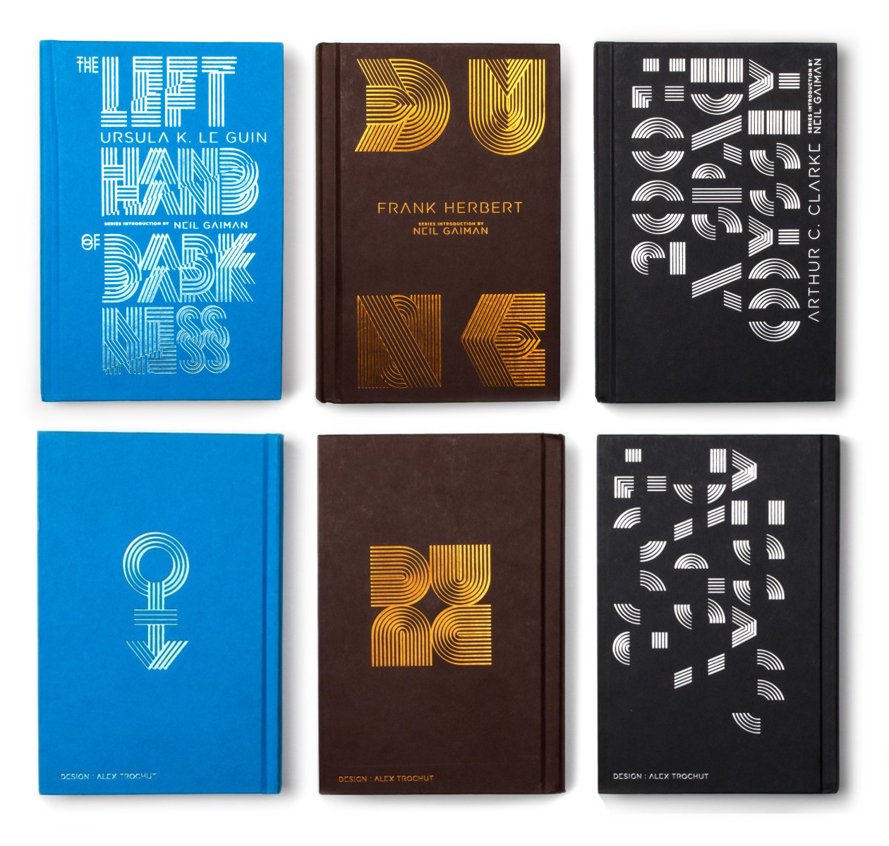
The back cover of this edition of Frank Herbert's Dune features a seemingly abstract quartet of semi-circular shapes. On closer inspection, these spell out the title of the book. And they'll do so whichever way you happen to be holding the book up. It's an ingenious piece of typographical design (check out our top typography tutorials if you're looking for more inspiration).
Back cover of Dune. Turn it and it always says DUNE. Design by Alex Trochut from r/DesignPorn
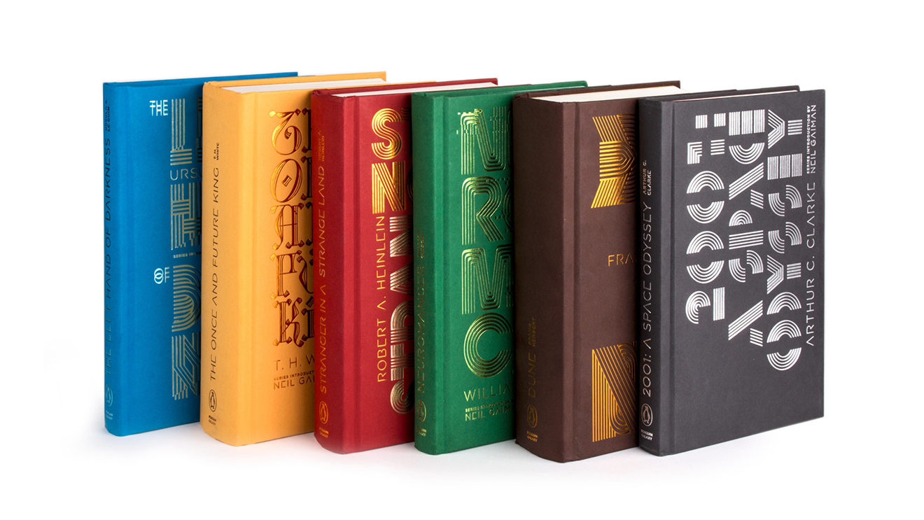
The design by Alex Trochut adorns the back of the Penguin Galaxy edition of the novel. Trochut designed covers for 6 novels in the sci-fi series (below), including 2001: A Space Odyssey and The Once and Future King. Published in 2016, the collectible hardcover editions feature typographical front covers, along with a more minimal and abstract version on the back.
Article continues below 
The Dune cover is particularly impressive not only for its clever rotation trick, but because it also manages to work as a pleasingly minimal and symmetrical standalone design before you even spot that it spells out the title of the book.
The design recently reappeared on Reddit, where it has already received over 13.5k upvotes. "This is my favourite book and I love the look of this," one user comments, while another adds, "this is the best design porn I've seen".
We can't help but wonder if the team behind the upcoming Dune film took inspiration from Trochut's cover. The film's title treatment features a similarly minimal look – only this time it was so minimal that many took it to read 'DUNC'. While we wouldn't blame the team for having taking inspiration from Trochut's design, perhaps they'd have done well to check out our logo design guide.
Read more:
Sign up to Creative Bloq's daily newsletter, which brings you the latest news and inspiration from the worlds of art, design and technology.

Daniel John is Design Editor at Creative Bloq. He reports on the worlds of design, branding and lifestyle tech, and has covered several industry events including Milan Design Week, OFFF Barcelona and Adobe Max in Los Angeles. He has interviewed leaders and designers at brands including Apple, Microsoft and Adobe. Daniel's debut book of short stories and poems was published in 2018, and his comedy newsletter is a Substack Bestseller.
