The travel industry has faced huge disruption in the past decade or so. Changing tastes, the rise of online bookings and the Covid-19 pandemic have all had an impact, so it's perhaps not surprising that brands have made big design changes as they seek to weather the storm.
The UK travel agency First Choice doesn't do subtle rebrands. Its latest overhaul is just as radical is the last one back in 2015, but happily its new logo and other assets look a lot more apt for a travel brand this time around (see our pick of the best tourist board logos for more travel inspiration).

First Choice's last rebrand was a strange one. It dropped a cliched cartoonish tourism-board-like logo featuring a sunny beach scene in favour of a design that had no obvious connection to travel and looked more like a logo for a life sciences company. After eight years, it's putting that right with a new logo and other assets that present a warmer, classier identity while leaving little doubt about what the brand does.
With many people now opting to book their holiday activities themselves, Ragged Edge, which led the rebranding strategy, aimed to highlight the benefits of travel agencies, including for younger customers who never dealt with them in the old high street format. As well as communicating the convenience and security, this meant selling the idea that travel agencies also act as curators.
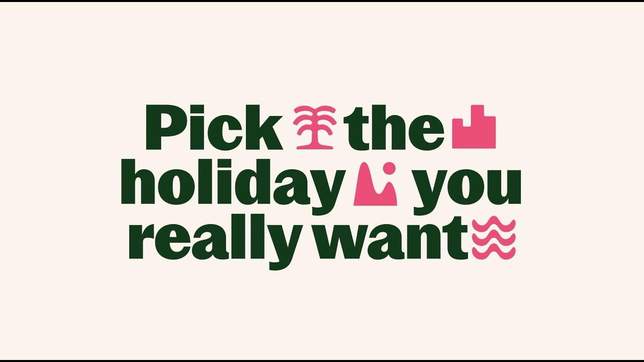
Ragged Edge says it aimed to show First Choice a solution to the modern problem of the 'Fear of Better Options', or FOBO, and the decision paralysis that comes with it. Its new identity for the brand urges people to be “proudly picky” without having to do all the comparison work themselves.
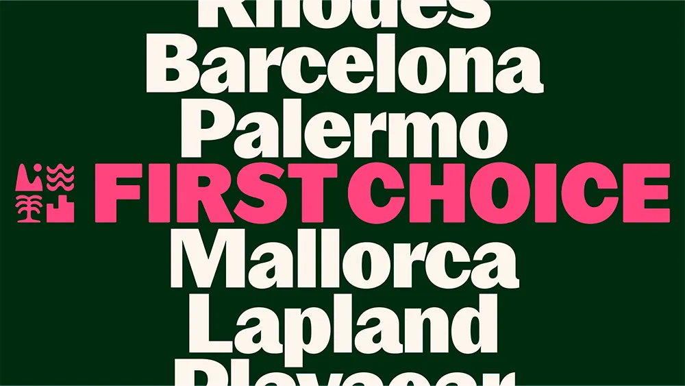
There's a bunch of icons that have a lot of personality: fun, playful but also slightly aspirational. These represent different holiday options like the city, coast, pool or countryside, and when they come together to form a logo lockup they look almost like a heraldic shield.
The typeface for the rebrand is a customised version of Pastiche Grotesque created with Order Type Foundry, which has an organic, uneven feel. That's backed up by a similarly "loose, imperfect" approach to photography. Rather than using images with a particular style from one photographer, Ragged Edge opted to use images from a range of travellers to convey diverse experiences of travel.

“Booking travel has become an increasingly overwhelming experience. Having unlimited and unfiltered choice makes picking the right holiday harder, not easier," Ragged Edge co-founder Max Ottignon says. “First Choice replaces endless options, and the choice paralysis that comes with them, with a single platform built to help you pick the trip you really want. So that became the focus of the brand. A brand that makes it easy to get picky.”
We've seen this week the dangers of designing for designers rather than a brand's target audience, but First Choice's target audience is changing. This rebrand feels like it could strike just the right balance in appealing to a younger demographic without alienating customers that know the brand.

