Need a laugh? Just look at these football badges drawn from memory
Sign up to Creative Bloq's daily newsletter, which brings you the latest news and inspiration from the worlds of art, design and technology.
You are now subscribed
Your newsletter sign-up was successful
Want to add more newsletters?
Premier League football club logos are pretty ubiquitous. More than just sports clubs, the biggest teams are now global brands. We see their logos during every fixture, but also in the street, in the media and on countless pieces of merchandise every day. And while shirts change every season, many of the biggest Premier League teams have been using the same badge for years. So you think football fans could have a good stab at drawing them from memory.
But football team badges can be fairly complex designs. While brand logos these days often aim for simplicity, football club logos need to retain an element of tradition, which can include symbolism, mottos and more. And although most fans seem to remember the general shape and main feature of each badge, they seem to be a little hazier when it comes to those smaller details.
An amusing project set out to test how football fans would do when asked to draw the badges of the top six teams from the last Premier League season: Manchester City, Liverpool, Chelsea, Tottenham, Arsenal and Manchester United. Many of these club badges contain symbolism that tells a story about the team's roots, from Liverpool's mythological liver bird to Tottenham's cockerel.
Article continues belowBut how well would fans of the "beautiful game" be able to recall them from memory? Betsperts asked 100 fans to have a go, and then it ranked the results from those that got closest to the net to those that didn't even kick the ball in the right direction. Some were fairly accurate, but others were hilariously off the mark. And some people appear to have used the exercise to propose novel ideas of their own.
Arsenal
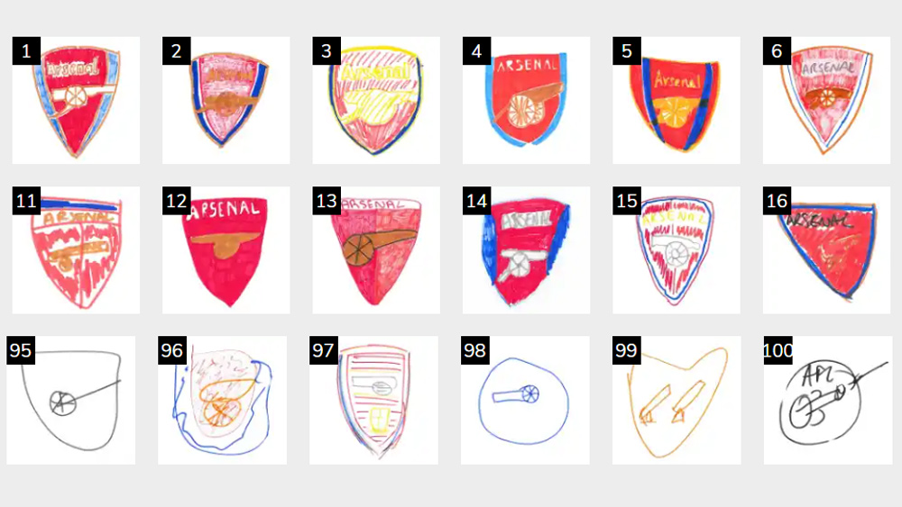
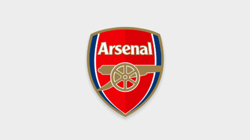
Arsenal are known as the ‘The Gunners’ because the team was founded by munitions workers. Today, the Arsenal badge is much simpler than it used to be, but it still honours that history with a prominent cannon below the club's name. Some 94 of the 100 participants included a canon and 86 got the shape of the badge right, but only 11 recalled that the Arsenal badge features three colours: red, gold and blue.
Chelsea
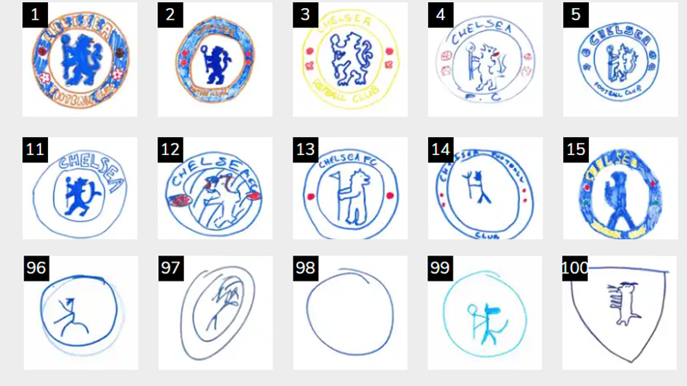
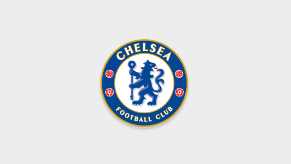
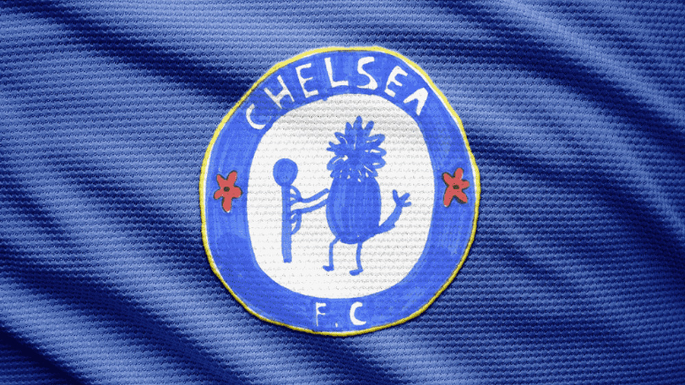
The Chelsea logo might seem like one of the simpler Premier League badges, but there are a few little details that many people might not have noticed. Along with the staff-wielding blue lion, which came from the coat of arms of the Metropolitan Borough of Chelsea and the Cadogan family, there are also two red roses and two red footballs.
Almost everyone got the colour right and nearly two-thirds of the submissions included what could be interpreted as a lion. However, others seemed less sure about exactly what kind of blue animal Chelsea sports as its mascot. Some attempts appear to include birds, dragons, bears, fish and... erm.. a dinosaur?
Sign up to Creative Bloq's daily newsletter, which brings you the latest news and inspiration from the worlds of art, design and technology.
Liverpool
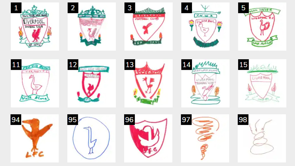
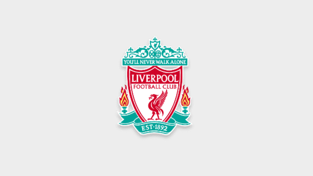
Liverpool has one of the most complex Premier League club badges, so it's perhaps not surprising that this one proved to be a challenge. There are a lot of things going on. The iconic liver bird, a mythological symbol of the city of Liverpool, takes pride of place, and most people included it along with the general shape of the shield, but people weren't so good at recalling the two flaming torches, the green ribbon with the year 1892 and the detailed depiction of the Shankly Gates with the club motto ‘You’ll Never Walk Alone’.
Manchester City
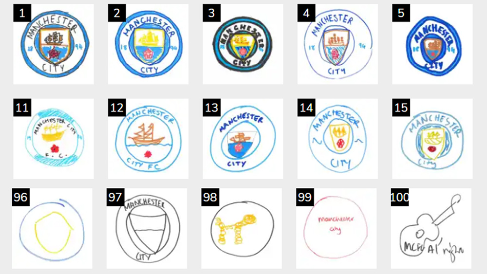
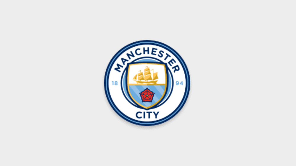
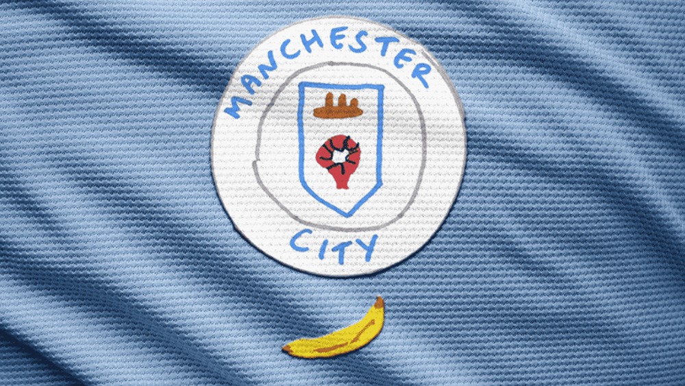
Blue is a vital part of of Manchester City’s identity too – in this case a sky blue. The majority of attempts at recalling the Manchester City badge got that right, although the secondary colours turned out to be less memorable. There were fewer attempts to include the badge's darker blue and gold highlights.
The golden ship – a reference to the Manchester Ship Canal – and the red rose, were included by around 50% and 30% of attempts respectively, but there was confusion about the number of ships in some cases. Some people just went wild and proposed their own ideas: a golden poodle? Why not. A guitar? Mad for it. One person even included a banana, presumably in reference to City fans' penchant for inflatables. We'd like to see the club take that suggestion up.
Manchester United
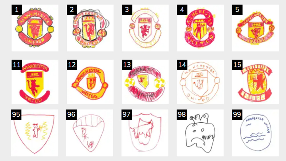
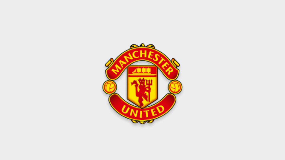
Many people may not have noticed, but the Manchester United logo also features a ship. It's somewhat overshadowed by the famous red devil, and that might be why less than a third of people included it in their attempts to draw the club badge. Most people got the colours right, but many missed the footballs on either side of the badge and even the shield in the centre. One person just drew a picture of what appears to be an unhappy half-eaten carrot.
Tottenham Hotspur
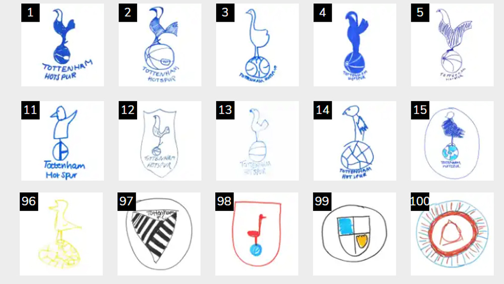
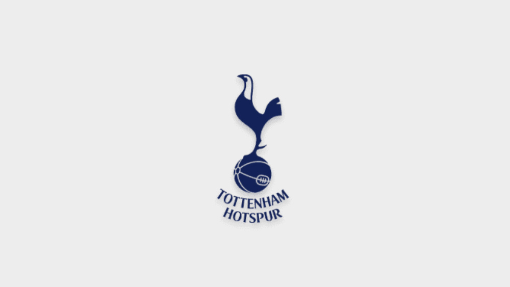
Finally, the Tottenham Hotspur badge is the simplest of the six. As a result, it was the one most accurately recalled by fans. Nearly all attempts included a bird – the cockerel was apparently a reference to club founder Harry Hotspur’s love of cockfighting. Most people also got a football in there. Surprisingly, quite a few people didn't get the colour blue right. And one person seemed to be thinking of Notts County or Newcastle United.
Of course, in an exercise like this artistic ability comes into play as well as the memorability of each logo (especially with the more detailed football badges), but it's interesting to see what parts of each design people most recall. The main colours are generally recalled well, but secondary colours less so. And smaller motifs also tend to be a bit hazy (we also get the impression that some people just weren't really trying!) You can see all of the attempts at Betsperts.com.
One fascinating phenomenon that can occur when people try to recall logos is the visual Mandela effect, which causes people to remember things wrongly – something we've seen with other logos that people remember wrongly. If you're considering designing a logo for your own sports team, we'd recommend taking a look at our guide to how to design a logo and investing in the best graphic design software.
Read more:

Joe is a regular freelance journalist and editor at Creative Bloq. He writes news, features and buying guides and keeps track of the best equipment and software for creatives, from video editing programs to monitors and accessories. A veteran news writer and photographer, he now works as a project manager at the London and Buenos Aires-based design, production and branding agency Hermana Creatives. There he manages a team of designers, photographers and video editors who specialise in producing visual content and design assets for the hospitality sector. He also dances Argentine tango.
