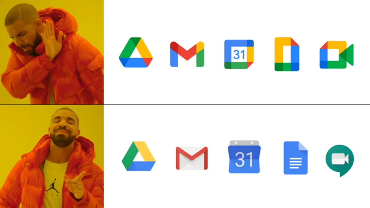
Among other things, 2020 was the year of the new Google logo. From Gmail to Google Maps, pretty much every app and service under the G Suite umbrella was given a new icon – with decidedly mixed results. A surprise late addition has just dropped – and it’s only ten years late.
Google Fiber, the company’s (currently US-only) fibre optic internet service, is the latest product to be given a new logo – and, surprise, surprise, it looks pretty much exactly the same as the rest of the Google Workspace logos. And for that very reason, it won’t be hitting our best logos roundup any time soon.

The hallmarks of every other Google logo are present and correct, including the four Google colours (blue, green, red and yellow) in abstract form. And yep, it could easily be mistaken for any of the others. Users were furious about the confusingly similar logos revealed last year, but it seems the company is continuing to double down on the aesthetic.
But what’s particularly curious about this design is that, despite Google Fiber launching in 2010, it’s the service’s first logo. Until now, there was no Google Fiber logo – just those words written in Google’s signature font (check out our best free fonts if you’re looking for typographical inspiration).
It might look like every other new Google logo, but that hasn’t stopped the company from waxing lyrical about the new design. “The icon represents two key concepts, core to Google Fiber’s mission,” The company announced in a press release. "The first is that of a catalyst. The dynamic shape upon which the icon is built inspires a feeling of movement in its upward arcing motion. The second concept is scalable impact, represented through its modular pattern. This new icon acts as the cornerstone upon which the brand is built, signalling the ambition to galvanise and uplift communities.” Ok, Google.
Thankfully, being the logo for an internet service provider rather than an app, this one is unlikely to sit on your dock or homescreen getting mixed up with other icons. Next time Google decides to refresh its logos, it ought to check out our logo design guide (spoiler alert: it states that your logo shouldn’t be easily mistaken for another). And if you fancy designing your own, check out today's best Adobe Creative Cloud deals below.
Read more:

