The new Instagram logo and font are dividing the internet
It's all about the 'squircle'.
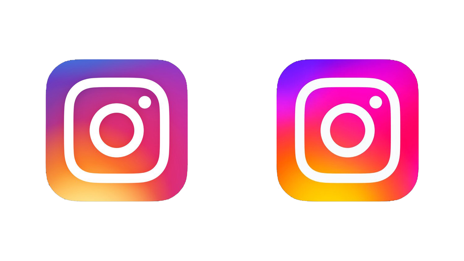
Just last week, Instagram users noticed that the app icon had randomly become a lot brighter. Well, now we know why – it's all part of Instagram's biggest rebrand in years. But it seems the internet is torn over the platform's new look.
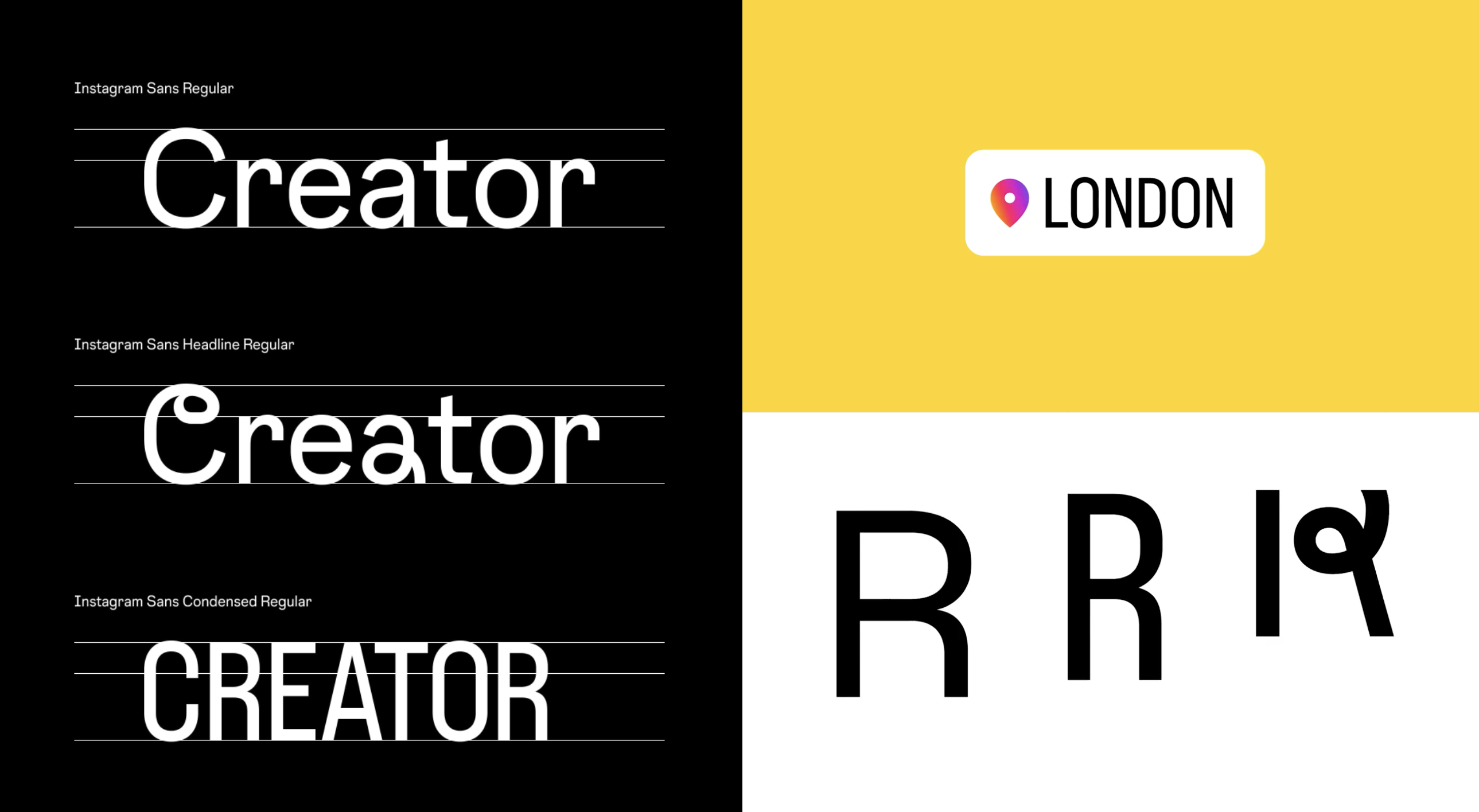
Meta-owned Instagram has revealed a new visual identity comprising of a brand new bespoke typeface, and the aforementioned brighter logo. Perhaps the most notable change is the new wordmark, now rendered in the 'Instagram Sans' typeface. (Looking for more inspiration? Check out the best free fonts.)

Instagram says the refresh is designed to help the platform “create more immersive and inclusive experiences.” In a blog post, the company breaks the rebrand down into three core areas:
- The gradient is reimagined with "vibrant colours to make it feel illuminated and alive, and to signal moments of discovery".
- The new typeface, Instagram Sans, is "designed with Instagram's heritage in mind and includes multiple global scripts."
- The new layout and design system is "content-forward and celebrates creativity, simplicity and self-expression."

We've already seen the tweaked icon (designed by Rose Pilkington), which appears to be blinding some users. But now we've been given a much more comprehensive look at the new brand identity. 'Instagram Sans' is a fun new typeface based around what Instagram "lovingly" calls the "squircle" – the rounded square of its logo. The typeface is also available to use in Stories and Reels.

But the most noticeable use of the typeface is in the brand new wordmark (above). Replacing the 'handwritten' style that's been around for as long as Instagram, the new wordmark is a much more contemporary affair – and considering how long we've had to look at the last one, I'm a fan.
A post shared by Rose Pilkington (@rosepilky)
A photo posted by on
But over on that other social media platform, reactions are mixed. Yes, Twitter is, as Twitter does, making its feelings known about the new look, and the responses range from really loving it to really not loving it.
I hate instagram’s new font, who’s working UI/UX over thereMay 20, 2022
why does instagram insist on giving us the ugliest fonts to exist. what IS that new fontMay 17, 2022
okay i wasn't totally sold in the new gradient but this new instagram font is 👁️🫦👁️ https://t.co/JDT7VLvqOXMay 24, 2022
And responses to the new icon have been doing the rounds for a few days now. "I'm going to have to reduce my screen brightness for that," one Twitter user complains, while another adds, "New Instagram icon is way over-saturated. Gross." And lots have users have shared screen recordings of iOS seeming to struggle with the new icon – when closing the app, the icon appears to judder between the old and new design.
Sign up to Creative Bloq's daily newsletter, which brings you the latest news and inspiration from the worlds of art, design and technology.
You can find out more about the rebrand in Meta's detailed case study. Meanwhile, if you're looking to improve your Instagram game, check out these top 10 Instagram tips for creatives.
Read more:

Daniel John is Design Editor at Creative Bloq. He reports on the worlds of design, branding and lifestyle tech, and has covered several industry events including Milan Design Week, OFFF Barcelona and Adobe Max in Los Angeles. He has interviewed leaders and designers at brands including Apple, Microsoft and Adobe. Daniel's debut book of short stories and poems was published in 2018, and his comedy newsletter is a Substack Bestseller.
