It's the final day of Vertex Week 2022 and we go out with a bang. Today is animation day and we have the amazing Aaron Blaise, Pixar's Dylan Sisson, and Jackie Droujko with two tutorials for designing characters for animation.
We began today's live blog by joining Pixar's Dylan Sisson for a look at how the animated short Luca was created, and what this has meant for the future of RenderMan – Pixar's free-to-try animation and rendering software. Rewatch his video talk below.
You can rewatch every day of Vertex Week, beginning with Monday's first live blog: Vertex Week 2022 live blog.
Earlier we joined Jackie Droujko for the first of her two tutorials where the animator showed us how she likes to rekindle the artistic process and get inspired. You can rewatch that video below. We then joined Droujko for her second video tutorial today. She demonstrated her workflow for speedpainting a character design for animation.
Now, for the final video live blog of the day and the week, we're following along with legendary Disney artist Aaron Blaise who will take us through his process of design creature and animal characters for animated movies.
Scroll down to follow along with us…
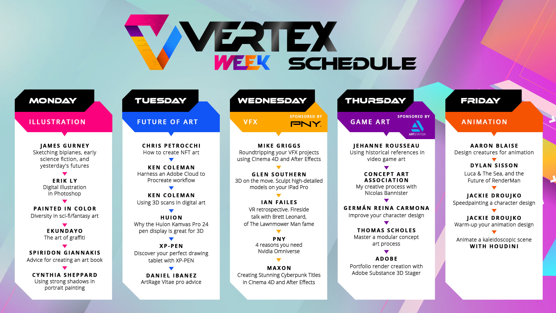
Vertex Week schedule
Luca and the Future of RenderMan
Warm up your animation design
Speedpainting a character design
Designing creatures for animation
We start Vertex Day 5, our animation special, and we begin with a look behind the lens with Pixar's Dylan Sisson. Let's begin…
Ooh, the future of RenderMan. Can't wait to see what is coming from Pixar.
Is it wrong we want a Woody Statue too. Guess we need to put in 20 years at Pixar.
Those stylised oval water wakes are fantastic. Nice to see how they were adapted from the book's illustration.
There's a photorealism to Pixar's current animations, but they've not left the stylised cartoon look behind. A really interesting balancing act of technology versus artistry.
RenderMan treats animations as if they are live action sets. The team can light and set up a scene as if it were a film set or photo studio. "It's a truly cinematic approach to lighting," says Dylan.
The Luca team put the director's vision ahead of realism. So things are fiddled with and adjusted to ensure the film looks artistic and not simply a recreation of real life.
This meant developing a post lighting shading using lighting filters, says Dylan. This enabled the film to have a warm, dappled approach to lighting shadows.
This was expensive, says Dylan, so used sparingly. It looks great.
Ah, Soul. One of the best animated movies in recent times. Who cried?
The history of RenderMan, has it been this long? Is there a favourite Pixar movie you'd like to see come back?
Pixar's come a long way from a walking lamp and Toy Story.
RenderMan RIS is free to try for yourself, visit the RenderMan website to take a look.
What's next? Increased image quality and control, says Dylan. Pixar wants to improve workflows for artists.
XPU is the next evolution of RenderMan, this is big. RenderMan XPU – the next-gen renderer from Pixar. Forget GPU and CPU, Pixar has XPU.
Wow, RenderMan takes 6.44 mins to render a scene. That's 11 times faster than the current RenderMan.
That light rendering demo is impressive. We can imagine there'll be some great films coming out of Pixar with XPU.
Croc-Ostrich! The Pixar walking Teapot is a little different to what we remember.
Pixar and ILM teaming up here.
'Phasor Noise' looks great. Dylan says it can look "wacky" or more real, like marble.
Pixar Vary looks like an amazing time saver.
This is cool, you can create and share your own libraries across Maya, Blender and Houdini.
Pixar is looking into creating more stylisation in its technology and we guess its movies. This could be interesting. It's interesting to hear how much harder it is to create stylised looks rather than photoreal animation.
This living illustration demo is giving us an A-ha vibe.
Competition time – who guessed the renders versus illustrations correctly?
You can apply traditional illustration techniques to these new stylised renders. Dylan shows us some training from a classic pen and ink art book.
The same ideas apply to Dylan's render in RenderMan. The focus on contrast replicates how a traditional pen and ink drawing would work.
"Style can attract the viewers," says Dylan.
Really interesting to watch the airship move from style to style within the same scene.
Red popping up in the corner there. Lovely movie.
Thanks Dylan, that was a great talk. Can't wait to see how Pixar is going to make use of some of this stylisation.
The first of today's live blogs comes to an end. Coming up later we have two tutorials from the excellent Jackie Droujko who will show how to warm up your animation design skills and then a speedpaint.
If you're inspired, take a look at our guide to the best drawing tablets for animation, and our feature on the best laptops for animation. Both can help you get started.
Remember, Dylan Sisson's talk can be rewatched at any time on the site.
We continue today's animation special with Netflix Animation Studio's Jackie Droujko. She'll be showing how to warm up your art skills. Let's start…
Jackie does a master study like this when she’s feeling unmotivated. She asks herself, “what are my goals?” Here she’s looking to understand shapes and improve her colour knowledge.
She says the goal is to improve her ‘artistic eye’.
Pay attention to the shapes. This character is “very soft,” says Jackie. The image is full of smooth shapes. Jackie is drawing over the original master painting to gain a better understanding of the shapes and how to break those down into her own interpretation.
Jackie’s not aiming to replicate this painting but draw it in her style as if she were designing it for animation. She’s considering how the character could move.
The necklace is large so Jackie considers making it larger or smaller. Does she make a feature or it to create interest or reduce it? The shapes are competing. These are the kind of thought processes that go into designing new characters for animation. Jackie is constantly looking at how to break down a character and exaggerate or focus on elements.
Remember the classic straights versus curves ideal, balance your character designs with straight and curved lines for dynamism.
Jackie uses two layers; one is the sketch layer and the second is for painting. It’s a simple approach, but she finds it freeing and keeps the style “nice and messy and sketchy”.
Jackie is keeping this warm up exercise loose and sketchy.
Jackie caught the colours nicely while updating them to her bolder, animation style. We love it!
Jackie has a second speedpainting tutorial coming up. You can follow along with us here in an hour or be cheeky and jump right in and watch her speedpainting a character design.
If Jackie has given you the drawing bug then we can help too. Take a look at our guide to the the best tablets with a stylus for drawing and note taking and if you're on a budget take a look at our list of the best tablets for students.
We're joining Jackie Droujko for her second tutorial of the day. The Netflix Animation Studios artist will be speedpainting a character design…
Jackie says she started an illustration with reference. She heads to Pinterest for inspiration, “that’s what it’s there for!”
She’s looking for 60s references, but something modern.
Rollerblades are a “fun vibe”
Know the use of your illustrations. Jackie explains this one is going to be used for her Patreon account, as an art print. She sets the size and keeps a black border for the frame.
With just a couple of pen marks Jackie has already managed to define the pose and tone of this illustration. “Fun angles and shapes,” she says.
Jackie uses the handy Liquify tool to fix some errors in her linart. “When a pose isn’t intense enough or has the right energy I use the Liquify tool to put the chest up higher and the waist further back,” says Jackie.
Notice how Jackie does the basics without really thinking about it, for example the arm on the right is the perfect example of using straight lines opposite curved lines to give the arm a sense of movement.
She brings in a van photo into the background to get a sense of perspective and proportion.
Nice idea – don’t feel you need to give the viewer everything. The can is hinted at but we see enough to know it’s a camper van.
“It’s kind of all over the place!” Luckily Jackie’s partner is at hand to paint the background (he’s an environment artist).
We believe you Jackie! Lovely character design.
Jackie usually uses fewer shadows and sticks with strong line art but because of this van background she has to add shadows to the character to connect her to the background.
The funky painted van texture is really cool, it brings the piece together. Notice Jackie is using a limited colour palette to bring the character and van together.
Photobashing – Jackie is dropping photos onto the van at low opacity to give the sense of a texture and form without needing to paint it all.
“Make life easier, not harder,” says Jackie.
That pillow trick was great – Jackie took a photo of an existing pillow and took its shape before painting over it. Neat.
Amazing work from Jackie, everything feels consistent. The shapes used to create the character and the angles Jackie has chosen really bring the image to life.
Oh, an art retreat in Morocco. Where do we sign up?
Thanks Jackie for another great tutorial. You can rewatch this video any time you like either on this live blog page or at the dedicated page, speedpainting a character design.
We have more tutorials this week too, if you missed them head over to the main Vertex Week 2022 hub page and pick a video workshop. We have plenty of guides if you want to replicate what Jackie has done here, such as our list of the best drawing tablet for artists or the best laptop for animation.
We're pleased to be following along to Aaron Blaise's exclusive workshop for Vertex Week, he'll be taking us through this design process. Let's begin…
Swish opening. The legend.
We’re getting an insight into how The Lion King was made now. Aaron’s pen strokes are so defined and purposeful.
It already feels like a lioness and he’s not even got into the art properly.
He’s looking for a flow through the body, which comes from studying animal anatomy.
Watching Aaron sketch in the muscle groups and bones is fascinating.
The magic is all in understanding those core shapes and the proportions. The six elements to every four-legged animal can be adapted. This, of course, comes from years of study and practice.
Aaron is demonstrating the basics of any animal design, if you want to create an alien or monster design these will stand as the basis for any concept. Using this knowledge can give you concept creatures a greater believability.
We're plantigrade. We learned something similar in Wednesday's tutorial from Glen Southern for sculpting on the iPad.
The lesson, know how the real animal works and then you can begin breaking it down to a stylised cartoon version for animation. Now we can bring in characterisation and personality.
The real lion cub is done. Now Aaron can begin taking it to a new level. We're going to see how The Lion KIng's Nala was designed…
"We want to be able to draw it over and over again," says Aaron who reminds us he was a hand-drawn animator. "Big shapes," are the key.
The lion has eyebrows – Aaron stole this from humans to give Nala more personality.
Big and chunky proportions of the kitten are adapted to create the Lion King's baby lion Nala. The flow remains the same to give it that readability and credibility.
"She's not built that differently to a real lion cub," says Aaron. "She's just smoothed out."
Adult lion time.
He says the lines and shapes and "burned into his brain" because he's drawn them for so many years.
A great lion, it's leaner and more aggressive than the lioness. Just a few shape changes, and add in the mane and he's really looking good.
"Having real lions in my head helps me," says Aaron.
The strings are being pulled together now, using his understanding of human anatomy and animal he can combine the two. Now Aaron is creating anthropomorphised designs, and we're getting into Brother Bear territory…
Or it's a big cat on two feet. But we believe it. Where's Brother Bear?
Amazing, those tine line details suddenly bring out a character. He kinda looks goofy.
"The more you know the better off you are," says Aaron.
This is great, Aaron is taking his quick design and beginning to work up a new pose, adding clothes and really bringing life to the character with a quick doodle.
"I create very quick gestures," says Aaron, then he shows how he goes in and redraws for extra clarity.
Just the bear necessities, Aaron?
The same six parts to the bear as the cat. The principle stacks up but the proportions change.
We all have our quirks and habits, Aaron likes to draw his animals slanted and then reposition.
The round shape Aaron starts with is a great way to break the sparseness of the page and begin getting some shapes and lines down.
Finding the place for the nose first then gives Aaron the proportions and from here he can begin finding the eyes, snouts, brows and cheeks.
It's interesting to watch Aaron draw in patterns, developing his characters in a similar way.
Using the same simple shapes Aaron can draw this bear in any position. We can now understand how the Disney style emerged, as artists like Aaron would need to draw these characters over and over again.
The principle still stands now.
That was amazing. He makes it look so easy. Aaron mentioned he's up for a Q&A there at the end, if you want to ask Aaron Blaise anything about his art head over to Twitter and send your questions to @AaronBlaiseArt.


