Few things get the graphic design world talking as much as a new Olympic logo. But when it comes to the brand new symbol for the 2026 Winter Olympics, it isn't just the design itself that's proving a talking point. The selection process was also unconventional this time around, with the public choosing the final design.
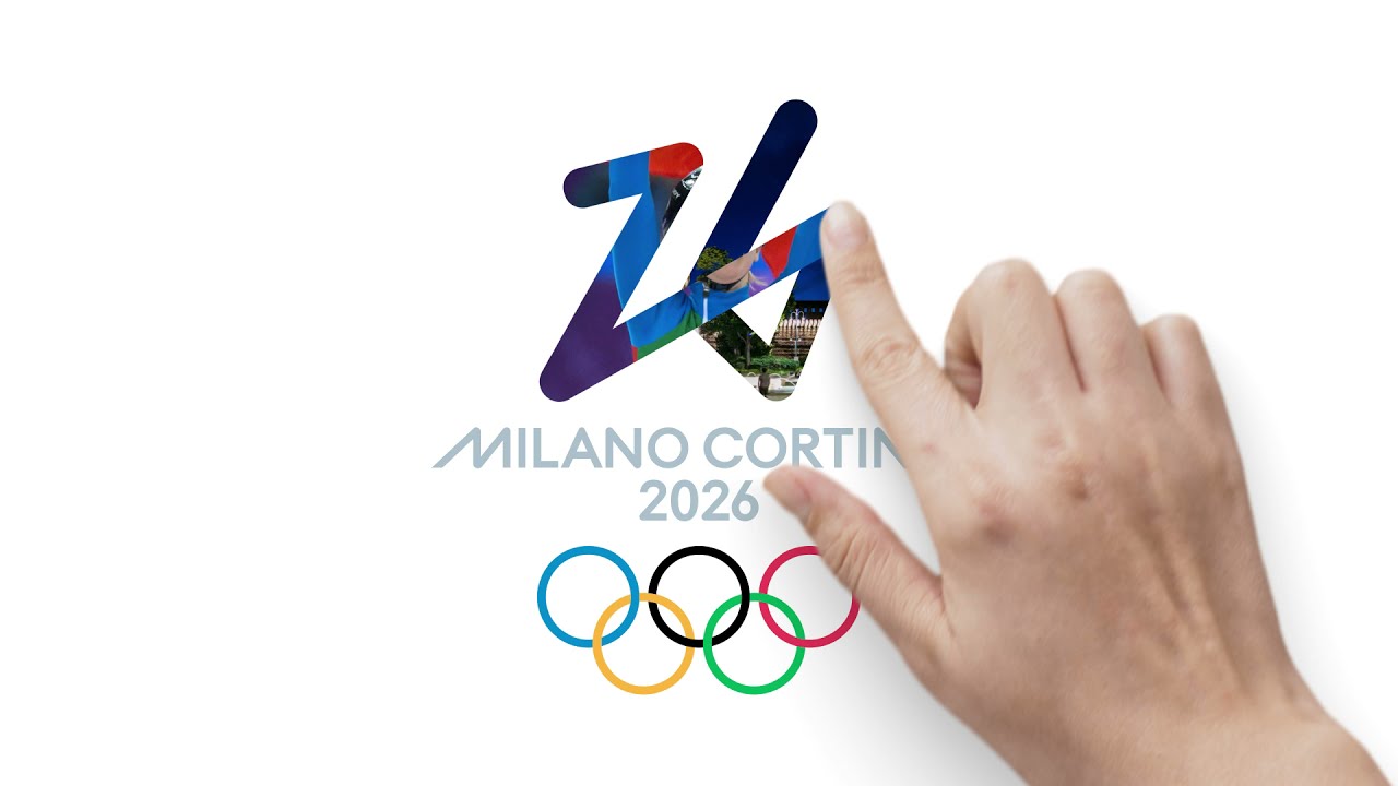
For the first time in history, the the decision was put to the people, with over 871,000 votes cast between two shortlisted designs. Over 75 per cent of the audience selected the winning design, 'Futura' (below), featuring a stylised '26'. (If you're looking for more inspiration, check out our logo design guide.)

According to a blog post on the Olympic website, the emblem traces a single ice-white line on the number to reflect "Milano Cortina 2026's ambition to place sustainability and legacy at its core".
"Influenced by the themes of sport, solidarity and sustainability, 'Futura' illustrates a dynamic and modern design that reflects some the fundamental values of its Olympic and the Paralympic Winter Games," says the games' coordination commission chair, Sari Essayah.

While hardly one of the best logos of all time, we're fans of the clean and crisp design. It works particularly well in motion – a new advert for the games (below) reveals how the design can be traced with a finger, which should lend itself to fun applications in subsequent ads (such as being traced on an icy window, perhaps?).
The design has received a mixed response online. Some are fans of the simplicity, whereas others are finding it a little dull. Curiously, many have commented that it reminds them of the logo for London 2012 (which is, of course, one of the most hated logos of all time).
They really pushed 26 but it looks dull. This reminded me of the 2012 London Olympics logo. https://t.co/0DByTamvWkApril 6, 2021
Of course, Olympic logos seem to face more scrutiny than most. From the brutally mocked Paris 2024 logo to the polarising LA28 design, criticising Olympic logos appears to be a sport in itself. If you're inspired to create your own design, check out today's best Adobe Creative Cloud offers below, and see our selection of the best Olympic poster designs for more inspiration.
Read more:

