We often take the logos we see everyday for granted, associating a certain shape with a well-known brand without considering the reasons behind the design. But many of the most famous logos have more to them than meets the eye, and the design secrets are still capturing attention on the internet – even if the branding has been around for what feels like forever.
This year threw out many logo secrets, from hidden elements to fascinating back stories. But we think these three examples are the most surprising. Whether this is new information or not, these logos deserve a moment to shine for their standout design, so good they deserve a spot in our best logos list. So, prepare to be shocked and awed as we sum up the three most surprising logo secrets of 2022.
01. Bluetooth
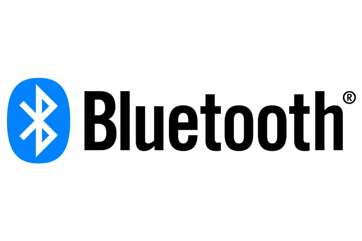
We see the Bluetooth logo in situ in a bundle of different situations, right? On boxes and at the top of our phone screens are just two. And until now, you might have assumed the Bluetooth logo is just a pointy little 'B'. But you'd be wrong.
In fact, the Bluetooth mark is hiding a secret message and intriguing story. Apparently, 'Bluetooth' refers to a Viking-era King with a bad tooth. Stay with us. The designers of the technology saw parallels between the functionality of the technology, which pairs PC and cellular devices, and the King, who united Norway and Denmark. Unsurprisingly, this was decided over a beer (or two. We assume.)
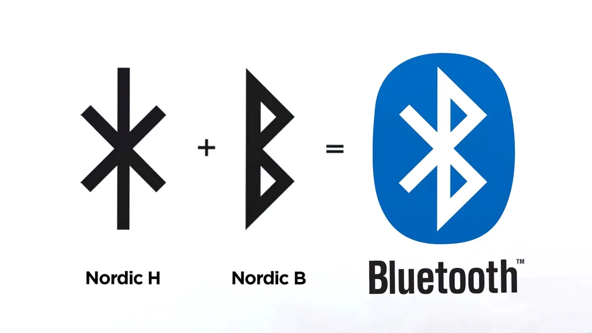
The icon itself hides a secret, too. Far from being a simple 'B', the icon is actually made up of two letters – the Nordic runes for 'H' and 'B', which stands for Harald Bluetooth (that 10th century King of Denmark).
02. Walmart
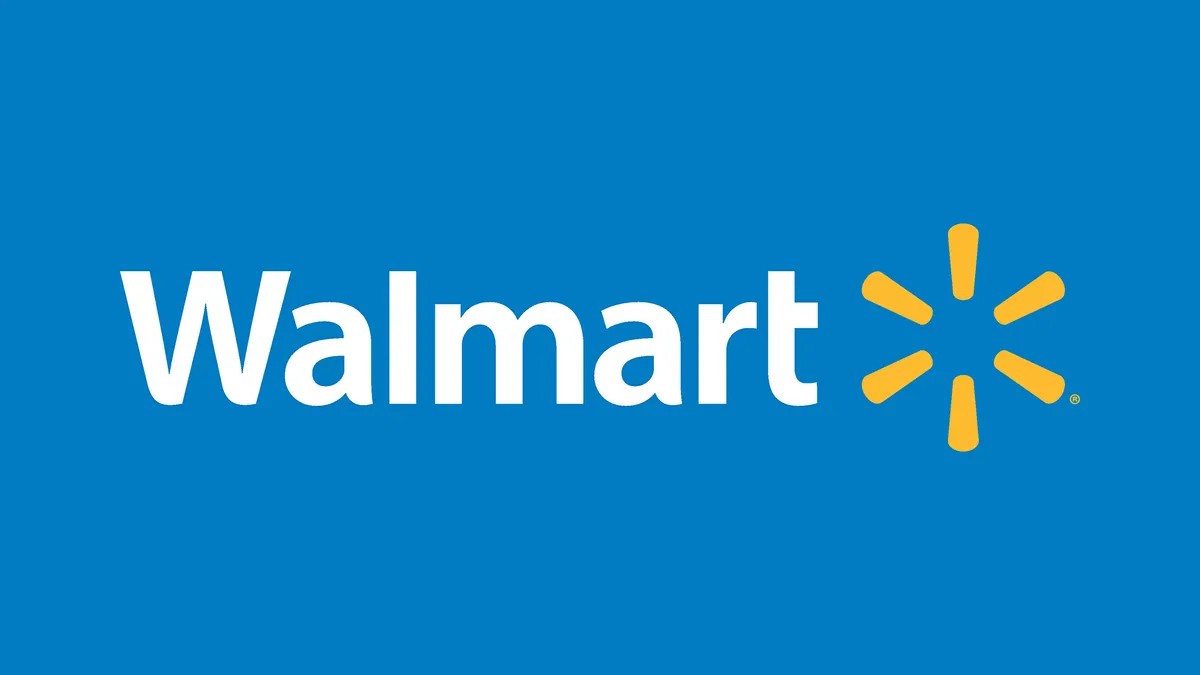
The Walmart logo is a sun, right? No? Okay, then... a flower? Wrong again. Actually, according to a blog post on Walmart's 'digital museum' (yup, that's a thing), the company's mark is actually based on the 'spark of inspiration' that prompted Sam Walton to found the first Walmart.
So, there you have it. The logo design is actually a spark. And each of the individual lines is called a 'sparklet'. Apparently, they represent each of the company's values – the customer, respect, integrity, associates, service, and excellence. We're not sure how to feel about that.
03. Vans

At first glance, the Vans logo seems pretty simple – a brand name with a nicely placed line coming from the V. But this year, the internet's collective mind was blown when some plucky folk realised there could be more to it.
The extended V looks exactly like the square root symbol. And this makes perfect sense because the brand's logo matches the equation for 'the square root of answer', which on a calculator, appears as '√ANS'. Pretty tidy.
Read more:
- How to design a logo: Tips for making your brand mark stand out
- Best free logo maker: Useful tools for designing logos
- World's oldest logo infographic baffles the internet

