I'm intrigued by what this new Nikon logo could mean
Logo design is an essential part of branding, and for serious brands, every variation and design tweak has a purpose and meaning. It's understandable then that the photography world is now poring over a mysterious new Nikon logo that the company has just trademarked in Japan.
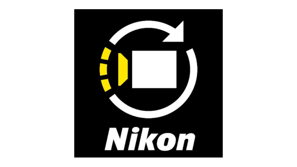
It's by no means the most sophisticated or attractive logo design. In fact, it's pretty ugly. But the big question is, what's it for? It shows a camera with the shape most usually used to represent video, ringed by an arrow that partly comprises broken yellow lines. The usage descriptions in the application are very much on the vague side, generating even more intrigue. Could it mean we have a new device for our list of the best cameras?

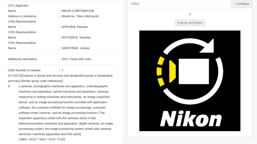
Could it be a logo design for a new range of video or vlogging camera, or even a 360-degree camera? Perhaps new video editing software or a video playback feature? The speculation in online photo communities is intense. The logo trademark application, numbered 2023-006460, was submitted to the Japan Patent Office on 24 January and is currently "awaiting examination". It was noticed and brought to public awareness by the Nikon Rumors website.
Logo trademark applications are often intentionally very broad in their language, partly to avoid giving anything away to competitors and partly to protect as many possible uses of the logo as possible to prevent someone else getting there first. Nikon's application is no exception, with cameras, photographic machines and apparatus, cinematographic machines and apparatus, an image inspection device, and an image processing function provided with application software, image processing computer software and smart cameras just some of the listed uses.

That doesn't help narrow down the mystery, but one person commenting on Nikon Rumors has made a connection with Nikon Creates, – the new video production subsidiary that Nikon announced in April last year and which seems to be a bid to enter the area of volumetric content creation (Volumetric capture uses multiple cameras and sensors in order to create a full volume recording of the subject).
So it makes sense that the new logo could be for the Nikon Creates Corporation, representing its focus on video for entertainment and advertising divisions. And it's expected that this move will see the company create new hardware, for example a 360-degree video camera, perhaps.
On the other hand, the circular arrow looks not unlike the kind of icon we associate with recycling, and some have pointed out that many companies are looking to get their own teeth into the thriving second-hand tech market or developing initiatives to extend the circular economy of their devices.
Sign up to Creative Bloq's daily newsletter, which brings you the latest news and inspiration from the worlds of art, design and technology.
Nikon's issued a save-the-date for March 25. Many think the headline announcement will be the rumoured Nikon Z8 camera, which is expected to be smaller and more affordable than its flagship Z9 (see below), but there's just a chance we might get some clues as to the meaning of this mystery logo.
Read more:

Joe is a regular freelance journalist and editor at Creative Bloq. He writes news, features and buying guides and keeps track of the best equipment and software for creatives, from video editing programs to monitors and accessories. A veteran news writer and photographer, he now works as a project manager at the London and Buenos Aires-based design, production and branding agency Hermana Creatives. There he manages a team of designers, photographers and video editors who specialise in producing visual content and design assets for the hospitality sector. He also dances Argentine tango.
