Netflix has a 'new' logo – and it's driving Stranger Things fans wild
Spooky stuff.

Unless you've been living in the upside-down, you're probably aware that the fourth series of a certain 80's-set sci-fi series has just landed on Netflix. Yep, Stranger Things is back – and it seems it's brought with it a rare update to the famous Netflix ident.
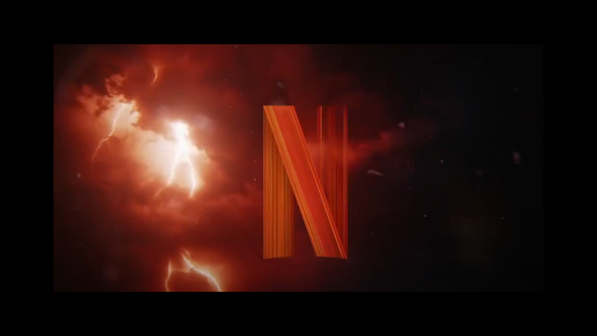
Fans immediately spotted that the opening Netflix logo (you know, the 'DUH-DUNNN' one), looks a little different at the start of Stranger Things season 4. Instead of a plain black background, the animated 'N' appears against a red sky, complete with crashing thunder. (Looking for more inspiration? Check out the best logos of all time.)
The logo animation is so cool! @netflix #StrangerThings #StrangerThings4 pic.twitter.com/diANhXiVWPMay 27, 2022
Indeed, it looks rather like the ident is being beamed straight from the upside-down, the series' spooky "alternate dimension existing in parallel to the human world" (thanks, Stranger Things Wiki). And hey, perhaps the 'N' itself is upside-down? We'll never know because, well, it's an 'N'.

Netflix isn't known for playing with its visual identity (that's often left to the fans – check out this awesome interpretation of the logo made of yarn). And it's a testament to how much Netflix gets watched that the Easter egg is by no means going unnoticed.
i love how the netflix logo animation in front of stranger things 4 fits the style of the show. i hope more shows start doing this pic.twitter.com/YtIy4NmWHqMay 30, 2022
Netflix customizing their logo for Stranger Things shows that even they know this is their single biggest deal program.May 30, 2022
STRANGER THINGS HAS IT’S OWN NETFLIX LOGO THAT IS SO SICKMay 27, 2022
It'll be interesting (to an extent) to see whether Netflix decides to give other shows the special ident treatment, or whether the treat remains solely reserved for its biggest blockbuster. In the meantime, if you want to design an ident of your own, take a look at our guide on how to design a logo.
Read more:
- The Apple logo has a surprising history
- Is this really the most offensive logo?
- Walmart is still angry about Kanye's new Yeezy logo
Sign up to Creative Bloq's daily newsletter, which brings you the latest news and inspiration from the worlds of art, design and technology.

Daniel John is Design Editor at Creative Bloq. He reports on the worlds of design, branding and lifestyle tech, and has covered several industry events including Milan Design Week, OFFF Barcelona and Adobe Max in Los Angeles. He has interviewed leaders and designers at brands including Apple, Microsoft and Adobe. Daniel's debut book of short stories and poems was published in 2018, and his comedy newsletter is a Substack Bestseller.

