Chinese tech brand Xiaomi is certainly one for experimentation. From transparent TVs to USB-powered fish tanks (seriously), the company is known for its weird and wonderful gadgets. But if you were expecting its new logo, revealed at the company's 'Mega Launch Event', to be as innovative as its products, prepare for disappointment.
In a 20-minute presentation, Xiaomi revealed a "brand new" logo – which is basically its old logo with slightly rounder edges (insert joke about the company cutting corners). Let's just say, the new design isn't exactly logo inspiration goals.

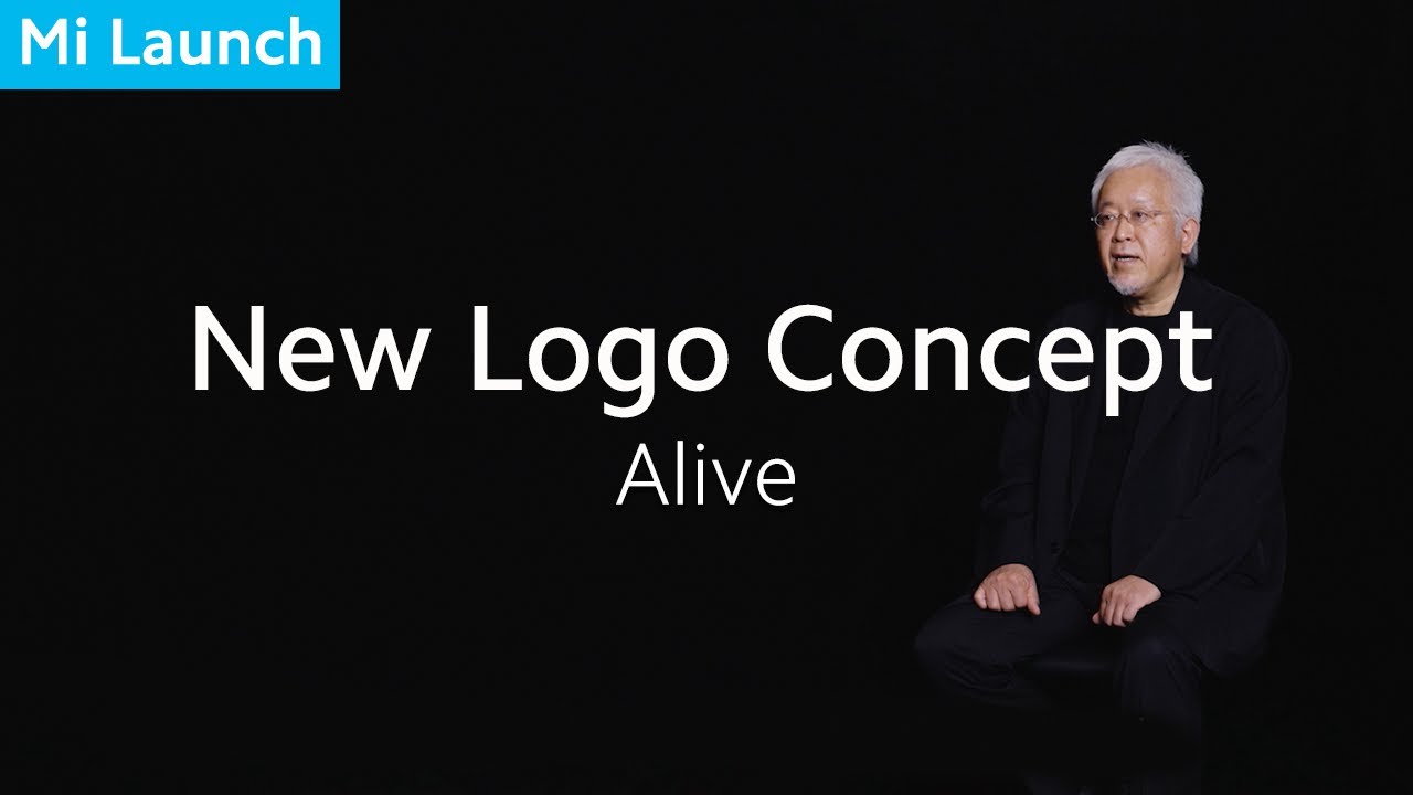
In a launch video (below), designer Kenya Hara claims that the new logo "is not just a simple design of the shape," but it in fact an "encapsulation of Xiaomi's inner spirit". In fact, the logo is intended to convey the essence of a single word: Alive. Okay, then.
According to Hara, the team used the power of mathematics to try to find the perfect middle ground between a square and a circle (a squircle?). In the end, out of twenty-four options (below), the team opted for shape n:3. Whether or not n:3 looks more 'alive' than the rest is up to you.

Perhaps we're being a little unfair to Xiaomi. Not every rebrand can (or should) include an entirely new logo design – and to be fair, the slightly rounder version looks a little more contemporary. But did the company really need to dedicate 20 minutes of stage time to some slightly rounded edges? (Hey, it isn't the most absurd logo reveal we've seen). If you want to make your own logo, see today’s best deals on Adobe software below.
Read more:

