There's been a clear trend in car logos over the past few years. One by one, most of the big car makers have dropped the gradients and 3D touches added in previous decades for simpler, flatter designs. That script-based Ford logo was one of the last to resist, but it seems that it's finally given in.
The brand has unveiled a revamped F-150 and the pickup sports a new Ford badge. But with no announcement of the change, some people may not even notice it. The design drops the chrome look of the previous logo and uses a slightly larger application of the script with simple white accents. If it looks familiar, that's because it's very similar to the classic design used back in the 1960s. We think it still deserves its place in our pick of the best cursive logos and the best big brand logos.

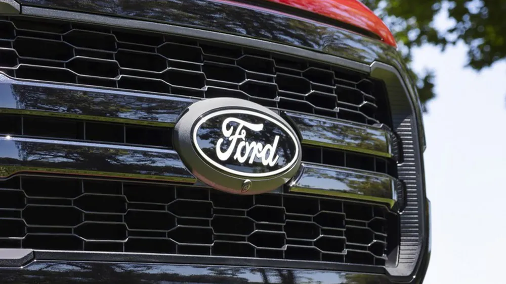
The new Ford badge retains the classic stylised Ford script that's been used in various forms since it was developed by the company’s first chief engineer, Childe Harold Wills, in 1909. The oval, first introduced in 1912, is also present and familiar. But the design has been simplified, making it more similar to how it looked when it was reworked by the great designer Massimo Vignelli in the 1960s.
The Chrome finish and out border have been replaced with simple white, and the inner border has been removed, allowing the text to be enlarged slightly to fill the space. The design doesn't constitute much of a surprise. In fact, it's perhaps more surprising that it took Ford so long to join the trend, which has seen a mixed response (see our round up of the good, the bad and the ugly of car logo redesigns). But with a logo as recognisable as Ford's, it was wise not to introduce a more radical change.

