
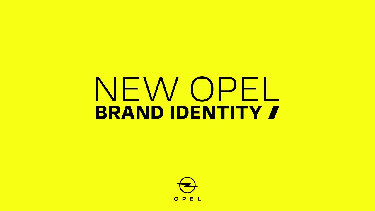
With all the car logo redesigns around recently, it would be fair to call 2020 the year of the automobile rebrand (nothing else has been going on, right?). Well, we've got another one for you and, while it follows the same flat design trend of all the others, we think Opel's rebrand has got just enough zing to stand out from the rest.
We love the new typography (especially the spacing) and perfectly-angled lightning strike-style 'Blitz' logo (see it below) – which are clean and eye-catching. Although the old design has merely been tweaked, what has been changed streamlines the branding and serves as some serious logo design inspiration.

When we said 'zing', you probably expected us to mention the eye-wateringly yellow colour palette straight away. It's called Neon Opel Yellow and, while it is endlessly zingy and definitely stands out from the more mundane redesigns we've seen from some of Opel's competitors, it seems a little obvious to decide to rebrand as 'bold' and choose such an in-your-face colour.
However, the colour is meant to represent electricity (because electric power is the future of the industry) and we agree it would be hard to think of a better colour for that purpose – it's certainly electrifying. The contrast against the simplicity of the black logo is striking too, and it's energising to see something so different in the world of car branding.
Though the logo changes are discreet (check out the process in the above video), they serve the brand's aim of slimming down, with the elongated and thinned out logo actually looking much more sleek and modern. But, in essence, the black logo is kind of more of the same flat design seen elsewhere, not likely to set the world alight without the accompanying background.
According to Opel, the redesign aims to make the branding more "pure" and "bold" as well as serving as a "detox", and we'd say the simplicity serves the aim – especially the new font (Opel Next), which packs a real punch.
Want to explore some of the other car logo redesigns this year? See the updated Nissan logo here and the Toyota logo here. And if you think you know car logos, you can test your knowledge with this surprisingly tricky quiz.
Read more:

