Kia’s new logo is a LOT cooler than its old one
Sawtooth-based design is sure to turn heads.

Kia isn't exactly an automotive brand that you associate with exciting design. We've nothing against its cars – they have plenty of decent qualities and certainly tick many of the right boxes you might look for in a new motor – but it's definitely one of the more functional marques. No teenager has ever plastered their bedroom wall with photos of the latest Picanto, is what we're saying.
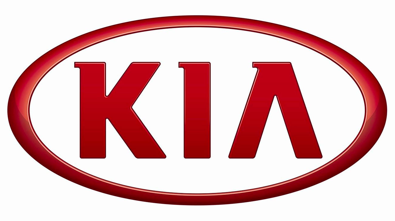
To its credit, though, Kia at least seems to realise this, and now it's moving to reposition its brand as something a little more thrilling and forward-looking. Its current logo's never going to turn up in anyone's list of best logos. A lot like Kia's cars, it's perfectly serviceable. It looks like someone typed out KIA in the first sans-serif they could find, then livened it up a bit by adding a few serifs with a chisel-tip marker and cutting out the crossbar on the 'A'. Yeah, that'll do.

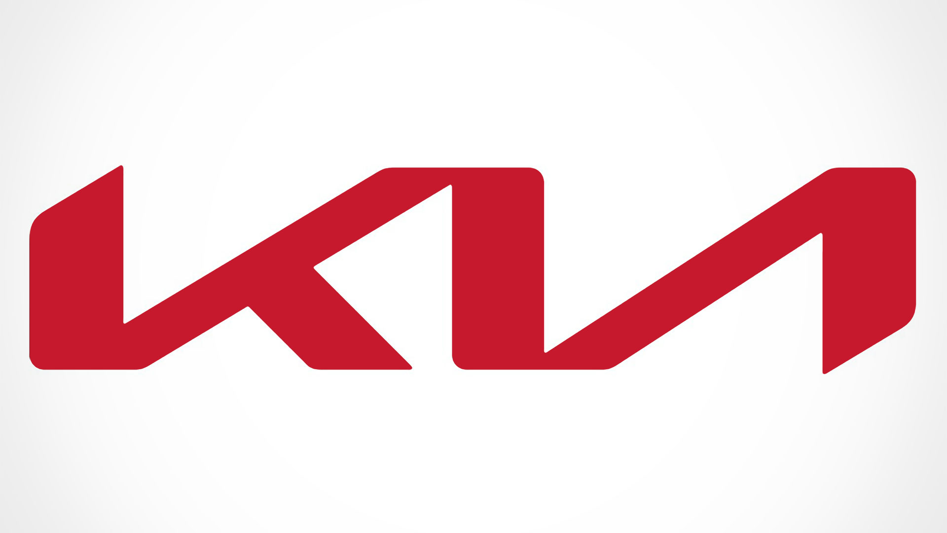
The new Kia logo, recently discovered within a Korean trademark filing, Kia is definitely putting a lot more effort in. The new design is a sleeker, racier number that still loses the crossbar off the 'A' but carries everything off in a much more stylised way, ditching those half-hearted serifs and instead arranging the logo in the form of a sawtooth wave. It's just the leg of the 'K' that turns it into a splendidly minimal representation of Kia's name.
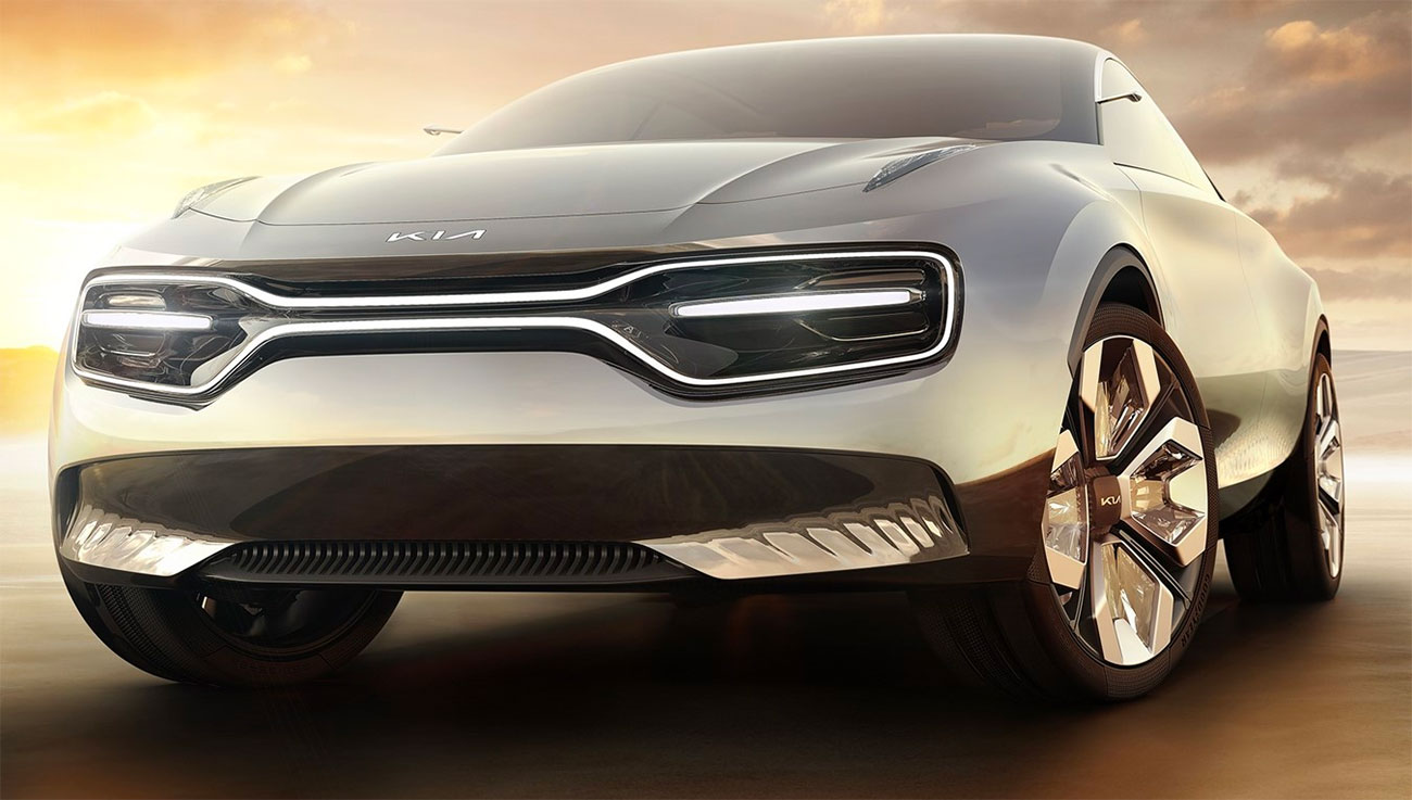
This new design's clearly been in development for a while; the original filing was made in July, and back in March a similar logo was spotted at the Geneva motor show, adorning the nose of Kia's all-electric concept car, named 'Imagine by Kia'.
It's worth pointing out that this isn't the exact same logo. The one on the front of the Imagine featured similar letterforms to the one in the new logo, but they weren't connected as in this latest version.

It's not entirely clear how Kia intends to use this new logo design. It's been suggested that the swish new logo will be used on high-end electric vehicles and SUVs, while the sensible motors that everyone associates with the Kia brand will continue to use the boring old logo. We hope not, though; we'd like to think that Kia's finally getting its design act together and sprucing things up across its entire output.
Don't hold your breath, though; the logo's yet to be officially approved. If Korean trademark filings are your thing, you can find Kia's application here.
Sign up to Creative Bloq's daily newsletter, which brings you the latest news and inspiration from the worlds of art, design and technology.
Related articles:

Jim McCauley is a writer, performer and cat-wrangler who started writing professionally way back in 1995 on PC Format magazine, and has been covering technology-related subjects ever since, whether it's hardware, software or videogames. A chance call in 2005 led to Jim taking charge of Computer Arts' website and developing an interest in the world of graphic design, and eventually led to a move over to the freshly-launched Creative Bloq in 2012. Jim now works as a freelance writer for sites including Creative Bloq, T3 and PetsRadar, specialising in design, technology, wellness and cats, while doing the occasional pantomime and street performance in Bath and designing posters for a local drama group on the side.

