New Staples logo does what it says on the tin (sort of)
Staples has straightened out its brand with a new logo.

Sign up to Creative Bloq's daily newsletter, which brings you the latest news and inspiration from the worlds of art, design and technology.
You are now subscribed
Your newsletter sign-up was successful
Want to add more newsletters?
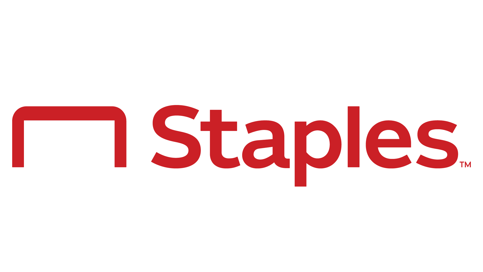
Is it a staple? Is it a table? Nope, it's the new Staples logo, which was revealed earlier this week with dramatic fanfare. The office supplies company, which currently operates over 1,500 stores in North America, revealed the new branding alongside five new internal product ranges designed to appeal to its business customers.
At the heart of the rebrand is the new symbol, which looks like a straightened out version of the staple found in the company's previous logo (below).

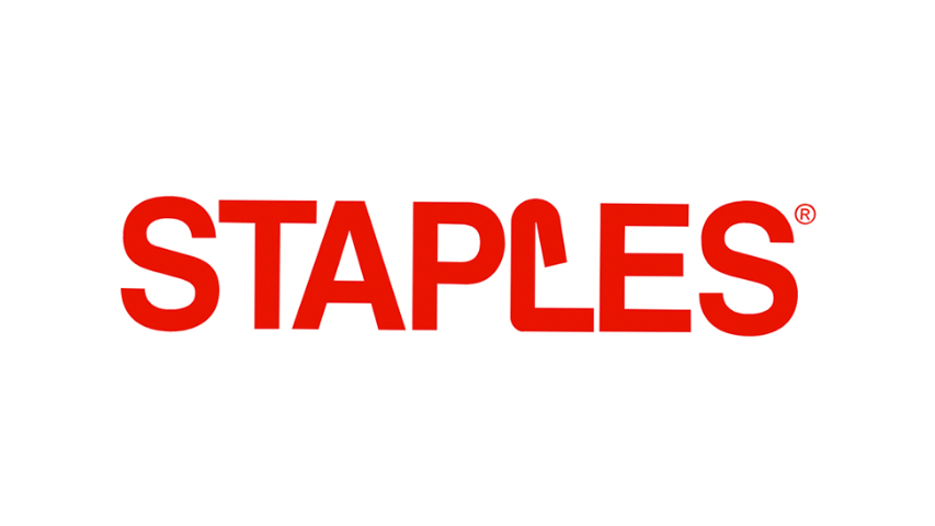
In that logo design, which had been going strong for over 25 years, the staple motif was worked into the brand name, complete with a bent end to keep the name legible. This was a nice, personal touch that's sure to be missed by shoppers, but Staples felt it was time to modernise.
Article continues belowGiven that a straightened out staple is going to function better than a bent one, we can't fault the logic behind the rebrand. It's an elegant way of communicating that Staples will help businesses work.

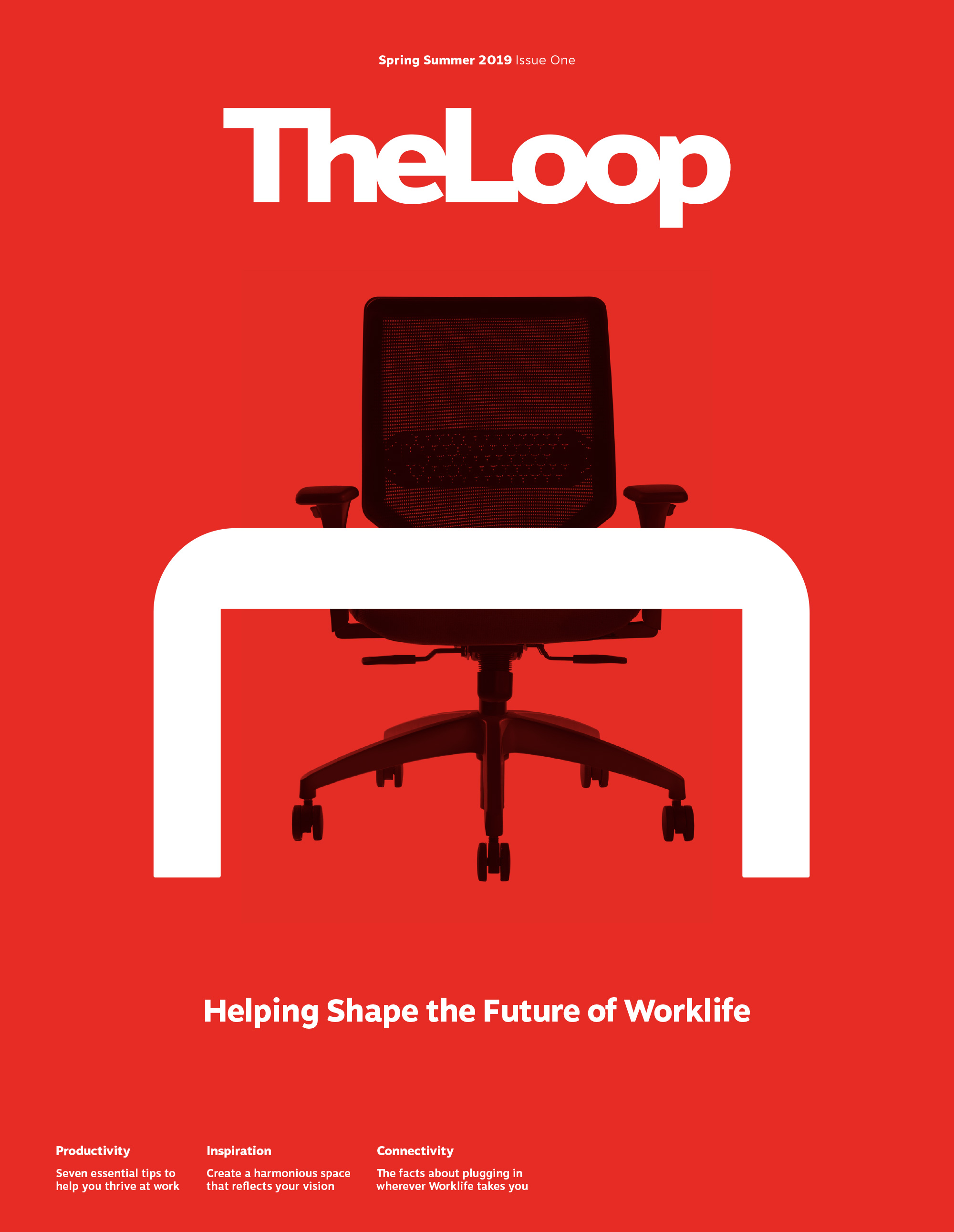
However, there's a bit of ambiguity around whether it's even a staple at all. Other promotional material position chairs behind the motif, turning it into a table.
Maybe we're over-thinking it, but if your brand name is staples and the big staple-looking symbol next to the word staples isn't a staple... maybe you've missed the mark? We'd ask the team behind the rebrand for some clarification, but nobody has been credited for the design.
Either way, the enthusiasm of the Staples team in the announcement video is enough to make the rebrand work. Just ignore the fairly nightmarish delivery of the guy who says "your work and your life are one".
Sign up to Creative Bloq's daily newsletter, which brings you the latest news and inspiration from the worlds of art, design and technology.
While this might not sound like the work-life balance that creatives crave, at least Staples seems genuinely passionate about creating a comfortable working environment furnished with the best office chairs, tables and stationery.
Don't believe us? Check out the announcement at the 2019 Sales Conference, which was even more dramatic.
Related articles:

Dom Carter is a freelance writer who specialises in art and design. Formerly a staff writer for Creative Bloq, his work has also appeared on Creative Boom and in the pages of ImagineFX, Computer Arts, 3D World, and .net. He has been a D&AD New Blood judge, and has a particular interest in picture books.
