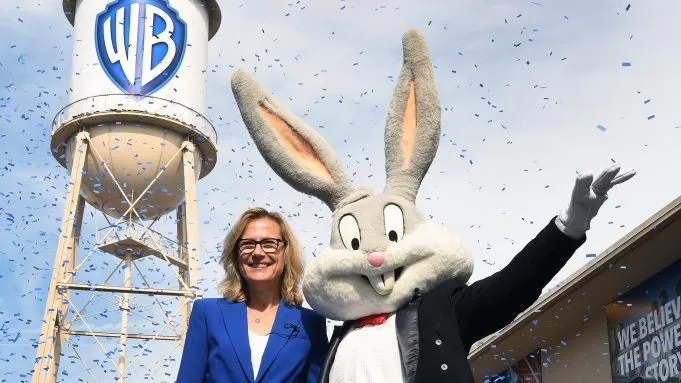
Warner Bros, the home of programming spanning from Looney Toons to The Sopranos, is approaching its centenary and has celebrated with a logo transformation. The streamlined update of its time-honoured shield has been unveiled on the famous water tower in the Burbank lot in the presence of more than 500 employees – and a super-fancy Bugs Bunny.
The original logo which must be up there with the greats (see here for our guide to great logo design), has been part of the Warner Bros brand since 1923, but has now been refreshed and modernised to take the company into its second century. Ditching the shiny gold/yellow that's been such a feature so far, the shield itself is now blue and the iconic lettering is now in a striking white.

Pentagram is to thank for the studio's cohesive new brand image, which will tie together the many branches of the studio's output. The team, headed up by Emily Oberman, tweaked the original design in an update described as a reincarnation rather than a reinvention.
Dee Dee Myers, Warner Bros' executive vice president of worldwide corporate communications and public affairs, described the old visual identity as "a little dated", but it was the mismatch of identity that seriously needed to be addressed – the "logo soup" across departments needed to go.

That's where the Pentagram team stepped in, not to totally overhaul the design but to tweak and streamline the brand for modern platforms, and the modern era. Oberman told Fast Company that the shield has been reimagined to look "more sleek and clean", put into a golden ratio and thinned out. The letterforms were also redrawn to give more of a sense of balance, as the process below shows.
The dimensional quality of previous logos hasn't been lost altogether though, as there are now two versions of the logo in play. The dimensional version will be used by the TV and Film departments, with the flat logo in use everywhere else.
Reactions to the change are lacklustre on Reddit, with some users wondering what exactly had changed. Commenter heyimjared asked, "What's new about it? The "B" is angled now?".
And others stated their dislike outright. "Doesn't have that glamour to it. I like flat designs but this one I despise", said user thoughtsmachine.
On Twitter, opinions were more mixed, but it's clear the reincarnation isn't setting the world on fire.
Eh, I don't mind it too much. Gives me an old-fashion vibe with the simplified logo. Hopefully the execution of it works nicely.November 13, 2019
And user Elf340 would rather WB returned to the retro version.
No thanks, I'd rather have this back. pic.twitter.com/fXzIN4gpK6November 13, 2019
Accompanying the logo is a brand-new mission statement to drive the company ethos forward. Putting storytelling firmly in the centre, Warner Bros' aim is “to be the world’s leading creator and distributor of extraordinary entertainment by partnering with the world’s most inspiring storytellers.”
The company's brand message is now summed up in a simple sentence.
"We believe in the power of story.”
It's a snappy, succinct assertion. And with WarnerMedia gearing up to release its streaming service, HBO Max (coming next year), Warner Bros' is clearly stating its intention to be a serious competitor in the crowded streaming marketplace.
Rather than a total design overhall, it's tweaking a classic logo that seems to be popular right now (see Reebok's redesign), especially for a brand with so much history. It's a branding choice that keeps consumers connected to a company's history whilst stating its intention to march towards the future.
Read more:

