New Bond 25 poster released – and we're majorly underwhelmed
No Time to Design?
Sign up to Creative Bloq's daily newsletter, which brings you the latest news and inspiration from the worlds of art, design and technology.
You are now subscribed
Your newsletter sign-up was successful
Want to add more newsletters?
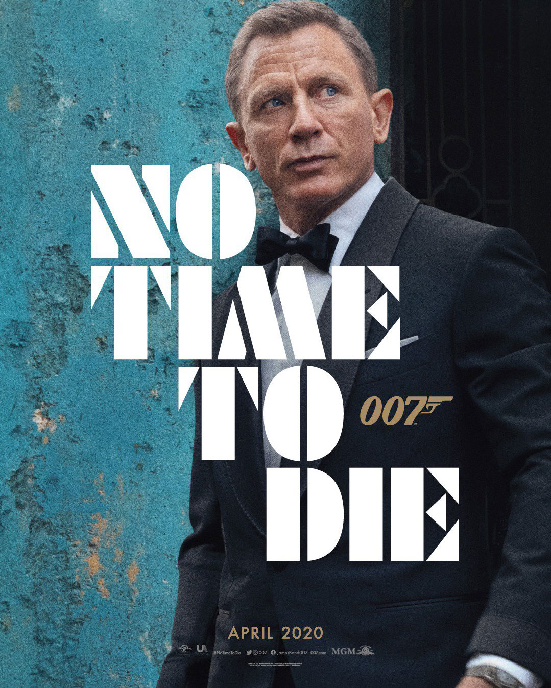
Saturday was James Bond day and fans of the British spy were treated (we use the term loosely) to a look at the first poster for upcoming Bond film No Time to Die.
The poster sees Daniel Craig doing his usual smouldering thing up against a faded turquoise background. It also shows that same font we saw in the killer typographic logo, released earlier in the year (read more about the No Time to Die logo here). The text, of course, reads No Time to Die. And the 007 is also present and correct. But to be honest, there's not a lot more to it.

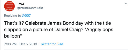
The poster has been met with a mixed reaction online. A lot of people are not happy with the look and feel of the poster. Some felt that there could've been a lot more to the poster design (see our favourite poster designs here).
Article continues below 
Others felt that the design team had had 'no time to create'.
No Time To Die. Did the design team have no time either to come up with this? 😳October 6, 2019
And some picked at the font, saying it was hard to read. One Reddit user, bobrformalin even said it was "worse than papyrus". Ouch.
Although of course, there are plenty hardcore fans who are just excited about the film, glad to see the poster, and desperate for a glimpse of the trailer.
Overall, we can see why the No Time to Die poster may be underwhelming for Bond fans. It doesn't exactly scream of slick action that'll set your pulse racing. Mainly, Daniel Craig just looks a bit like he's kind of wishing he hadn't signed up for another Bond film.
Sign up to Creative Bloq's daily newsletter, which brings you the latest news and inspiration from the worlds of art, design and technology.
It's not quite as bad as that Spider-Man poster though.
No Time to Die will be out in the UK on 3 April 2020, with the US release following a few days later on 8 April 2020.
Read more:

Rosie Hilder is Creative Bloq's Deputy Editor. After beginning her career in journalism in Argentina – where she worked as Deputy Editor of Time Out Buenos Aires – she moved back to the UK and joined Future Plc in 2016. Since then, she's worked as Operations Editor on magazines including Computer Arts, 3D World and Paint & Draw and Mac|Life. In 2018, she joined Creative Bloq, where she now assists with the daily management of the site, including growing the site's reach, getting involved in events, such as judging the Brand Impact Awards, and helping make sure our content serves the reader as best it can.
