Original The Simpsons style guide reveals fascinating character design secrets
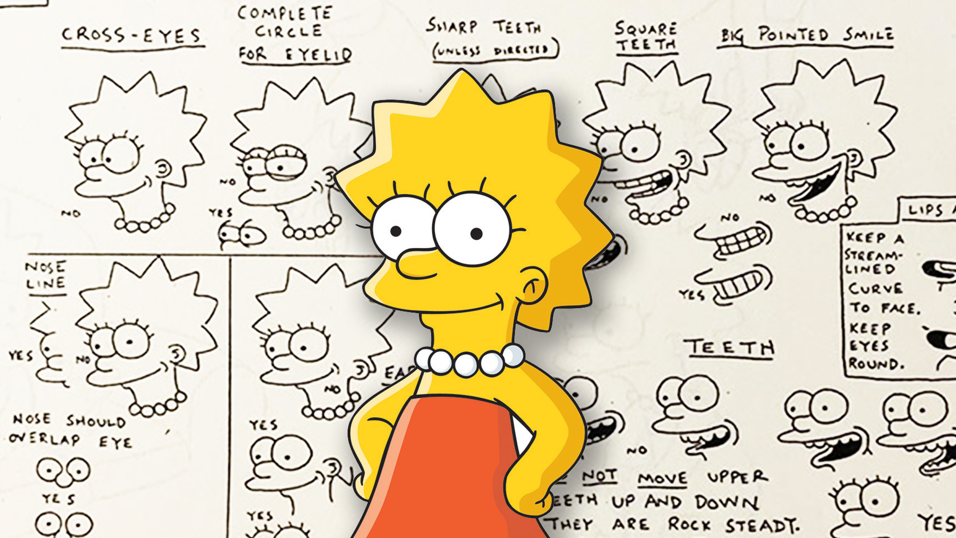
What shape are Lisa Simpson's teeth?

Sign up to Creative Bloq's daily newsletter, which brings you the latest news and inspiration from the worlds of art, design and technology.
You are now subscribed
Your newsletter sign-up was successful
Want to add more newsletters?
It's one of the most recognisable animations around, and it's hard to imagine a time before each of The Simpsons' main character designs were forever etched on our consciousness. But a fascinating glimpse at an early 1990s style guide shows just how precise those seemingly simple drawings really are.
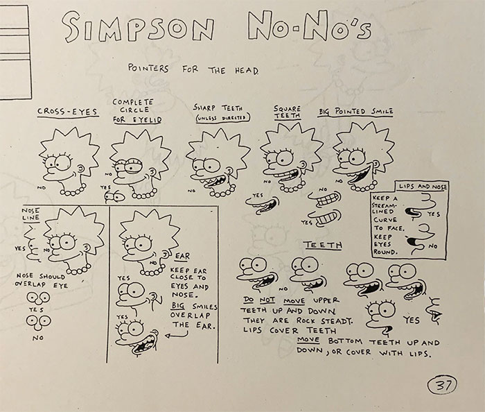
For Simpsons writer Josh Weinstein shared a photo of a hand-drawn page titled 'Simpsons No-No's', demonstrating various characteristics you'll never see on screen. Did you know Lisa Simpson has very specifically shaped teeth? (Check out the best character design tips if you're looking for inspiration.)
What you will never see on the Simpsons (from a delightful, nearly 500 page early style guide, circa 1990) pic.twitter.com/0Gyv36UOqWApril 22, 2020
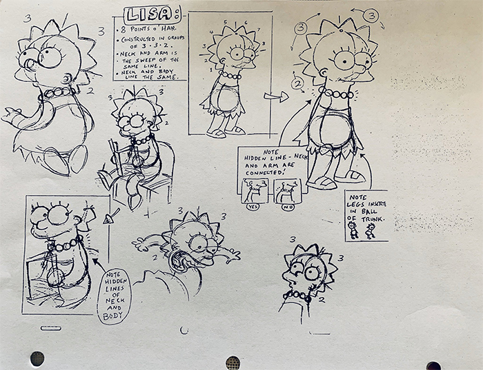
Weinstein only shared two of the document's 500 pages – and like countless Simpsons fans in the replies, we'd love to see the whole resource published one day. But even in those two Lisa-centric pages, there's a mind-boggling amount to chew on.
Article continues below 
From just these pages, we've learned that Lisa's nose should always overlap her eyes, her smile shouldn't be pointy, and those teeth should never, under any circumstances, be square. It's a fascinating glimpse at how much discipline and precision goes into even the most apparently uncomplicated character designs.

The pages went viral on Twitter when Weinstein shared them back in 2020, and have been doing the rounds on Reddit since. "I love animation bibles/model sheets like these," one Redditor comments. "They really speak to the level of draftsmanship animators have. Even the silliest cartoons are best guided by understanding of 3-D space and anatomy and natural laws." Another adds, "What's neat about this is I could immediately tell which one is wrong even if I didn't know exactly why." As Weinstein himself puts it on Twitter, "The Simpsons could’ve become Bizarro Simpsons with any of these choices."
Indeed, any changes to a beloved character design can prove a controversial topic – just look at the reaction to this year's tweaks to Minnie Mouse and the green M&M. Still even a familiar design can look entirely different from a new angle – the less said about Mickey Mouse from above, the better.
Read more:
Sign up to Creative Bloq's daily newsletter, which brings you the latest news and inspiration from the worlds of art, design and technology.

Daniel John is Design Editor at Creative Bloq. He reports on the worlds of design, branding and lifestyle tech, and has covered several industry events including Milan Design Week, OFFF Barcelona and Adobe Max in Los Angeles. He has interviewed leaders and designers at brands including Apple, Microsoft and Adobe. Daniel's debut book of short stories and poems was published in 2018, and his comedy newsletter is a Substack Bestseller.
