Stranger Things fans will probably know that season two of the 80s-styled smash hit is landing on Netflix today. Those of you who are counting down the minutes until you see that retro red lettering lighting up your screen again will be interested to hear that the opening sequence was originally going to look very, very different.
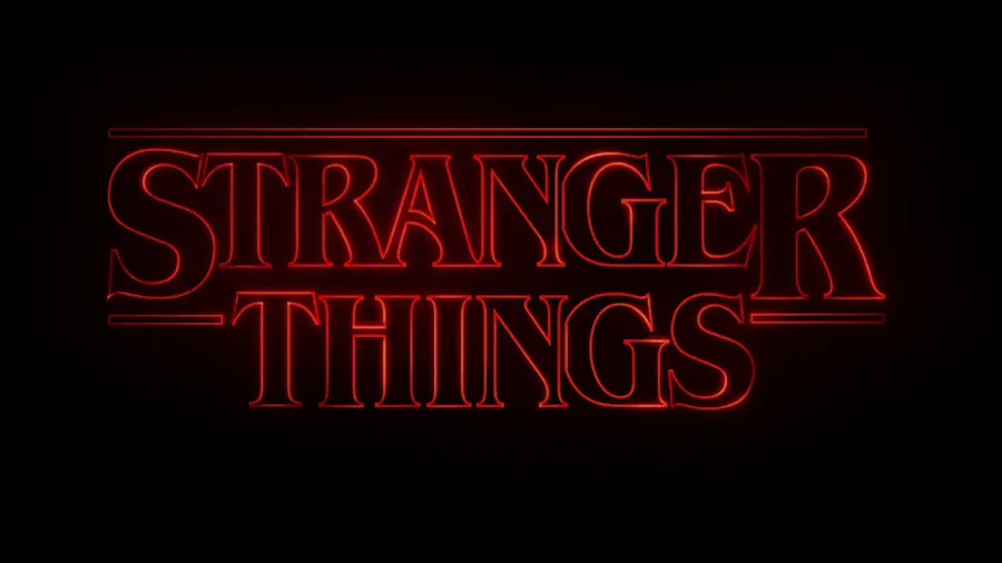
The show name is set in ITC Benguiat, created by the legendary typographer of the same name. This retro typeface sits perfectly with the vibe of the show, harking back to the Stephen King novel covers of that era.
So it will come as some surprise that originally, the plan was to go for something much more modern. Here are some of the options that didn't make the cut (via Time).

This option clearly references the distinctive logo for Alien, created by R/GA co-founder Richard Greenberg. The approach makes sense given the movie's solid links to 80s pop culture – the first film was released in 1979.

A second option uses a typeface with a similar style, but in a heavier weight. The glowing lettering and backwards 'E' help point to the uncanny, eerie mood of the show.

Another discarded version looks more like something from a Marvel film than a retro horror series, but we can see the beginnings of the interlocked character concept that was carried through to the final design.
The actual sequence starts with an extreme close-up on the lettering, so it's initially impossible for viewers to make out what they're looking at. The floating letters eventually slot into place and lock together to reveal the title. The concept was intended to mirror the series' plot.
While initial experiments favoured ghostly greys and whites, the final lettering is in bloody red – a perpetual favourite of horror branding, but undeniably effective. The retro vibe is emphasised through the inclusion of glitches and imperfections that make it look like the sequence was made in a pre-digital era (and, of course, echo the moments in the show when the monsters of the Upside-Down approach our world, fairly lights aflicker).
To put together the Stranger Things opening credits, show creators Matt and Ross Duffer collaborated with Imaginary Forces. The visual storytelling agency has impeccable pedigree – it's the studio behind the iconic title sequence for Mad Men, and has worked with brands such as Game of Thrones, Transformers and Marvel – so it's no surprise that the title sequence is a winner.
[Via Time]
Read more:

