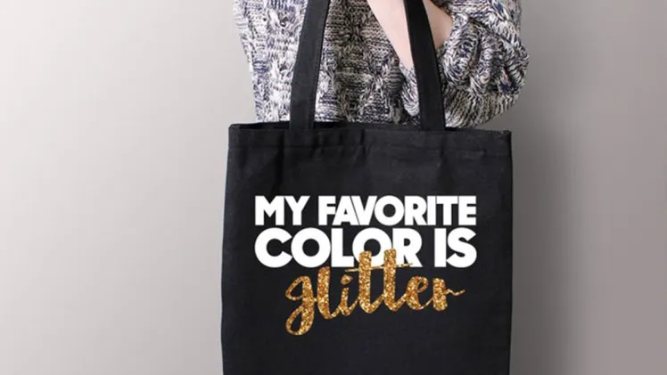
We’ve seen some amazing examples of questionable kerning in our time – but this tote bag from online fashion store BelleChic illustrates all too clearly what can happen when designers don’t pay attention to font choice, or legibility.
The tote is meant to say: ‘My favorite color is glitter’. Unfortunately, as Twitter users have pointed out en masse, there’s an alternative reading – and it’s decidedly different.
my fav colour is also hitler pic.twitter.com/0tMnOGpsOGJuly 23, 2017
Is all publicity good publicity? We’ll let BelleChic be the judge of that.
Related articles:
TOPICS

LATEST ARTICLES
