Outcry over school logo that resembles Nazi symbol
They’ve claimed it’s an honest mistake.

Sign up to Creative Bloq's daily newsletter, which brings you the latest news and inspiration from the worlds of art, design and technology.
You are now subscribed
Your newsletter sign-up was successful
Want to add more newsletters?
Regular readers will know that we’re no strangers to a godawful logo design, but this is perhaps the most catastrophic one we’ve seen yet.
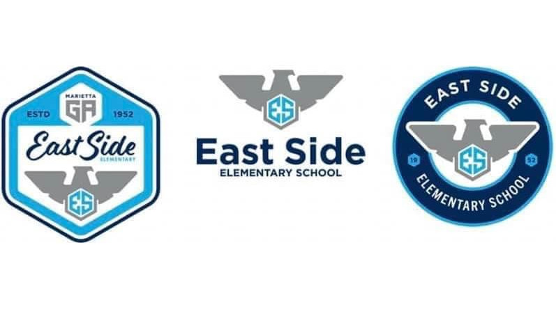
East Side Elementary School in Marietta, Georgia, recently unveiled its new logo that had been designed by the Cobb County School District. According to the announcement, the "new logo & badges were chosen to represent the Eagle soaring into excellence and to honour the history of our great school".
Unfortunately – there’s no way to sugarcoat this – the new logo bore a distinct and unmistakable resemblance to the Nazi eagle. It genuinely looks like the school in question might've been better off using well... literally any other symbol, even the most random of designs made by one of the best logo design makers would've been preferable.
Article continues belowPresenting, from the district that last week approved armed personnel in schools who are designated by the superintendent, a new logo for a nearby elementary school. Fix this, @CobbSchools, and apologize. pic.twitter.com/kD9H0ouLpt
As you might expect, there’s been outcry across social media. One user on Facebook wrote, "I have no idea who is [in] charge of these decisions but they are clearly not the right people to be making them. The teachers and staff and children at this school deserve better. I hope there is enough of an uproar to fix it before school starts. These poor kids."
It’s unclear whether this was simply one of the worst inadvertent logo design fails we’ve ever seen, or something more sinister. The resemblance to the Nazi eagle in the Cobb logo, even down to the side profile of the eagle and the centred angular “ES” logo beneath it, is very hard to ignore. Incidences of anti-semitism have on the rise in Georgia, according to research conducted by the Anti-Defamation League, and anti-semitic symbols and language has been found on walls at Cobb Schools.

The school district released a statement announcing withdrawal of the logo and claiming it was an unintentional error, and that the eagle imagery had been based on a U.S. Army colonel’s eagle wings. A spokeswoman for the district said: “The roll-out of this logo has been halted, and we are immediately reviewing needed changes. We understand and strongly agree that similarities to Nazi symbolism are unacceptable.”
Of course, even if it is unintentional, design mistakes like this can do material harm. As the American Jewish Committee pointed out in a tweet, "This only clarifies the urgent need for comprehensive Holocaust education at all levels."
Sign up to Creative Bloq's daily newsletter, which brings you the latest news and inspiration from the worlds of art, design and technology.
One of the golden rules of logo design is to always get a second opinion on any decisions you make – that’s how you avoid facepalm moments like the phallic Women's Network logo we saw recently. We’ll likely never know what exactly happened behind the scenes with this gross, disastrous logo fail at Cobb County Schools, but if you want to avoid making the kind of inadvertent error they claim to have made, check out our other pro tips on how to design a logo.
Read more:

Jon is a freelance writer and journalist who covers photography, art, technology, and the intersection of all three. When he's not scouting out news on the latest gadgets, he likes to play around with film cameras that were manufactured before he was born. To that end, he never goes anywhere without his Olympus XA2, loaded with a fresh roll of Kodak (Gold 200 is the best, since you asked). Jon is a regular contributor to Creative Bloq, and has also written for in Digital Camera World, Black + White Photography Magazine, Photomonitor, Outdoor Photography, Shortlist and probably a few others he's forgetting.
