Visa's new logo has a clever hidden meaning
Finance service undergoes a brand refresh in a bid to be seen as 'more than just a credit card company'.

Sign up to Creative Bloq's daily newsletter, which brings you the latest news and inspiration from the worlds of art, design and technology.
You are now subscribed
Your newsletter sign-up was successful
Want to add more newsletters?
Visa is one of those iconic brands, with its vibrant blue and yellow logo and instantly recognisable bold Myriad font that you could spot a mile off. However, the finance giant has recently collaborated with branding consultancy Mucho to come up with a new brandmark and brand symbol.
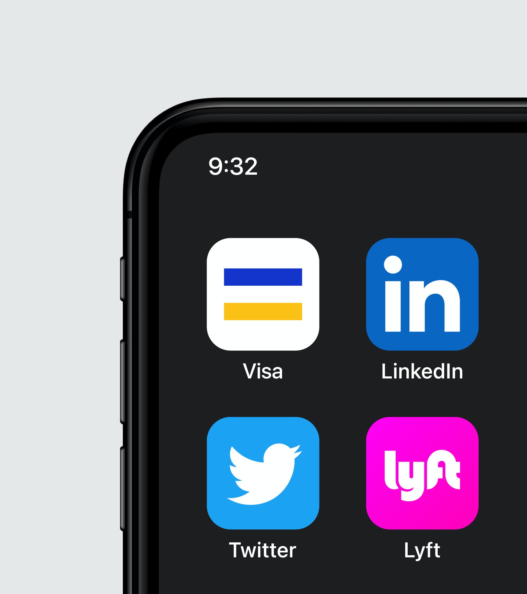
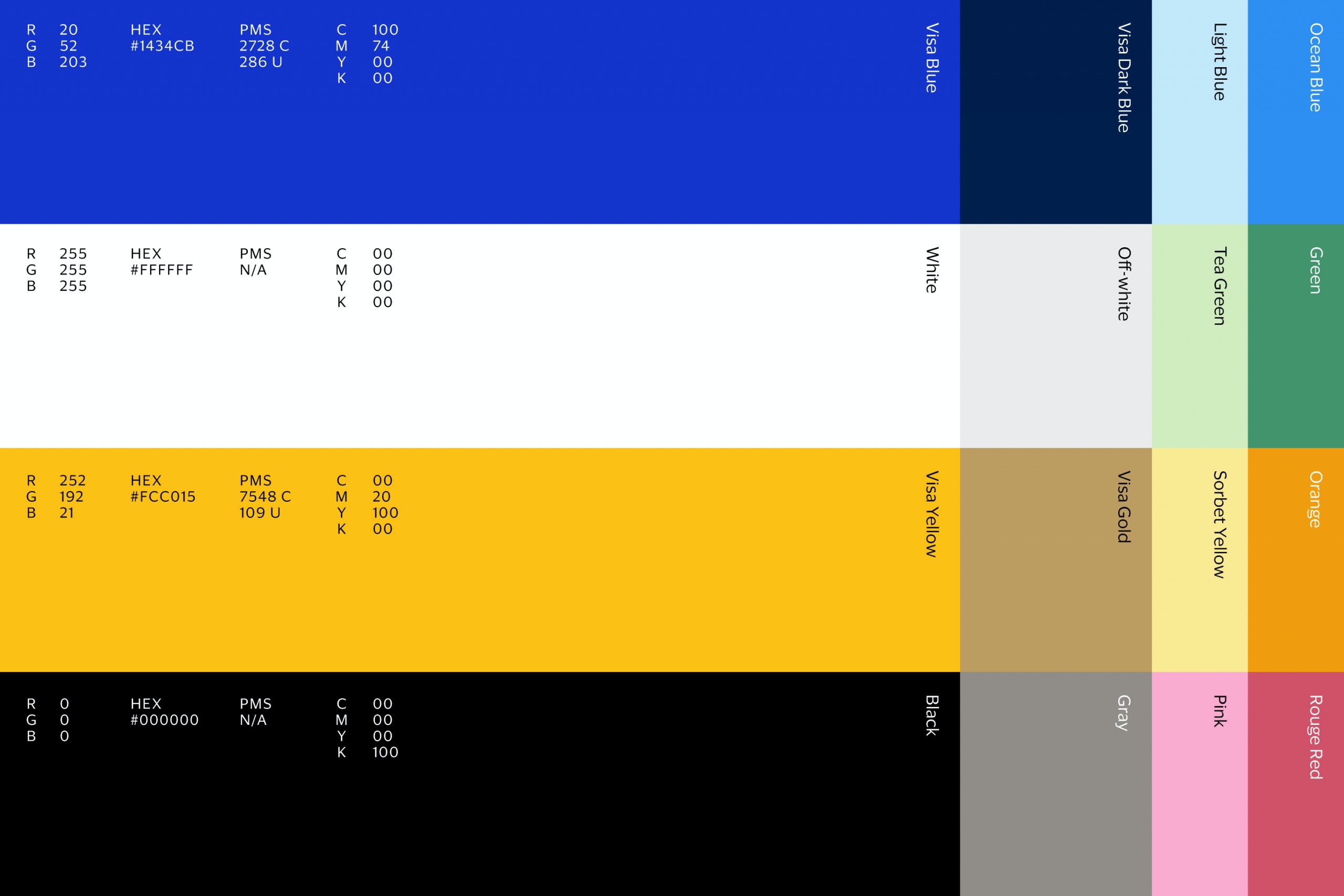
The new look still focuses heavily on Visa's iconic blue and yellow colour scheme, however the colour palette has been updated slightly, with the new brandmark (or wordmark) now in a new typeface and 'new blue', which is clearly brighter than its predecessor. And the tricolour brand symbol are said to represent Visa's three purposes: access, equality and inclusion.
While at first glance it doesn't look like a lot has been changed, we can assure you there's more going on than meets the eye. If you're looking to give your brand a refresh with a new logo, then make sure you check out our 15 golden rules of logo design.
Article continues below 
Interestingly enough, the new logo is not obviously different to the old one, but it has some slight adjustments that make it special. The new logo has been altered to resemble a equals sign, to signify Visa's new company belief that "economies that include everyone everywhere, uplift everyone everywhere".
Visa has said that it would like its rebrand to, "ensure it is seen as more than a credit card company". So with that in mind, it has created a cohesive set of illustrations, graphics, motions and even a new colour palette to help convey its message.

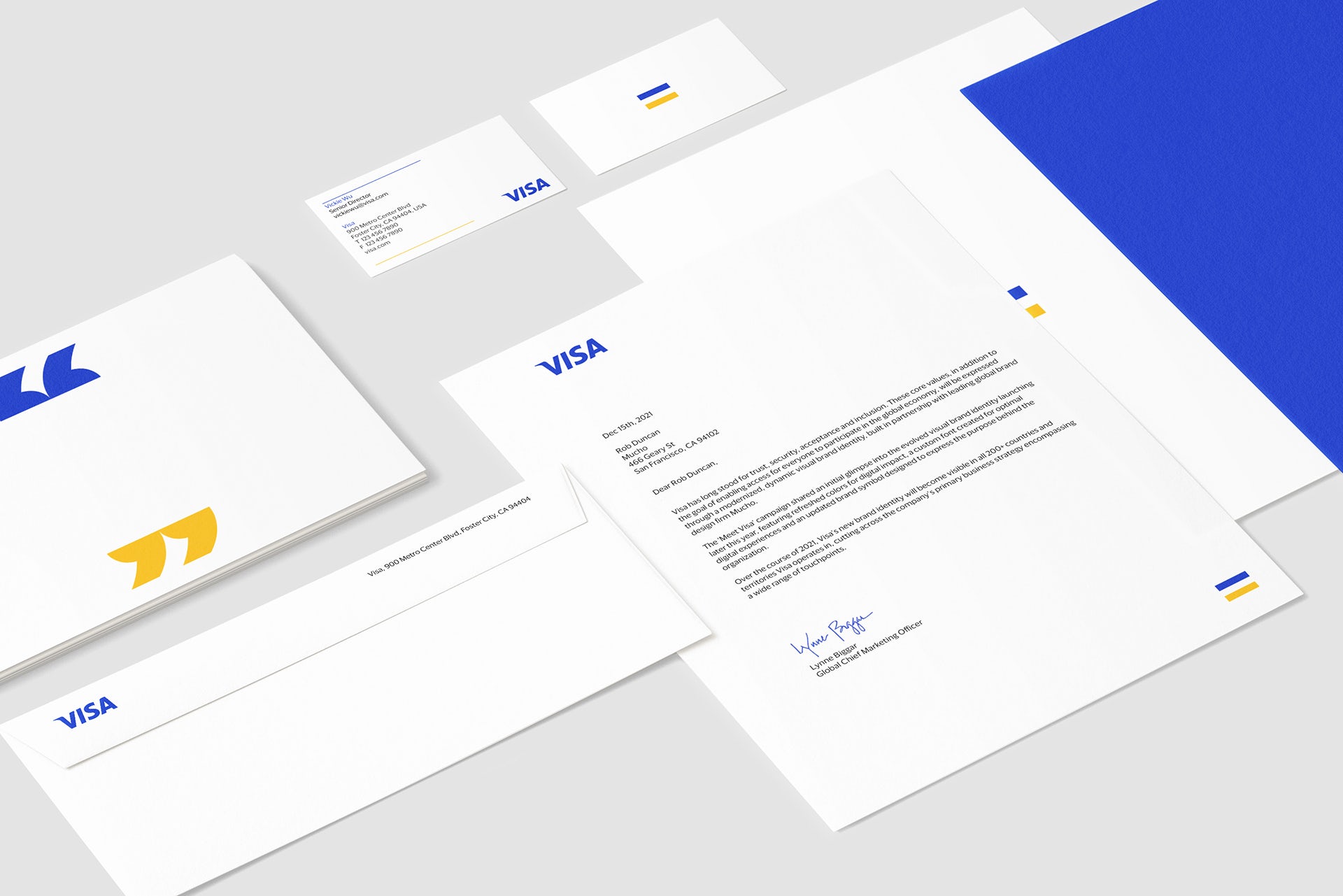
While the change is subtle, we can appreciate that Visa has done a good job at freshening up its brand, whilst also making sure it's still instantly recognisable. There's maybe an argument for them having chosen something slightly more exciting, but it would be a bold move to step away from branding that everyone knows, and, as the old saying goes, if it ain't broke, don't fix it. Overall, we're in favour of the facelift, with the new branding in the context of bank statements and letters (see below) looking fresh, friendly and clean.

We love a good rebrand here at Creative Bloq, and Visa's vibrant redesign is no exception. If you're currently working on your brand but are stuck for inspiration, then make sure you check out our roundup of the best branding books to help get you started.
Sign up to Creative Bloq's daily newsletter, which brings you the latest news and inspiration from the worlds of art, design and technology.
Read More:
- The Starbucks logo flaw you've probably never noticed
- New iPhone 14 price rumour hints at exciting new features
- Are these the 10 commandments of logo design?

Amelia previously worked as Creative Bloq’s Staff Writer. After completing a degree in Popular Music and a Master’s in Song Writing, Amelia began designing posters, logos, album covers and websites for musicians. She covered a range of topics on Creative Bloq, including posters, optical illusions, logos (she's a particular fan of logo Easter eggs), gaming and illustration. In her free time, she relishes in the likes of art (especially the Pre-Raphaelites), photography and literature. Amelia prides herself on her unorthodox creative methods, her Animal Crossing island and her extensive music library.
