How to give illustrations a retro look in Photoshop
Top illustrator Peter O'Toole shows you how to create a vintage aesthetic using textures.
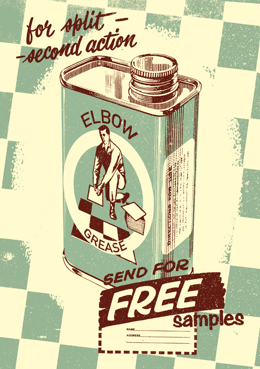
In this tutorial I will cover the process of creating a vintage-looking illustration. Using a limited colour palette and textures sourced everywhere from second-hand markets to online, we will utilise Photoshop's Threshold and Color Range tools to create a retro '50s-style advertisement.
We will also touch on how to use the Channel Mixer to create some effective colour combinations. This tutorial works with versions of Photoshop from CS through to Creative Cloud.
01. Rough sketch
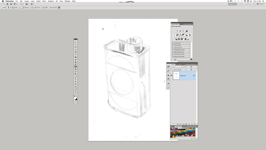
Roughly sketch your idea, scan and import it into a Photoshop document on its own layer and turn the opacity to around 40%. I'm going to be creating three layers from this image: one for shadows, one for highlights and one for midtones. With the opacity down it's easier to trace your sketch on the new layers.
02. Work on the detail
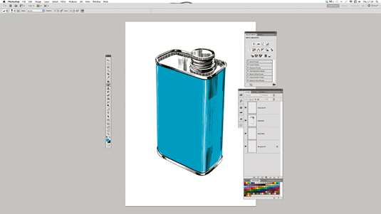
Using the Brush tool, start working in the detail of the tin. I've used black for my shadow layer, white for my highlight layer and blue for my midtone layer. The impact of the final image will rely on sticking to these three colours throughout the image. To achieve a retro effect, try drawing your lines with the Brush tool and then cross-hatching back over them with the Eraser tool.
03. Add an extra layer
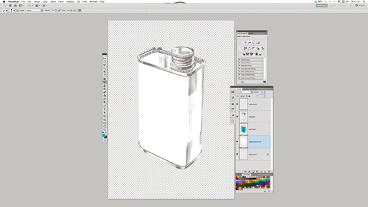
Underneath your three layers create a new layer, and cut a path around the shape of the tin with the Pen tool. Fill this white. Although there isn't much benefit for doing so here, it's a good habit to get into – now if you drop anything under the tin it won't come through the lines of your drawing. Change your background layer to the same colour as the midtone layer created in the last step, which is blue in my case.
04. Find a retro texture
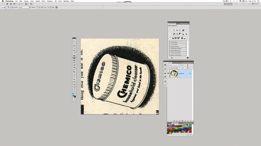
We now need something to make the tin pop out from the background. Look through some old magazines and other resources for an appropriate texture. It's a good idea to build up archives for inspiration and textures as you go. I found the perfect option, but I needed to get rid of the image before I could use it.
05. Clean it up
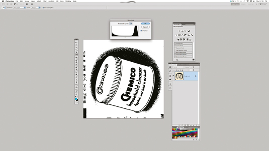
Scan your texture in at 600dpi. To equal out the colours go to Image>Adjustments>Threshold. Slide the cursor up or down until you feel you have the right balance of black and white. The cleaner you can get it, the easier it will be to clean up in the next step.
Sign up to Creative Bloq's daily newsletter, which brings you the latest news and inspiration from the worlds of art, design and technology.
06. Extract the texture
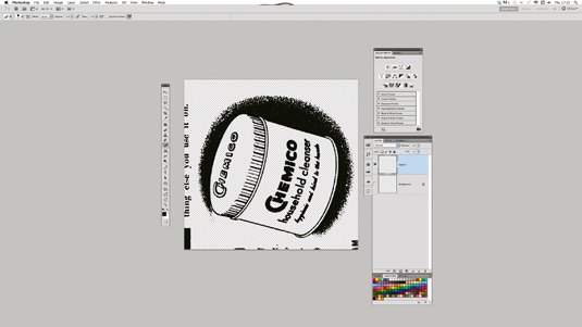
Now go to Select>Color Range and select Shadows from the drop-down menu. This will give you a selection of just the black areas in the image. Hit the D key to reset your colours and create a new layer. Now hit Shift+F5 to fill the selection and Cmd/Ctrl+D to deselect it. You have now separated the black from the white.
Delete or hide the original layer. You can also pick selections by clicking on a colour within your image when the Color Range panel is open. Hold Shift to select multiple colours.
Next page: the next six steps

The Creative Bloq team is made up of a group of art and design enthusiasts, and has changed and evolved since Creative Bloq began back in 2012. The current website team consists of eight full-time members of staff: Editor Georgia Coggan, Deputy Editor Rosie Hilder, Ecommerce Editor Beren Neale, Senior News Editor Daniel Piper, Editor, Digital Art and 3D Ian Dean, Tech Reviews Editor Erlingur Einarsson, Ecommerce Writer Beth Nicholls and Staff Writer Natalie Fear, as well as a roster of freelancers from around the world. The ImagineFX magazine team also pitch in, ensuring that content from leading digital art publication ImagineFX is represented on Creative Bloq.

