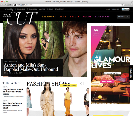
Celebrity site gets the big picture on mobile
It's not easy to make a busy website with a large number of images work on small screens, but online sex-and-celebrity mag The Cut pulls it off with aplomb.
Sign up to Creative Bloq's daily newsletter, which brings you the latest news and inspiration from the worlds of art, design and technology.
You are now subscribed
Your newsletter sign-up was successful
Want to add more newsletters?

Words: Paul Lloyd
The Cut is a website from New York magazine focusing on fashion, beauty, politics, sex, and celebrity. Faced with packing in a wealth of content, the in-house design team behind it could easily have opted for a fixed-width layout.
Yet while this large site comes with a large download size - mainly because of the high number of images and advertising assets - it’s still worthy of closer inspection. The intricate layout adapts surprisingly well to fit different screen dimensions, and consideration has been made for smaller, lower-bandwidth devices, too.
Article continues below 
For example, the Miller Headline font gives The Cut much of its character, but not enough for its absence on smaller screens to be noticeable - Georgia proves a suitable alternative.
Sidebar content that appears at greater widths is also missing on smaller screens, which makes us wonder whether it’s needed at all.
Homepage requests/size: 147/3.0 MB mobile, 179/4.18 MB desktop
This showcase was originally published in .net magazine issue 235.
Sign up to Creative Bloq's daily newsletter, which brings you the latest news and inspiration from the worlds of art, design and technology.
Now read these!
- Web design training: the top online tools
- Great examples of HTML5
- The best iPad apps for designers

The Creative Bloq team is made up of a group of art and design enthusiasts, and has changed and evolved since Creative Bloq began back in 2012. The current website team consists of eight full-time members of staff: Editor Georgia Coggan, Deputy Editor Rosie Hilder, Ecommerce Editor Beren Neale, Senior News Editor Daniel Piper, Editor, Digital Art and 3D Ian Dean, Tech Reviews Editor Erlingur Einarsson, Ecommerce Writer Beth Nicholls and Staff Writer Natalie Fear, as well as a roster of freelancers from around the world. The ImagineFX magazine team also pitch in, ensuring that content from leading digital art publication ImagineFX is represented on Creative Bloq.
