5 news websites doing responsive design right
As the range of digital devices multiplies, it's a case of adapt or die if you want to keep your audience. These beautifully responsive sites lead the way.
Sign up to Creative Bloq's daily newsletter, which brings you the latest news and inspiration from the worlds of art, design and technology.
You are now subscribed
Your newsletter sign-up was successful
Want to add more newsletters?
Journalism isn't dead, but it's being challenged like never before. Not only do print publications face the challenge of the web, but titles that have already moved online are having to redesign along responsive lines to enagage their audiences on smartphones, tablets and a range of desktop screen sizes. If you're looking for some fine examples to follow, here are five that have well and truly cracked the nut...
- Read all our responsive design-related articles here
01. Global News

Global News is a Canadian news outlet developed by Filament Group and Upstatement, both bringing experience from the hugely successful Boston Globe project to this superb responsive site.
Global News is visually and technically impressive: intricate elements seamlessly translate across sets of major breakpoints and minor tweakpoints. On high-density displays, the exquisite Gotham typography shines and hi-res images are downloaded via Scott Jehl's Picturefill. “The Global News site had large imagery needing to be delivered to lots of devices: some with HD screens; some with limited capabilities,” says Filament founder Todd Parker. “We used Picturefill to address various screen sizes and densities with media queries and the SD/HD switcher.”
Article continues belowGlobal News director of digital David Skok adds: “The sensibilities of real-time news are far more immediate than print; video is front and centre.”
Ubiquitous responsive video, regardless of the intended consumption device, is arguably the next big frontier for RWD. “We developed a HTML5 video player based on MediaElement.js and customised it for Global News to integrate tracking and ads,” reveals Parker.
Homepage requests/size: 1639.4kb/77 desktop, 1554.2kb/77 mobile
02. The New Republic

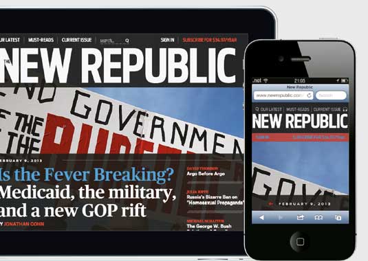
The New Republic is a publication covering politics, culture and big ideas. Although the website is technically an adaptive web design with a pinch of responsive web design, the design features many clever little touches including a unique marginalia component for housing footnotes and annotations to complement the main body of content. When space is cramped, the sidebar collapses into an elegant pull-out drawer.
Sign up to Creative Bloq's daily newsletter, which brings you the latest news and inspiration from the worlds of art, design and technology.
Digital product manager Justen Fox at The New Republic describes the new content-oriented design and says, “Our new design uses a single column structure to keep the focus entirely on our content. This allowed us to avoid many of the difficulties associated with building two and three column responsive websites.”
A large part of responsive design is designing for the unknown. Chief operating officer Sloan Eddleston adds, “Our readers want to enjoy our content on the device best suited for that moment.”
Homepage requests/size: 44/517.9kB desktop, 48/548.1kB mobile
03. Town & Country

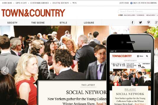
Town & Country produced its first publication in 1846, making it the oldest general interest publication in the USA. It's still going strong 167 years later with an exquisite responsive design that's faithful to the print edition. Regardless of the device it's read on, the integrity of visual language and elegant typography remains intact across the various design breakpoints resulting in a beautiful and rewarding experience for visitors.
Erin Toland led the art direction on the project and emphasised how important a responsive approach was for Town & Country. She says, “When the opportunity came up to redesign Town & Country, we knew we wanted to make it responsive. It promotes efficiency in the way we publish content. We now only have one site to manage instead of separate sites for mobile and desktop.”
Homepage requests/size: 73/2215.7kB desktop, 75/2650.9kB mobile
04. Curaqion

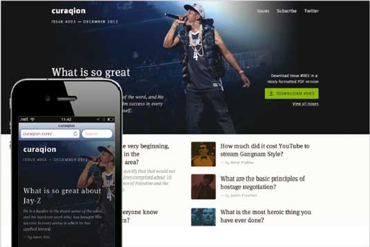
Gaddafi Rusli and Mohd Huzairy are the curators behind Curaqion: a monthly online publication that showcases the most fascinating topics on Quora. Curaqion has a simple and pleasing editorial design that doesn't compromise on readability between breakpoints.
Each article is accompanied by relevant visual assets to represent detailed answers from Quora contributors. It's remarkable how the developers kept an aesthetically pleasing design and so tightly optimised page weight and performance.
Gaddafi explains the desire to keep file sizes and resource requests low: “When it comes to mobile, we cannot just serve images larger than what the device can display as it's a waste to the bandwidth. Although making the image smaller is not always an ideal solution because we can lose the context and composition of the image. It's about finding the right balance.” Gaddafi says this is something they're always experimenting with and always looking to improve upon.
Homepage requests/size: 24/489.9kB desktop, 29/349.3kB mobile
05. Kotaku

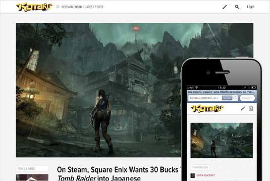
Leading gaming news and opinion site Kotaku is a part of the Gawker Media network, which features popular blogs such as Lifehacker, io9 and Gizmodo. Its responsive redesign appears alongside others on the network. The approach is content-centric, and information architecture has been simplified to encourage more content-specific actions from the reader: the main nav only features a toggle between top stories and latest stories along with search and submit actions.
“The new version is cleaner and does a better job of showcasing the images and video that make gaming culture so vibrant,” Kotaku's editor in chief Stephen Totilo says. Could this be a riposte to Polygon's new, disruptive responsive presence on the gaming blog scene?
Homepage requests/size: 9843kb/46 desktop 4063.8kb/50 mobile
Words: Paul Lloyd
These reviews were originally published in .net magazine.
Liked this? Read these!
- How to build an app
- Brilliant Wordpress tutorial selection
- Our favourite web fonts - and they don't cost a penny
Have you seen a great example of responsive web design? Share your thoughts in the comments below!

The Creative Bloq team is made up of a group of art and design enthusiasts, and has changed and evolved since Creative Bloq began back in 2012. The current website team consists of eight full-time members of staff: Editor Georgia Coggan, Deputy Editor Rosie Hilder, Ecommerce Editor Beren Neale, Senior News Editor Daniel Piper, Editor, Digital Art and 3D Ian Dean, Tech Reviews Editor Erlingur Einarsson, Ecommerce Writer Beth Nicholls and Staff Writer Natalie Fear, as well as a roster of freelancers from around the world. The ImagineFX magazine team also pitch in, ensuring that content from leading digital art publication ImagineFX is represented on Creative Bloq.
