Cat's amazing - responsive web design in action!
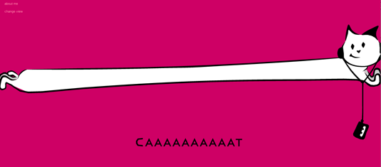
This cute animated cat responds to the width of your browser, with hilarious consequences. Check out this simple but brilliant web design demo.
Sign up to Creative Bloq's daily newsletter, which brings you the latest news and inspiration from the worlds of art, design and technology.
You are now subscribed
Your newsletter sign-up was successful
Want to add more newsletters?

Japanese web designer and interactive director Masayuki Kido, aka Roxik, has been delighting the design community for years with his playful and inventive websites and web experiments - and this is the best one yet!
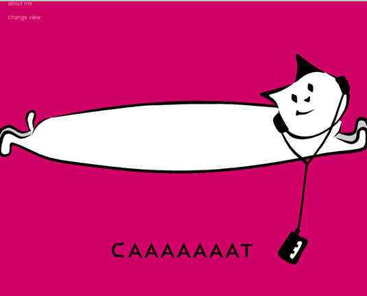
Roxik's responsive cat is just what it sounds like: an animated kitty that stretches across the length of the browser window, and resizes accordingly as you reduce the window's width.

Make it narrow enough and the creature turns from 'cat' to 'fat', with hilarious consequences. And the fun doesn't end there - but we don't want to spoilt it, so go have a play now!
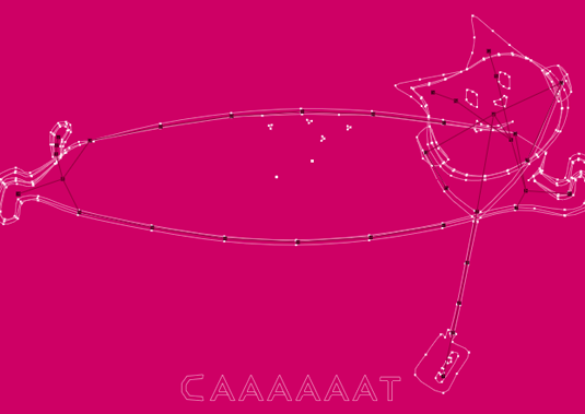
Article continues belowRoxik's responsive cat is a great way to demonstrate the basic principles of responsive web design, and you can even change the view to see the geometry that's going on underneath the drawing.

Now read these!
- 20 pro tips for creating a mobile website
- 40 amazing examples of HTML5
- 30 web design secrets to boost your skills!
- 101 CSS and JavaScript tutorials to power up your skills
Have you seen a great example of responsive web design? Tell us about it in the comments!
Sign up to Creative Bloq's daily newsletter, which brings you the latest news and inspiration from the worlds of art, design and technology.

The Creative Bloq team is made up of a group of art and design enthusiasts, and has changed and evolved since Creative Bloq began back in 2012. The current website team consists of eight full-time members of staff: Editor Georgia Coggan, Deputy Editor Rosie Hilder, Ecommerce Editor Beren Neale, Senior News Editor Daniel Piper, Editor, Digital Art and 3D Ian Dean, Tech Reviews Editor Erlingur Einarsson, Ecommerce Writer Beth Nicholls and Staff Writer Natalie Fear, as well as a roster of freelancers from around the world. The ImagineFX magazine team also pitch in, ensuring that content from leading digital art publication ImagineFX is represented on Creative Bloq.
