Greatest fonts countdown: 71 - Arnhem
We're counting down the 100 greatest typefaces in existence - here's the font at number 71.
Sign up to Creative Bloq's daily newsletter, which brings you the latest news and inspiration from the worlds of art, design and technology.
You are now subscribed
Your newsletter sign-up was successful
Want to add more newsletters?
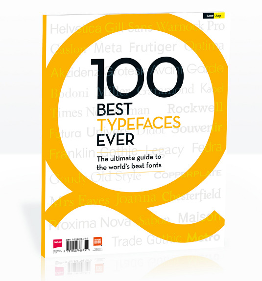
FontShop AG, the renowned type foundry, conducted a survey based on historical relevance, sales at FontShop.com, and aesthetic quality. With a few additions from the experts at Creative Bloq and Computer Arts magazine, the best fonts ever were selected for the new book, 100 Best Typefaces Ever.
Here we are counting down the 100 greatest fonts, but you can read interviews with some of the typefaces' creators, a brief history of type, the anatomy of a font, and much, much more in the book – find out how to get your copy in print or digital formats at the foot of this post.
But without further ado, here is the 71st best typeface…
Article continues below71. Arnhem

- Fred Smeijers, 1999
Dutch type designer Fred Smeijers enjoys remembering the Eureka moments in his career – and they have often been connected with the legibility of typefaces. There was the day in the mid-1980s, for instance, when he first succeeded in making a screen font more readable by adjusting the grayscale correctly. "I was so happy that I whistled as I cycled home," he smiles.
A similarly important, if not quite so far-reaching realisation, came during the development of the Arnhem font family. Arnhem was created in 1998 as a commission for the Dutch government gazette, Staatscourant. During the project, Smeijers had the rare opportunity to conduct extensive tests of his own and other typefaces on newspaper presses and paper. One of the insights he gained was that simple wedge serifs did more to improve legibility than any other feature, no matter how cleverly devised.
This feature was only one of many that made Arnhem an immediate success among text fonts for use in newspapers and books. And it became the showcase font of Fred Smeijers own small foundry OurType which launched in 2002. Fellow typographer Erik Spiekermann has listed Arnhem among his top five typefaces, praising its qualities when used as text.
The typeface is named after the city of Arnhem, in the eastern part of the Netherlands. The ArtEZ Institute of the Arts is situated there, and is an international centre for typographic greatness. Smeijers is an alumni of the school's programme.
Sign up to Creative Bloq's daily newsletter, which brings you the latest news and inspiration from the worlds of art, design and technology.


The 100 Best Typefaces Ever

This is an extract from The 100 Best Typefaces Ever, the definitive guide to the greatest fonts ever created, in association with FontShop AG. Over 180 premium pages, the book dissects the world's greatest typefaces, bringing you some insightful background on each and interviews with their creators.
You can pick up the book at all good newsagents today or order it online. Or you can download a digital edition directly to your iPad from the Computer Arts app on iTunes.

Rob is editorial, graphic design and publishing lead at Transport for London. He previously worked at Future Publishing over the course of several years, where he launched digital art magazine, ImagineFX; and edited graphic design magazine Computer Arts, as well as the Computer Arts Projects series, and was also editor of technology magazine, T3.
