Greatest fonts countdown: 78 - FF Cocon
We're counting down the 100 greatest typefaces in existence - here's the font at number 78.
Sign up to Creative Bloq's daily newsletter, which brings you the latest news and inspiration from the worlds of art, design and technology.
You are now subscribed
Your newsletter sign-up was successful
Want to add more newsletters?
FontShop AG, the renowned type foundry, conducted a survey based on historical relevance, sales at FontShop.com, and aesthetic quality. With a few additions from the experts at Creative Bloq and Computer Arts magazine, the best fonts ever were selected for the new book, 100 Best Typefaces Ever.
Here we are counting down the 100 greatest fonts, but you can read interviews with some of the typefaces' creators, a brief history of type, the anatomy of a font, and much, much more in the book – find out how to get your copy in print or digital formats at the foot of this post.
But without further ado, here is the 78th best typeface…
Article continues below78. FF Cocon

- Evert Bloemsma, 2001
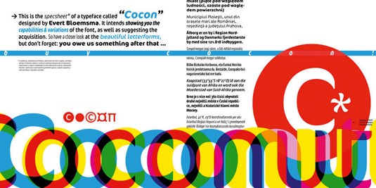
Dutch type designer Evert Bloemsma created this typeface for the FontFont type foundry in 2001 – it was his second typeface (he also designed FF Avance and FF Legato). The family has 18 weights in total, ranging from Light to Bold in Extra Condensed, Condensed, and Normal (including italics) and is particularly well suited to advertising and packaging work.
FF Cocon provides advanced typographical support with features such as ligatures, case-sensitive forms, fractions, super- and subscript characters, and stylistic alternates.
Bloemsma, who died in 2005, described FF Cocon as a 'serious typeface' and in the first sketches for FF Cocon, the designer attempted to erase every trace of handwriting – namely the small spurs of the lowercase letters a, b, d, g, h, m, n, p, q, r and u. As the FontFont foundry describes, "although this was a difficult starting point for a typeface, it proved successful. Bloemsma's design is a family of rounded yet rather asymmetrical forms with details that might be reminiscent of brush-strokes, but were not made with a brush in hand. In spite of its claim to seriousness, FF Cocon is a family of seductive, voluptuous fonts."
The original FF Cocon by Bloemsma had two widths – normal and condensed. Later, in 2005, the typeface family was expanded, with a more compressed Extra Condensed version being introduced, as well as italics. The additional weights were designed by Agnes Terhorst.
Sign up to Creative Bloq's daily newsletter, which brings you the latest news and inspiration from the worlds of art, design and technology.

The 100 Best Typefaces Ever
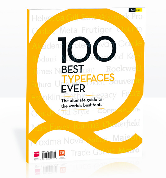
This is an extract from The 100 Best Typefaces Ever, the definitive guide to the greatest fonts ever created, in association with FontShop AG. Over 180 premium pages, the book dissects the world's greatest typefaces, bringing you some insightful background on each and interviews with their creators.
You can pick up the book at all good newsagents today or order it online. Or you can download a digital edition directly to your iPad from the Computer Arts app on iTunes.

Rob is editorial, graphic design and publishing lead at Transport for London. He previously worked at Future Publishing over the course of several years, where he launched digital art magazine, ImagineFX; and edited graphic design magazine Computer Arts, as well as the Computer Arts Projects series, and was also editor of technology magazine, T3.
