Design jargon explained: web design patterns
Chris Bank of UXPin offers a quick overview of what web design patterns are and how to use them.
Sign up to Creative Bloq's daily newsletter, which brings you the latest news and inspiration from the worlds of art, design and technology.
You are now subscribed
Your newsletter sign-up was successful
Want to add more newsletters?
In this article, Chris Bank of UXPin – The UX Design App details what web design patterns are and how to think about them when designing your website or web app, and touches on the importance of responsive design and touch screens.
They're covered in more detail with examples from over 50 hot websites and web apps in UXPin's free e-book, Web UI Design Patterns 2014.
What are web design patterns?
Generally speaking, a web design pattern, aka UI design pattern, is a reusable solution to a commonly occurring problem you might encounter every day.
Article continues belowIt's not a feature that can be plugged into your product design and it's not a finished design that can simply be coded. Rather, it is a formalized best practice, guide or template that designers, developers, and product managers (and anyone else who touches product) can use to solve common problems when designing a web application or system.
It is generally language, device, and platform agnostic – although there may be technological limitations depending on how the designs are ultimately implemented. (And, of course, if implemented in the wrong context, they do more harm than good, but we'll focus on the positives for now.)
Basic principles

UI design patterns can be challenging concepts to grasp and leverage. This is, in part, due to the lack of literature on the subject matter compared to the massive archives of technical design patterns.
It's also due, in part, to the fact that it's human nature to use patterns in a similar manner to stencils – tracing the outlines without understanding the edges; every curve, line, twist, and turn in the shapes being drawn.
Sign up to Creative Bloq's daily newsletter, which brings you the latest news and inspiration from the worlds of art, design and technology.
In practice, patterns are often used interchangeably with specific features, copied as-is from one of the popular design pattern and wireframe libraries – see a full list in UXPin's Guide to Wireframing.
Understanding patterns is fundamental to good product design and development. We'll look at an example in a moment, and I've detailed patterns from Pinterest, OKCupid, Spotify, Amazon, AirBnB, Dropbox, Quora, Eventbrite, Asana, RelateIQ, Flipboard and many more in UXPin's free e-book, Web UI Design Patterns 2014.
I'd also suggest looking at additional UI design patterns and elements in UXPin's free Mobile UI Design Patterns, Web Design Trends, Mobile Design Trends, and The Guide to Wireframing e-books.
A quick example
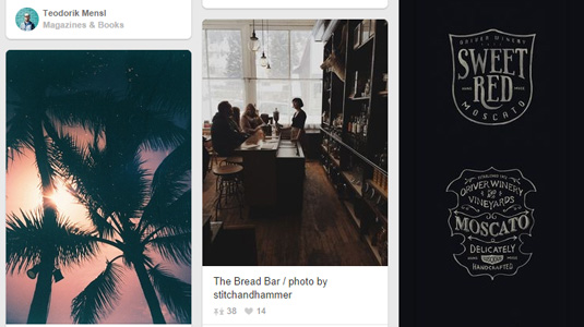
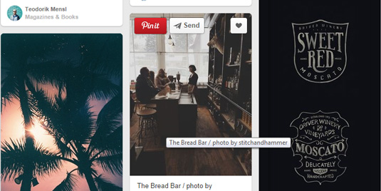
Below I've deconstructed Pinterest and Facebook's hover controls to give you a real-life example of how to think about mobile design patterns on a daily basis.
- The problem: The user wants to have access to controls without cluttering the content view.
- The solution: Hide actions and control buttons until a user hovers over the item they relate to.


It's always good to give the user complete control over content, but when an interface has a lot that can be acted upon, each button steals focus away from the content.
This UI pattern hides these contextual controls until the user hovers over the content with their mouse, keeping them out of the way until needed. Pinterest puts all focus on the photos, so the 'heart', 'send' and 'pin' buttons are invisible until you hover over the photo.
Since the buttons appear over the image itself, there's no confusion about which item they will act upon.
What to consider
It's surprising to see so many beautiful design pattern libraries that treat patterns like mockups; flat files vainly attempting to convey deeper product design concepts.
They offer no explanation about the problems these patterns are solving and how decisions were made in the implementation of the pattern examples. A picture may be worth a thousand words, but it is more likely worthless if the picture is entirely misunderstood.
Here's what you need to think about when evaluating a design pattern and adapting it to your own needs:
- Problem Summary: What user problem are you solving? Stay focused, and phrase it like a user story – in one sentence only.
- Solution: How have others solved this problem? Among others, a few things to detail include user navigation (including shortcuts), getting user inputs, dealing with data and integrations with other services or applications, and displaying information and content (including defaults).
- Example: Great, can you show me? Sometimes a screenshot or mockup is sufficient; other times, a user flows and/or additional notes are necessary to clearly communicate the pattern.
- Usage: When should this pattern be used? Among others, a few things to detail include product architecture, interface layout, device(s), programming language, absence or existence of other design patterns, type of user, and primary use cases.
It takes practice and discipline to think about patterns in this manner if you haven't yet been doing it. Take the time to answer these questions when designing your product because it could help you save a lot of time refactoring down the road when the your users and team ask for similar details.
Convergence
At the heart of many of these new UI design patterns is the emergence of responsive design, and incorporation of touchscreens on traditional desktops and laptops.
In the Mobile UI Design Patterns ebook, I talk in detail about animations and gestures heavily impacting mobile UI design patterns which is becoming increasingly relevant to web design as mobile and web continue to their convergence. But also want to touch on it briefly here because of its significance.
Responsive design
Today, almost every company wants a mobile version of their website – and vice versa. And although many designers and developers reference "responsive design" as a fancy synonym for "resizeable on different devices", it is far from this simple. Many have tried that approach and failed. Smashing Magazine summarizes a common definition of Responsive Web Design:
"Responsive Web Design is the approach that suggests that design and development should respond to the user's behavior and environment based on screen size, platform and orientation…"
But it's not just about adjustable screen resolutions and automatically resizable images. Practically speaking, a different product must be designed start-to-finish for each device (not just copy-pasted): one design for the BlackBerry, another for the iPhone, the iPad, Android, Kindle and so on.
Touch screens
Although the iPad – in some respects, an oversized iPhone – is credited for popularizing large touchscreens, it was only the beginning.
Not only has it ignited the development of many other large touchscreen devices but also hybrids, which ultimately increase the complexity of product design and development. And while large and small (mobile) touchscreen devices are similar in terms of hardware and OS, the diversity of products in each product class is testament to the differences in use cases for which they're being designed.
Granted, there are many iPhone applications that work seamlessly on the iPad. But that doesn't change the way products are designed the same way resizing and re-arranging applications between web and mobile isn't really 'Responsive Design'.
Beg, borrow and steal – when appropriate

Take these design patterns and elements from UXPin's free e-book, Web UI Design Patterns 2014, and tailor them to solve your own problems and, most importantly, those of your users.
Designers, developers, and product managers from all over the world collectively contribute to solving problems you're likely trying to solve today. Why reinvent the wheel? Learn from their insights and even explicit solutions to move faster and smarter.
Just remember that there is no one-size-fits-all solution when it comes to user experience design. Many of the patterns we've covered here work extremely well when mixed and matched with each other. And they should be tailored to your unique product, users, and team for optimal results.
Words: Chris Bank
Chris Bank is the growth lead at UXPin, a UX design app that creates responsive interactive wireframes and prototypes.

The Creative Bloq team is made up of a group of art and design enthusiasts, and has changed and evolved since Creative Bloq began back in 2012. The current website team consists of eight full-time members of staff: Editor Georgia Coggan, Deputy Editor Rosie Hilder, Ecommerce Editor Beren Neale, Senior News Editor Daniel Piper, Editor, Digital Art and 3D Ian Dean, Tech Reviews Editor Erlingur Einarsson, Ecommerce Writer Beth Nicholls and Staff Writer Natalie Fear, as well as a roster of freelancers from around the world. The ImagineFX magazine team also pitch in, ensuring that content from leading digital art publication ImagineFX is represented on Creative Bloq.
