3 things web designers can learn from print design
Discover three classical principles that will help you create better, more accessible online designs.
Sign up to Creative Bloq's daily newsletter, which brings you the latest news and inspiration from the worlds of art, design and technology.
You are now subscribed
Your newsletter sign-up was successful
Want to add more newsletters?
Five times a week
CreativeBloq
Sign up to Creative Bloq's daily newsletter, which brings you the latest news and inspiration from the worlds of art, design and technology.
Once a week
By Design
Sign up to Creative Bloq's daily newsletter, which brings you the latest news and inspiration from the worlds of art, design and technology.
Once a week
State of the Art
Sign up to Creative Bloq's daily newsletter, which brings you the latest news and inspiration from the worlds of art, design and technology.
Seasonal (around events)
Brand Impact Awards
Sign up to Creative Bloq's daily newsletter, which brings you the latest news and inspiration from the worlds of art, design and technology.
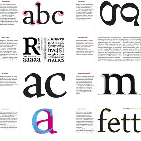
Design is function given form – no matter whether that form is bytes or atoms. Which means that web design owes a lot to its ink-and-paper forefather.
In this article, we will highlight a few print design principles that still hold true online.
By mastering them, you should be able to improve your UI and UX work to create better, more accessible designs.
01. Remain reader-focused
Print design focuses on readability, and that's no different on the web: just replace 'reader' with 'user'.
The goals should be clarity of communication, and the ability to move through the design with ease. Let's take a look at a few ideas that carry over from print design to the web.
Layout
Like a newspaper, users won't read every word on a website – at least, not at first. As described in the free ebook Web UI Design for the Human Eye, it's standard behaviour for users to scan the page.
Sign up to Creative Bloq's daily newsletter, which brings you the latest news and inspiration from the worlds of art, design and technology.
There are two layout patterns that you should consider when designing for scannability. First: the F-pattern.
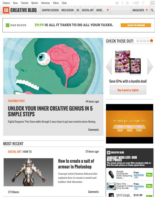
The F-Pattern reflects the most common way a user scans the page. Their eye travels horizontally across the top, then vertically down the left, looking for words that stand out.
Once they find something that sparks their interest, they read horizontally across the page again.
There's also the Z Pattern:
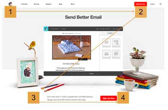
The Z-Pattern is another natural scanning pattern, often used in newspapers as well as on the web. The user scans horizontally across the top of the page, but then drops down and left, repeating the horizontal search on the lower part of the page.
Typography
Just as in print, online text should have a clear hierarchy. An appropriate choice of type sizes helps keywords jump off the page, and enables users to scan the page more easily.
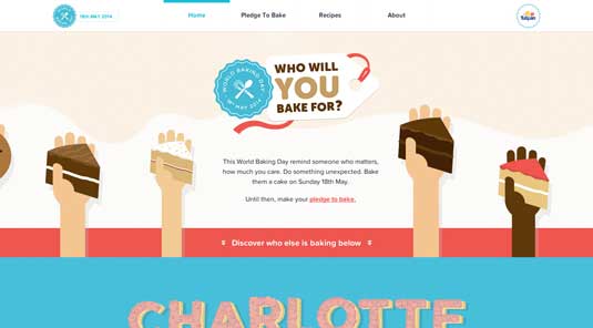
Let's look at a few common levels in typographical hierarchy:
- Primary: the most notable text on the page is bigger and brighter, capturing the user's attention. Typically used for headlines and decks.
- Secondary: everything in between. Less noticeable than the headlines but stands out from regular copy on the page.
- Tertiary: the type of choice of your main content. This level of the hierarchy helps immerse the user in the copy.
- Other: a smaller level created when using italics, bold type, underlining, different text colours, and so on.
Used in conjunction with a visual hierarchy, a typographical hierarchy creates order and prevents users from feeling lost.
To test the readability of your page, use the 'three-second rule': look at the page briefly, then look away. Do the things that stood out reflect your design intent? If so, you're on the right track and should continue; if not, it's back to the drawing board – maybe literally.
02. Create a sense of balance
Whether that balance is symmetrical, asymmetrical or radial, aim for a design the creates a sense of stability and unity. If a user feels at ease on your page, they're likely to stick around.
Don't go too heavy on graphics or text: always respect the spacing between elements. Lean toward simple layouts – a busy layout frustrates users. Clutter isn't easy on the eyes and makes it hard to follow the flow of content
Consider using a minimalistic design with a balance between a white, black or very dark background and foreground elements. As discussed in Web UI Design for the Human Eye, use of negative space enables you to direct the attention of your users.
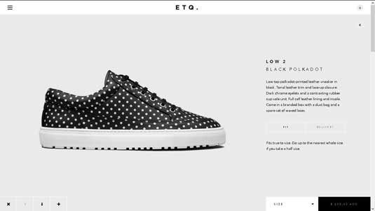
The ETQ website, shown above, makes use of negative space to draw your eye to the product on display. Contrasting white and black boxes at the foot of the page enable the user to choose sizes or view the item's price.
There is very little noise on the page, giving it a sense of calm and order – and hopefully, leading the user to make a purchase.
03. Practise safe design
Make your designs safe for all your users. Don't use more than two fonts, and make sure that users of all ages can read them. Too much clutter dilutes your message.
If you find yourself staring at the screen without knowing what you're working with any more, your design may include too many images.
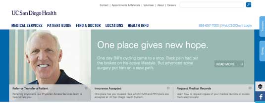
And keep the user in mind when choosing your colour scheme – if it's a website for a hospital, use cool and muted colours; if it's aimed at teenagers, more vibrant colours may suit your audience better.
Here are some mistakes commonly made during book design that also apply to web design:
- Not enough testing: Always test your design as widely as possible. Your content may cross multiple media (web, ebooks, print), which can lead text to reflow. In addition, some fonts may not be legible when transferred to a new medium. It's imperative to find fonts that work in all your use cases. Also consider how your design will appear at different screen sizes, screen resolutions and in different browsers.
- Inappropriate tone: Choose the right tone of voice for each element on the page. As with typography, the header should grab the reader's attention, the sub-heading should clarify or amplify the heading, and the body text should resemble a friendly conversation – warm and inviting, making the reader eager for more information.
- Inappropriate format: Embrace your chosen medium: otherwise, you will waste time constantly fixing files that should be in CMYK colour space for print, and RGB for online work.
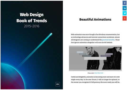
For more advice on effective online UI and UX design techniques, check out UXPin's free ebook, Web Design Book of Trends 2015-2016.
In it, you will find 166 hand-picked examples from companies like Adidas, Intercom, Apple, Google and Versace. To help speed up your design process, there is also a curated list of 100 free, online resources.
Words: Kyle Pereira
Kyle is publishing and design studio manager of TLAC Design Studio. He has more than 20 years of experience in print, graphic design, computer graphics and prepress: www.tlac.ca
Like this? Read these!
- Free graphic design software available to you right now!
- Download the best free fonts
- How to build an app: try these great tutorials

The Creative Bloq team is made up of a group of art and design enthusiasts, and has changed and evolved since Creative Bloq began back in 2012. The current website team consists of eight full-time members of staff: Editor Georgia Coggan, Deputy Editor Rosie Hilder, Ecommerce Editor Beren Neale, Senior News Editor Daniel Piper, Editor, Digital Art and 3D Ian Dean, Tech Reviews Editor Erlingur Einarsson, Ecommerce Writer Beth Nicholls and Staff Writer Natalie Fear, as well as a roster of freelancers from around the world. The ImagineFX magazine team also pitch in, ensuring that content from leading digital art publication ImagineFX is represented on Creative Bloq.
