Create flexible grids using Sass
Steve Hickey explains how to design your own flexible grid system using CSS and Sass – and ditch presentational markup for good.
- Knowledge needed: Intermediate CSS, Sass and HTML
- Requires: Sass, code editor
- Project time: 2-3 hours
Download the source files for this CSS tutorial
If you're a designer, or you work with designers, the chances are pretty high that you've had to implement a grid in a website layout before. The process can be painful, but the visual consistency achieved through a well-designed grid is worth the effort.
But when you're writing styles for a responsive design, you don't want to have to calculate individual widths for every element in your layout. Instead, you need a scalable solution that enables you to assign widths that match your grid on the fly.
Article continues belowA common solution to this problem is to use a framework such as the 960 Grid System, but in my opinion, frameworks come with a lot of problems that we can do without.
They add a lot of code to your style sheet that may rarely be used again, they require you to recalculate all of your widths if you want to modify the system, and they rely on presentational markup and non-semantic class names on your elements.
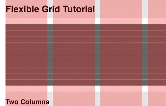
These drawbacks have been tolerated because of the speed and consistency that frameworks deliver, but I think we can do better. With some clever use of Sass, we can put together a quick grid system that can be modified in seconds, only compiles necessary CSS, and enables us to eliminate the use of non-semantic class names in our markup.
Designing a good grid
Any grid needs to be extensive enough to support the types of content specific to the project at hand, but not so complicated that it becomes unwieldy to use. One reason that the 960 Grid System has been so popular is that it strikes this balance well, allowing for a large number of equally divided columns that can be easily adapted to the demands of most content. This is important, because so many variables can affect a grid.
Sign up to Creative Bloq's daily newsletter, which brings you the latest news and inspiration from the worlds of art, design and technology.
The dimensions of the media and the line height and line length of the body text will all affect the spacing and the ratio between one grid element and the next.
The nuances of truly excellent grid design are beyond the scope of this article, but there are some tools that can help you get started.
I would suggest either the Modular Grid Pattern or Gridulator.
I personally use Gridulator, because it will calculate a maximum width for the grid for you and presents various options for column/gutter widths. One drawback is that it won't calculate the percentages necessary for fluid grids, but that seems to be a common issue with tools like these. In this tutorial, we will be converting those values ourselves.

For this tutorial, we will be using Elliot Jay Stocks' responsive Photoshop grid because the maths required to get to percentages is so easy to understand. His system is based on six columns of 150px separated by 20px gutters, for a total width of 1000px. To get these widths in percentages, we'll use the formula devised by Ethan Marcotte for creating flexible grids:
target / context = result
In this case we have a target of 150px and a context of 1000px. The formula would look like this:
150 / 1000 = 0.15
When this result is multiplied by 100 to convert it to a percentage, we get column widths of 15%. The same formula, when applied to our 20px gutters, gets us 2%.
At this point, you should see why we're building this with Elliot’s grid. We won’t have any long decimal values for our percentage widths, which should make it easier to focus on more important concepts.
(When using other grid systems, resist the urge to round long decimal values down. Browsers will do a better job of calculating the proper widths when supplied with the longer values.)
Writing clean markup
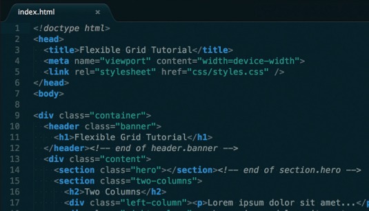
Next, let's move on to the markup. We're going to build a web page that demos the various features of this system. Open index.html from the 01-markup directory in the supporting download and have a look at it.
The markup we're starting with follows the best practices advocated by the HTML5 Boilerplate project, but for the sake of brevity we’re dropping some of the elements that should be used in production code.
Before you yell, "Hey, there are non-semantic class names in there!", take another look. Those classes are named after what they are demonstrating in the code, so they are, in fact, semantic. Any other class name would work just as well, which you'll see when we start writing our Sass.
Creating the Sass file structure
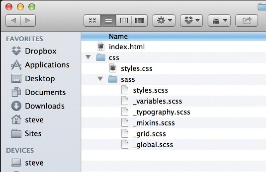
We're going to structure our Sass files in a manner similar to working with partial style sheets in a Ruby on Rails application. This structure allows us to organise our code clearly, but still compiles to a single CSS file for the sake of performance.
The css/sass/styles.scss file, which outputs to css/styles.css, is structured in this way:
@import 'variables'; // global variables first so they're accessible to the
other style sheets
@import 'mixins'; // global mixins next to use variables and be accessible to rest of the style sheets
@import 'typography'; // base typographic system is established next
@import 'grid'; // grid system functions and mixins will all be defined here
@import 'global'; // global style rules are defined last so they can use all the previous sheets
Normally, a reset style sheet would also be imported after the mixins sheet.
Style variables, mixins and type rules
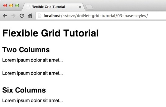
Next, open css/sass/_variables.scss from the 03-base-styles directory in the supporting download. These are the basic variables we will be using for this tutorial. We are using the single-line //comment syntax for comments because none of these rules will compile to the final CSS file, so we don’t want the comments to either. Grid-specific variables will be declared in the grid style sheet.
If you open css/sass/_mixins.scss from the same directory, you can see the mixins used for the grid system. These would typically be defined globally because they have uses outside of it.
Based on Paul Irish's advocacy, we're going to use box-sizing: border-box; to simplify grid calculations. It really shines for this purpose. (If your project needs to support IE7 and below, his article links to some appropriate polyfills.)
Finally, open css/sass/_typography.scss. These type rules are the absolute basics needed to support the elements used in this tutorial. The comment syntax used at the beginning of the document will compile to our CSS file and clearly indicate this section of style rules.
Defining the flexible grid functions
Now that we're all set up, we can get to the fun part. The first thing we'll do in our grid style sheet (css/sass/_grid.scss in the 04-grid-functions directory) is declare some variables for the grid functions to use, based on the calculations we made when designing our system.
$max-width: 1000px; // set page
max-width
$column-width: 15%; // set column width
$gutter-width: 2%; // set gutter width
$maximum-columns: 6; // set max number of columns
Next, we'll include the functions that will create our flexible column and gutter widths. These functions have been modified from a set of Sass mixins called Bourbon. We'll include just the set of mixins relevant to creating our grid system, and modify the variable naming system to better match the other support functions we'll be creating.
@function columns($columns, $container-columns: $maximum-columns) {
$width: $columns * $column-width + ($columns - 1) * $gutter-width;
$container-width: $container-columns * $column-width + ($containercolumns - 1) * $gutter-width;
@return percentage($width / $container-width);
}
@function gutter($container-columns: $maximum-columns, $gutter:
$gutter-width) {
$container-width: $container-columns * $column-width + ($containercolumns - 1) * $gutter-width;
@return percentage($gutter / $container-width);
}
Once these functions are in place, we can use them to set the widths and margins of elements in our global styles. As an example, let's look at the following code:
div.parent {
width: columns(3);
margin-right: gutter;
div.child {
width: columns(1, 3);
margin-right: gutter(3);
}
}
The column function requires at least one argument to be passed into it to work properly, which is the number of columns we want that element to have. It then calculates the necessary width based on the number of columns and gutters the element will have to span. It also accepts an optional second argument to be used when the element being styled is nested inside another element. Because percentage widths are calculated according to the width of the parent element, we need to adjust the percentages used on our child element to compensate. By providing the column span of the parent element as the second argument, our Sass function will recalculate the required percentage widths and adjust accordingly.
The gutter function works in a similar fashion. If we don't provide an argument, it won't perform any adjustments. When it's declared on a nested element, we will need to provide it with an argument indicating its parent element's column span so that the gutter width is recalculated properly.
Supporting mixins
Now we can calculate column and gutter widths for a responsive grid. But we still need some more styles that can be applied to other elements before the result is useable.
Typically, grid frameworks establish a .row class to hold columns. This can either be applied to a parent element, if it exists; or a wrapper div can be added to hold this class.
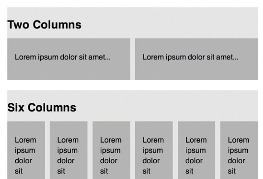
We're going to create it as a mixin that can be included on existing parent elements. This can still be applied to wrapper divs, but by including it as a mixin instead of a class we can discourage the addition of presentational markup. The row mixin needs to span the entire width of its container, have no padding, and has to clear the floated columns within it.
@mixin row {
width: 100%;
max-width: $max-width;
margin: 0 auto;
@include clearfix;
@include nesting;
}
The row mixin includes our global clearfix mixin to clear the floated columns within an element. It also includes a nesting mixin, which removes the padding so the nested columns fill the entire width available and tells direct children to float and have the appropriate gutters. We'll also set the borderbox property here. Later on, if we require support for more elements than divs alone, we can add them to the selector. This mixin can be included on any element that will contain elements aligned to our grid system.
@mixin nesting {
padding: 0;
& > div {
float: left;
margin-right: gutter();
@include border-box;
}
}
We'll also want our grid system to support offset columns, because white space is our friend and we want to encourage its use. When we want to offset an element, we'll use the offset mixin in our global style sheet. It will accept two arguments: the direction from which our element should be offset, and the number of columns by which it should be offset. Our offset-columns function will be used to calculate the amount of offset to be applied.
@function offset-columns($columns) {
$margin: $columns * $column-width + $columns * $gutter-width;
@return $margin;
}
@mixin offset($from-direction, $columns) {
@if $from-direction == left {
float: left;
margin-left: offset-columns($columns);
}
@if $from-direction == right {
float: right;
margin-right: offset-columns($columns);
}
}
That pesky last element in a row
We need to do something further with the last element in a row. If we don't remove its margin-right value, the element will kick down beneath its siblings. There are several solutions to this problem, and unfortunately none of them are great.
The first would be to add the :last-child selector to our nesting mixin. This way, the last element would always have its margin-right removed and we’d never have to think about it again.
Unfortunately, this won't work in IE8 or below.
The next solution would be to try the :first-child selector. By setting all of our margins on the left instead of the right, and removing the first element's margin-left value, we will achieve the same result, with the additional benefit of IE7 and IE8 support. But don't start celebrating yet. We're not trying to remove a margin from the first or last element in a container: we're trying to remove it from the first or last element in any given row. And we don't want to have to add wrapper divs into our markup just to achieve this goal - so :first-child is out, too.
The next logical jump is to use the :nth-child() selector - and it would accomplish this goal beautifully, but support for it is just as poor as for :last-child. Enter our solution: a distinctly unsexy mixin.
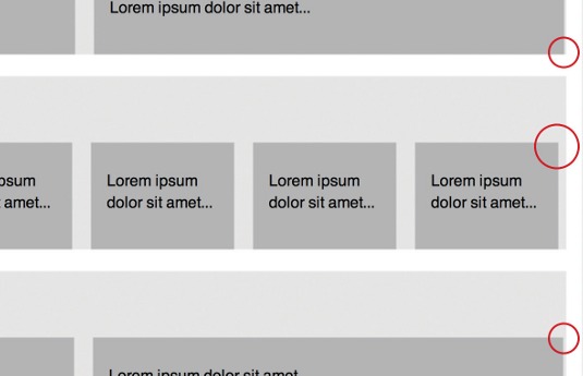
Most grid frameworks have a .last or .end class, the only purpose of which is to remove that margin. From the point of view of single responsibility, that's fantastic, but it also puts presentational classes into your markup. However, if we use it as a mixin instead of a class, we can apply it to semantically named classes in our existing style sheet. This method is a lot less sexy than :nth-child(), but it's also bulletproof, assuming that our elements can be specified properly from the style sheet.
@mixin last {
margin-right: 0;
float: right;
}
We'll also set the last mixin to float the element it is included on to the right. This is to hide the problem with how percentages are calculated. Basically, a precise percentage won’t always equal a precise number of pixels, and some rendering engines are better than others at deciding how to handle that problem. By visually aligning the right edge of the last element with the right edge of the container, we make that problem much less noticeable.
Putting it all together
Now that our flexible grid functions are set up, we can apply them to our markup. We'll start by setting up the basic styles for our body element and our container.
body { padding: 0 1em; margin: 0; }
.container { width: 100%; max-width: $max-width; margin: 0 auto; padding: 0; }
The 1em of right and left padding on the body will give our content some breathing room on smaller devices. You’ll notice that we aren't using the row mixin on the container, even though it uses many of the same styles. This is because we don’t want the effects of the row mixin's child selector. I'm comfortable with the repetition of code because it only occurs in one place and these are common styling attributes to apply to a container element.
Next, we'll tell our sections to behave like rows. This will also set up the basics of our column stylings on the contained elements.
.two-columns,
.six-columns,
.varying-columns,
.nested-columns,
.more-nested-columns,
.offset-columns {
@include row;
}
Finally, we can set individual styles on our elements. These include width declarations based on our flexible-column and flexible-gutter functions and any necessary includes of the nesting mixin. We don't have space to print the resulting code in full here, but you can see the results in css/sass/_ global.css in the 05-final directory: look for the section headed 'declare non-grid-related styles for your elements'.
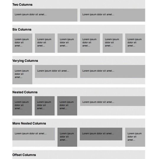
Note that actual production code would and should have some more efficient Sass organisation, but for the sake of this tutorial, we are using declarations on each element to illustrate their use.
Wrapping up
Let's review what we've done. We started by designing a responsive grid system and generating the width values in percentages necessary to make it work. Then we created a demo page with clean markup and no presentational classes. After setting up our site directory and structuring it in such a way that we could write efficient, maintainable Sass, we set up the starter styles we would need. Then we created the functions and mixins necessary to generate flexible column and gutter widths for our elements, to handle nested and offset elements, and to deal with the last element in any given container. Finally, we applied those functions in our global style sheet, enabling us to bring our page elements into alignment with our grid.
Best of all, the grid functions created here can be repurposed for new projects just by changing the variables at the beginning of the grid style sheet. In short, we've set up a grid for our next project already.
Words: Steve Hickey
Thanks to Mark Boulton for his peer review of this tutorial.
Liked this? Read these!
- Inspiring examples of CSS
- Our favourite web fonts that won't cost you a penny
- How to design social buttons for your website
Seen a great flexible grid? Tell us about it in the comments!

The Creative Bloq team is made up of a group of art and design enthusiasts, and has changed and evolved since Creative Bloq began back in 2012. The current website team consists of eight full-time members of staff: Editor Georgia Coggan, Deputy Editor Rosie Hilder, Ecommerce Editor Beren Neale, Senior News Editor Daniel Piper, Editor, Digital Art and 3D Ian Dean, Tech Reviews Editor Erlingur Einarsson, Ecommerce Writer Beth Nicholls and Staff Writer Natalie Fear, as well as a roster of freelancers from around the world. The ImagineFX magazine team also pitch in, ensuring that content from leading digital art publication ImagineFX is represented on Creative Bloq.
