Awe-inspiring data visualization conveys true scale of time
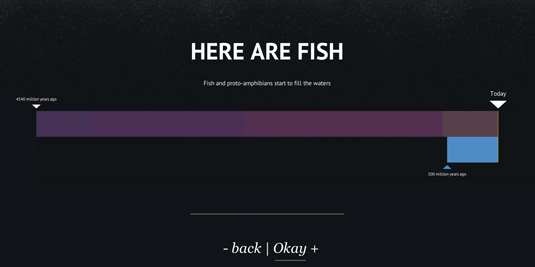
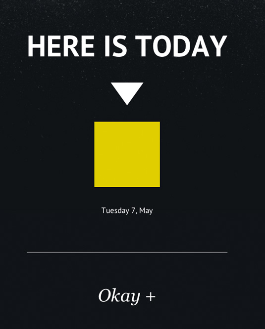
'Here is Today' makes clever use of JavaScript to illustrate the vastness of geological time. We chat to the designer to find out how it was made.
Sign up to Creative Bloq's daily newsletter, which brings you the latest news and inspiration from the worlds of art, design and technology.
You are now subscribed
Your newsletter sign-up was successful
Want to add more newsletters?

Like the infinity of space, the immensity of geological time can be a tricky thing to get your head around. Here is Today is a simple but brilliantly effective interactive data visualization that brings it all home in a very real and easy-to-grasp way.
Designer Luke Twyman explains the motive behind building the site: “Being fascinated by the scale of time, I wanted to create something that would clearly give people a sense of that vastness, and a feeling of where we sit in relation to all that’s gone before. To do this, two important features on the technical side would be some kind of zooming/ scaling mechanic, and also a super clean layout.”
Twyman kept all widths relative to make the site’s message convey equally well on a smaller screen: “From the start I decided to do away with pixel measurements and pt sizes for type, and instead set my own measurement unit based on a fraction of the screen width. I set one unit to be 1/22 of the screen width and positioned and scaled everything using that unit, so the spacious layout would be maintained on different displays.”
Article continues below 
It took just a small amount of JavaScript to put the animation in place: “The zoom mechanic is based on a simple tween animation formula, which I’ve used numerous times now, although I’d never used it in JS before. In fact this is only the second thing I’ve built using JS, but I’ve found the transition from other languages I’ve used or tried to be fairly easy, and there’s plenty of great documentation at hand online.”
This article originally featured in .net magazine issue 243.
Like this? Read these!
- Pro tips for creating interactive infographics
- Top data visualization resources
- The best tools for data visualization
- Brilliant Wordpress tutorial selection
Have you seen an inspiring example of data visualization? Let us know in the comments box below!
Sign up to Creative Bloq's daily newsletter, which brings you the latest news and inspiration from the worlds of art, design and technology.

The Creative Bloq team is made up of a group of art and design enthusiasts, and has changed and evolved since Creative Bloq began back in 2012. The current website team consists of eight full-time members of staff: Editor Georgia Coggan, Deputy Editor Rosie Hilder, Ecommerce Editor Beren Neale, Senior News Editor Daniel Piper, Editor, Digital Art and 3D Ian Dean, Tech Reviews Editor Erlingur Einarsson, Ecommerce Writer Beth Nicholls and Staff Writer Natalie Fear, as well as a roster of freelancers from around the world. The ImagineFX magazine team also pitch in, ensuring that content from leading digital art publication ImagineFX is represented on Creative Bloq.
